Date: March 13th – March 19th
For our final project, we decided to create the game “BLINK”, a simple horror survival game about trying to escape the workplace and the monsters that reside in it. The monsters, in this case, were once human, created by the screens in the office place. As the title suggests, the only way to avoid these creatures is to resist blinking, however, by not blinking, your sanity dwindles so the player must balance this mechanic in order to survive. This game was intended to be 2D as our biggest strength, especially as my art could only be translated in that particular medium. This meant that we weren’t restricted by limited knowledge as we were most confident with 2D styled games.
During this introductory week, we were mainly setting up plans for the project and through this process we would be able to further solidify our roles in developing the game. This was also the perfect time to further discuss and expand the world we had created for our game through compiling all the concept pieces made before the projects development.
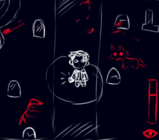
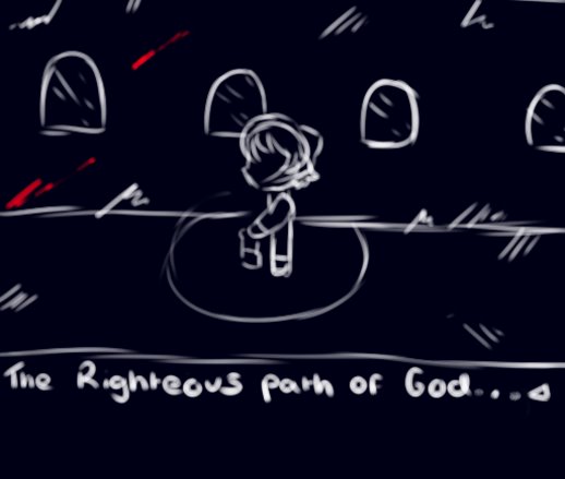
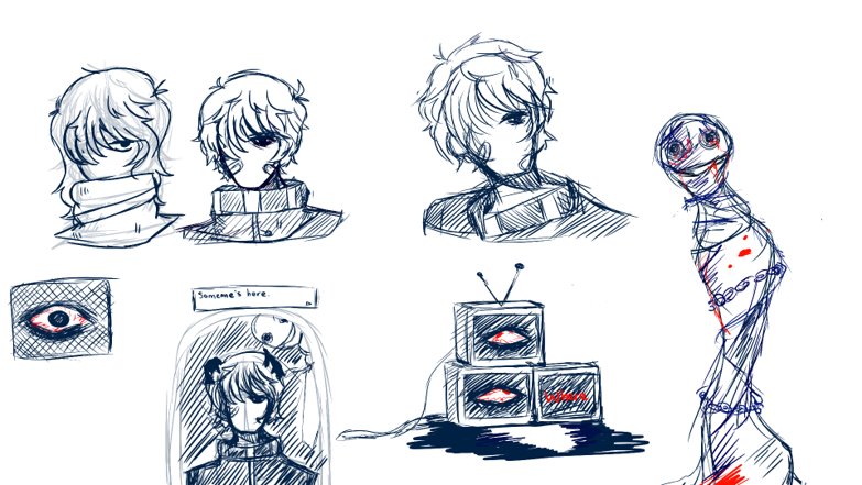
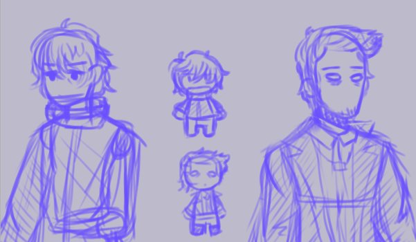
Our team, upon feedback, also combined two concept ideas (those being the BLINK and TV concepts) as those prototypes not only fit the fundamental premise of the project but also allowed me to explore different design options, especially when it came to the monsters and the game’s setting.
These core ideas were the main focus of this week’s tasks for my role as well as combining two ideas together, compiling relevant concept pieces and deciding on an art style that would not only fit the world but would allow both me and Damien, our level designer to both work unanimously without switching art styles.
This particular issue, would be resolved by researching pixel horror, a niche genre that perfectly works for a small team. To start off with, I looked into two of my biggest art inspirations in the RPG genre, Omori and Mad Father.
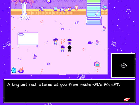
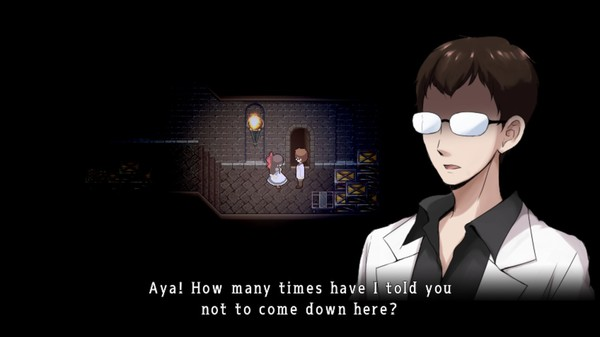

Thumbnail for Kikuo’s song, O Light [Image] Available at: https://www.youtube.com/watch?v=AxhZgT_Hx2I [Accessed on: 11/03/2023]
Whilst these games have two different art styles and tone, their pixel styles hold a simplistic yet personalized look similar to gameboy games. In the end, both me and Damien had decided to go for a style akin to Omori. This is because, whilst Mad father’s sprites look more detailed, we wanted to stay consistent with the game’s planned simplicity. This would also make the planned character sprites fit better with the level design. So now, with the character and detailed art, the style will be 16px based.
Planning our Development
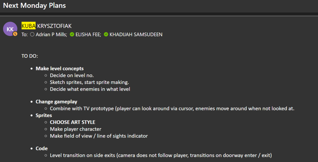
As mentioned prior, every week, as a team, we would write up our tasks in the Hack N plan and work through the specific tasks until the next week. Because we’re a small group, whilst the roles were set in stone, other team members could help with the development of other assets in case of delay. Our team would also regularly communicate in discord for advice or feedback:

These are a couple of examples of screenshots for our tasks for this week:
Compiling Monster Art
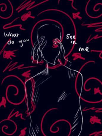
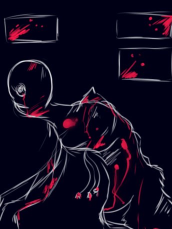
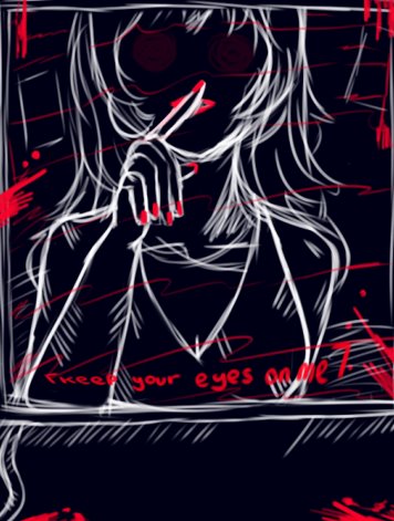
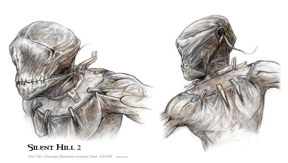
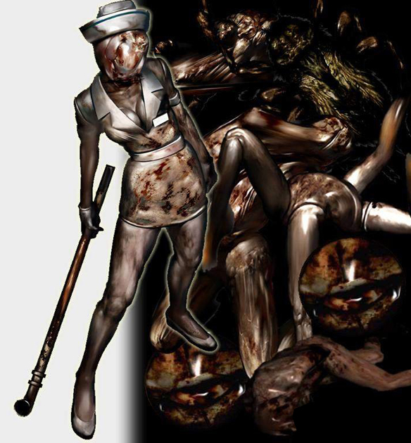
As the concept artist, I wanted to explore different ideas and scenarios that would suit the horror genre best. So in the beginning of the project, I created concept art inspired heavily by games such as Silent Hill and Resident Evil – these games also focused on the more survival and physiological aspects of their designs and settings. These inspirations also heavily contributed to my work as an concept artist as a lot of the monsters from said games have an uncanny, humanoid look which I tried to illustrate here.
