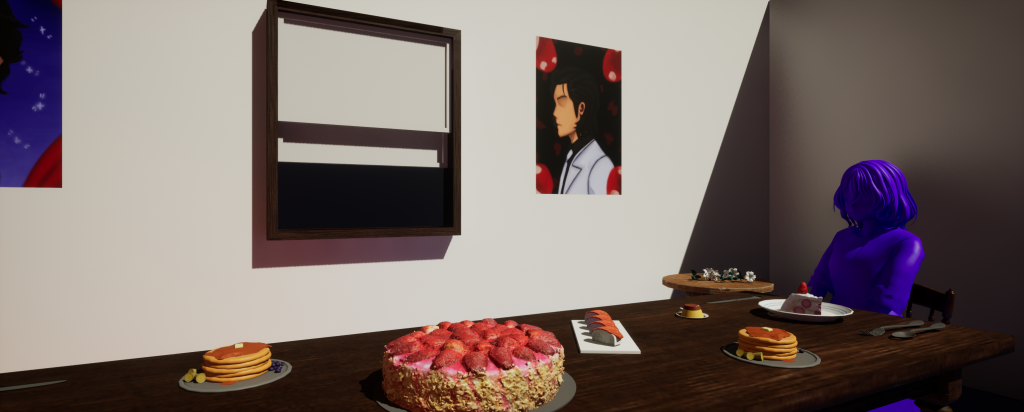
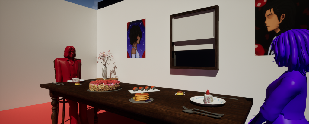
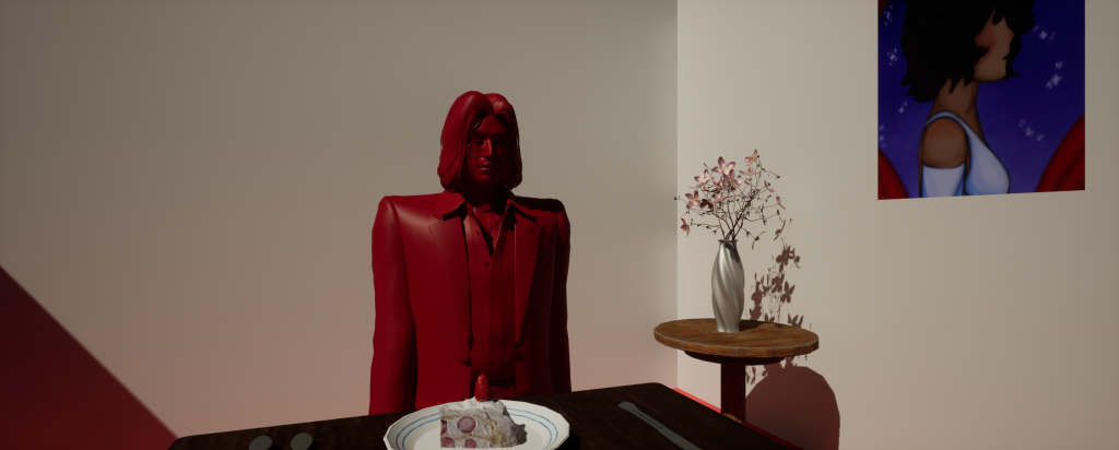
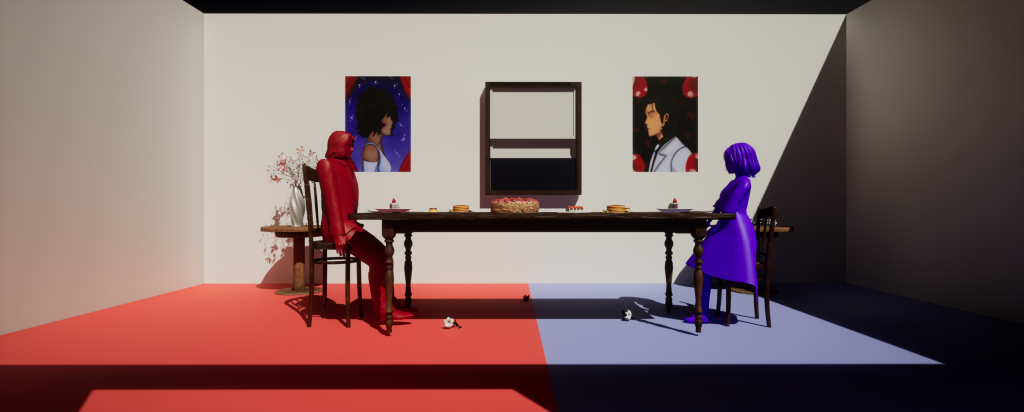
Since the MV was going to take an artistic approach, I decided to try and see if I could keep the sequence limited to one set piece, keeping the idea simple whilst being able to try out different props and compositions for the scene. By setting up the scene in unreal engine, it becomes a great opportunity to see which shots need to be tweaked or overall scrapped, much like the first storyboard.
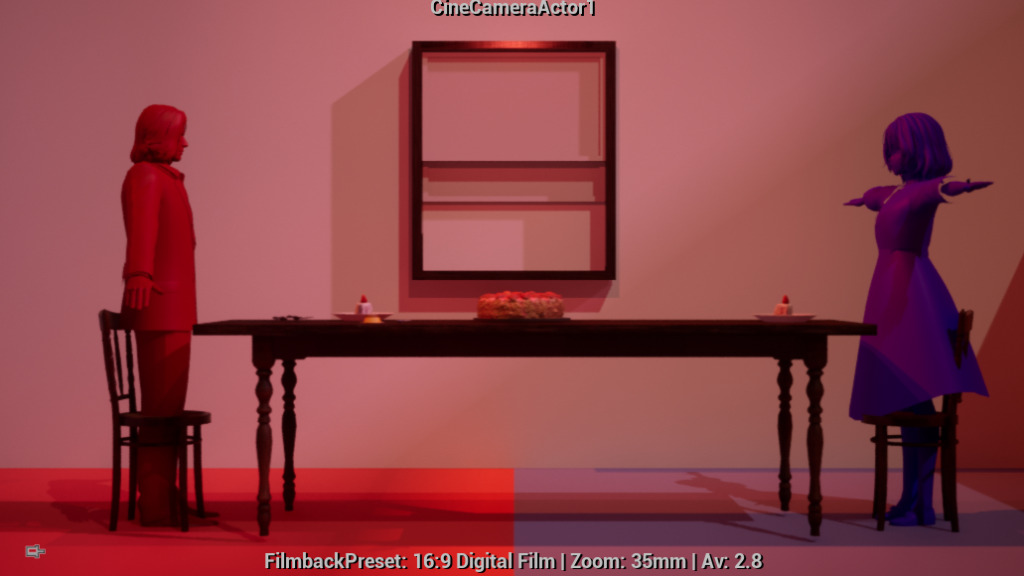
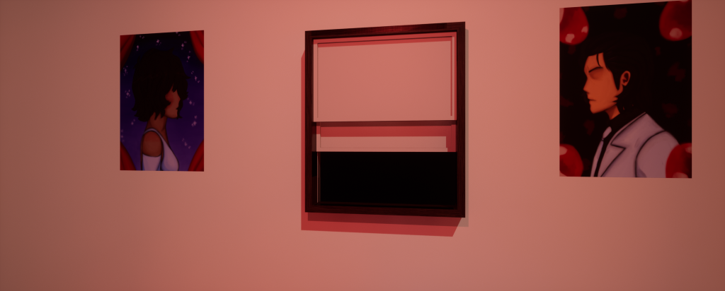
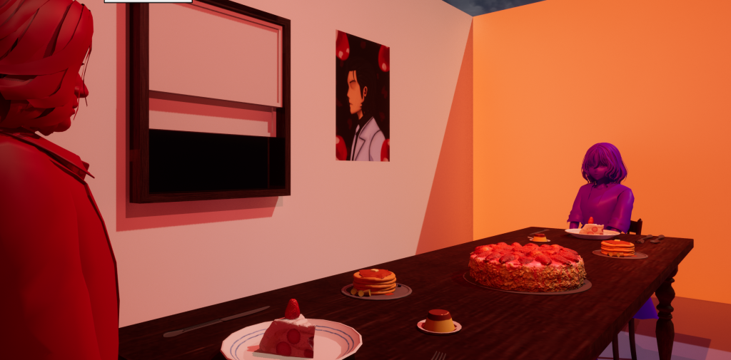
In the second storyboard, the MV would take place between two separate spaces. However, using the room’s size, the camera shots were able to create the illusion that the characters were in separate spaces during certain scenes, giving them their own unique space once the second half began. This was achieved by dividing the room into two seperate spaces and adding their own unique pieces to their areas,
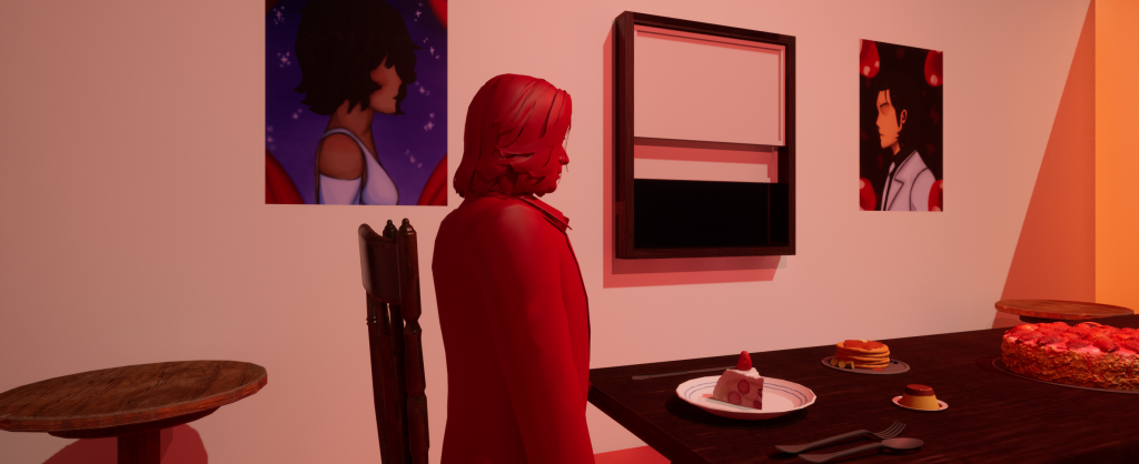
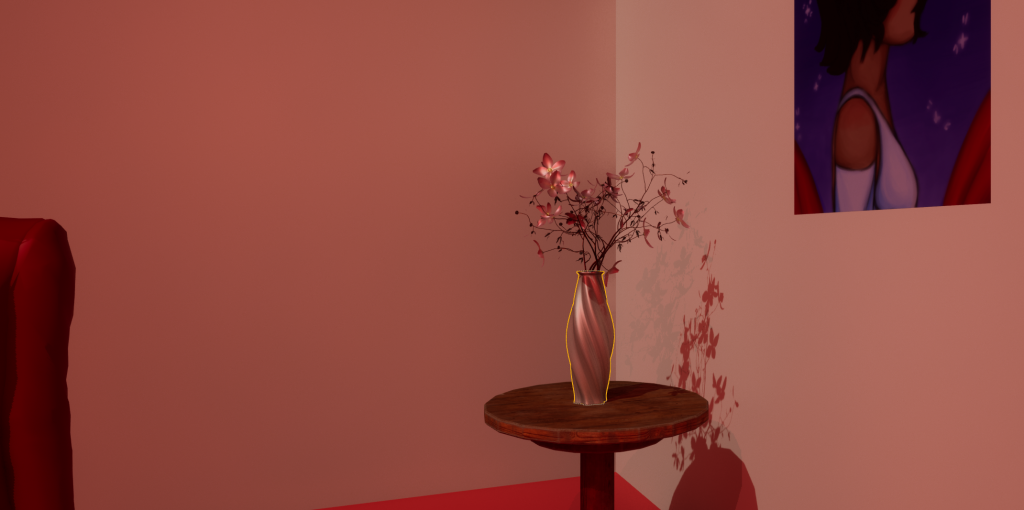
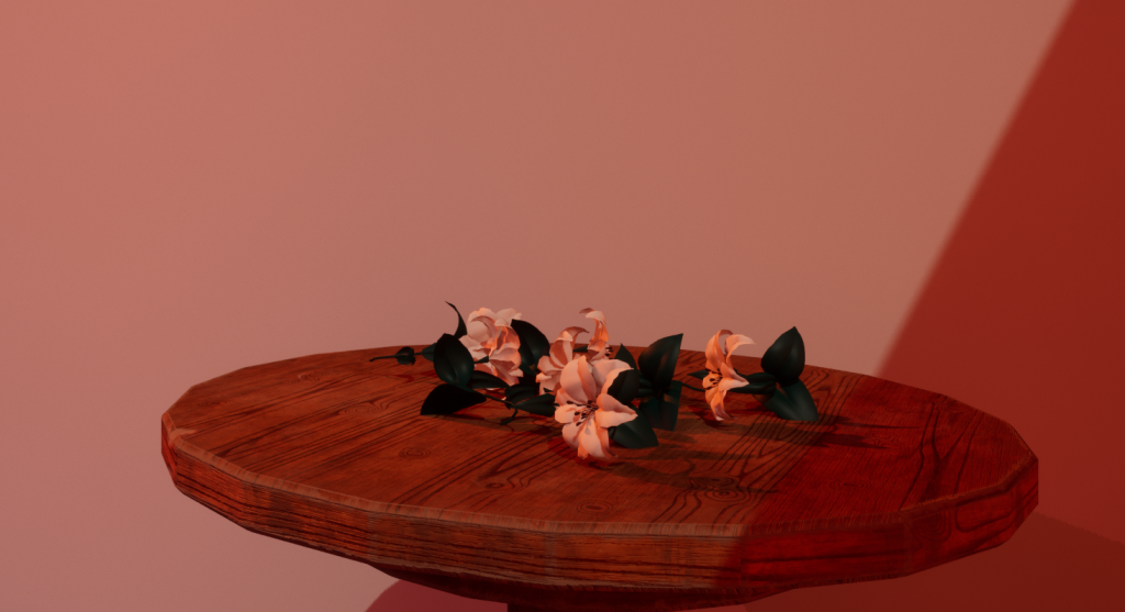
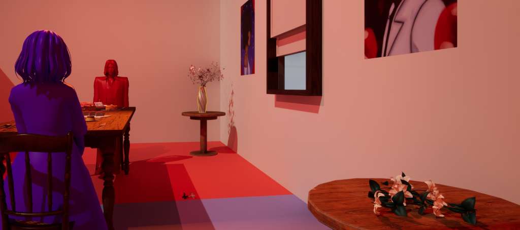
Initially, there were some concerns with the complexity of the set piece, but when seeing this complex MV take place in only 2 stages (with the majority of visuals being 2D). I wanted to challenge myself by creating an MV with only one set and only using camerawork to create these illusions mentioned prior.
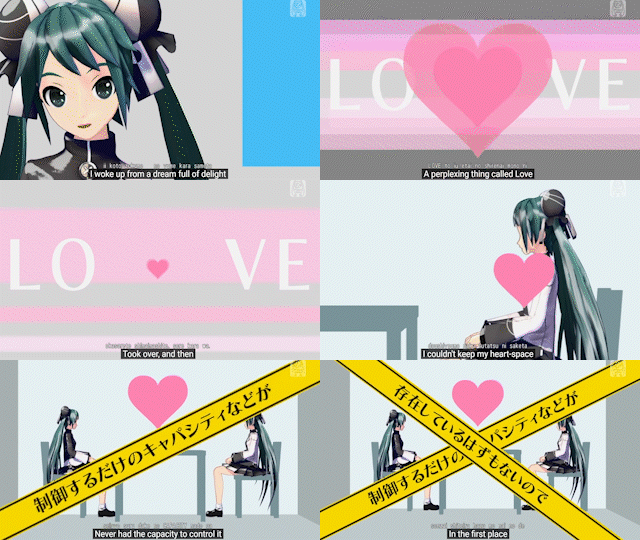

In addition, the visuals of this MV inspired the block colour aesthetic. Originally, the characters were going to be textured normally. However, they did stand out from the set piece too much, especially with the lighting. So instead, I gave them block colour textures in order for them to be the direct focus of the scene whilst also blending in with the aesthetic.
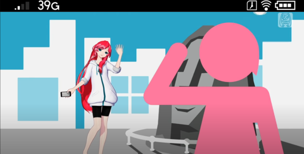
Given the inspiration, when building the composition for the set, the main objective was to make the room both artificial whilst still visually resembling a dining room. To do this I used symmetry composition by using one of the cameras to simulate a wide shot and the flooring as references. This helped me centre the dining table, cake set and window directly in the middle, creating an almost artificial but picturesque feeling to the room. This tone is further emphasised by the perfectly placed food on the table which also becomes part of the main focus. This also tells the audience that something isn’t right visually without directly telling them the reasoning behind it.
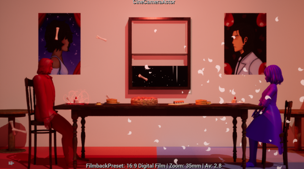
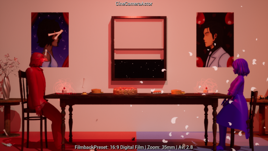
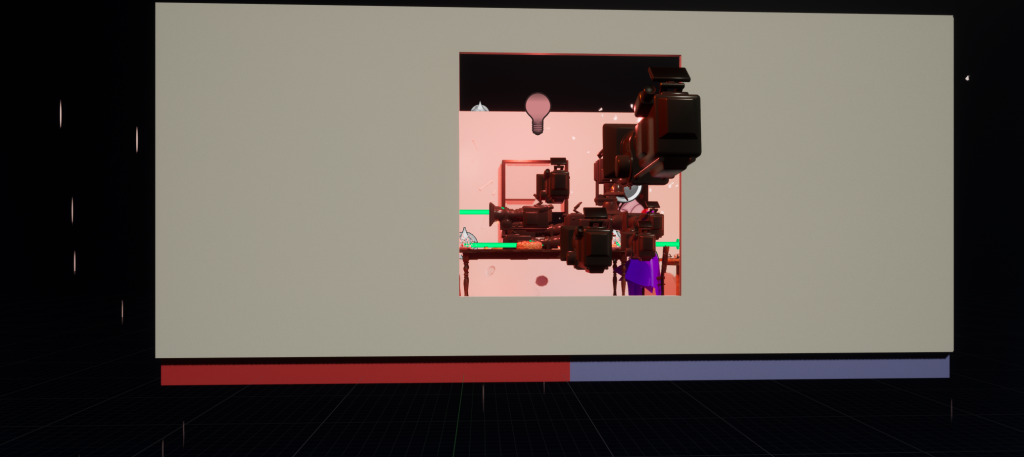
The orange, directional and spotlight lighting creates a warm ambience whilst also making the colours pop. This also helps sell the dining room image despite the set looking unnatural which, in a different interpretation, could make the room feel more ominous.
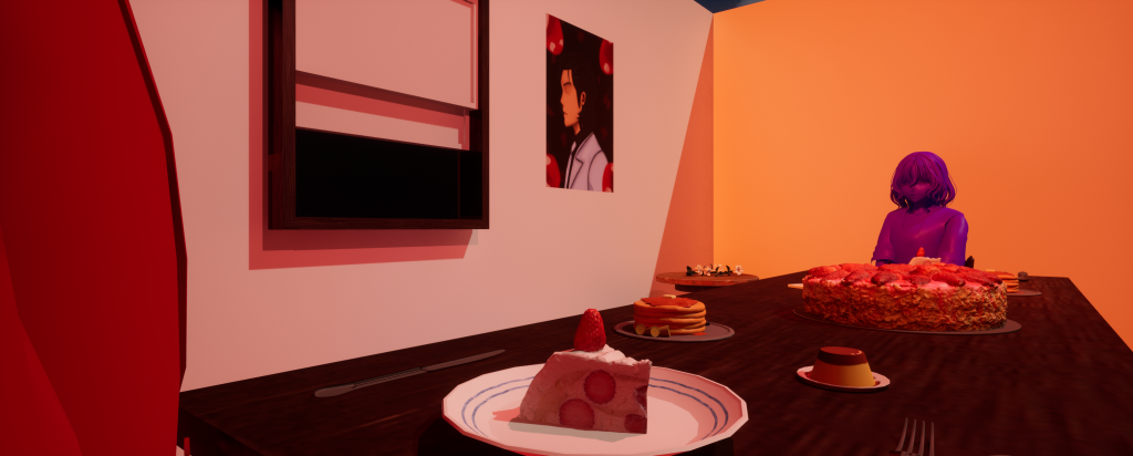
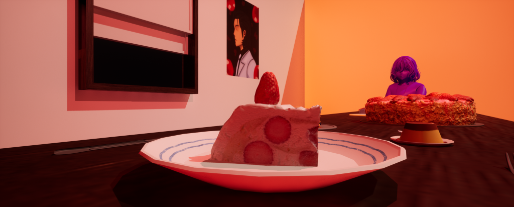
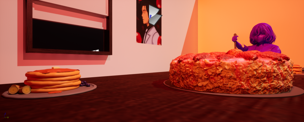
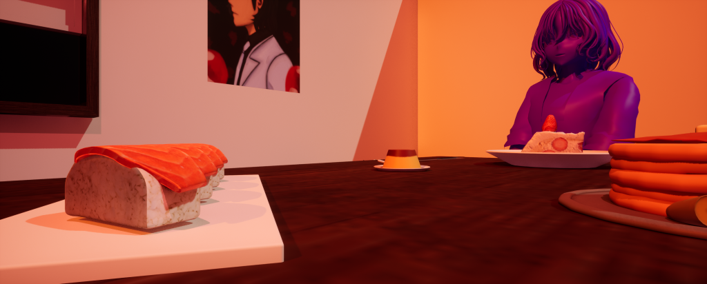
Without the lighting, the colours and food seem bland and sterile – the composition isn’t as interesting or visually appealing.
