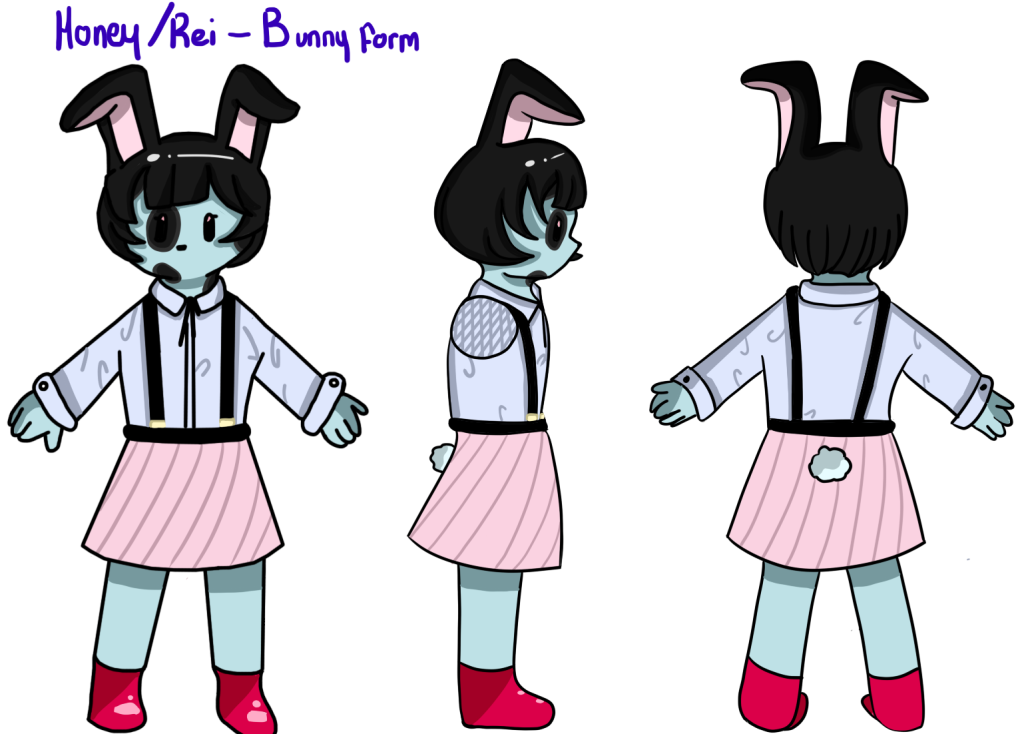
Categories
Design and Prototyping Year 1

Project 01: Cookie Clicker

Introduction

The Cookie Clicker is the starting point for developing prototypes and an introduction to coding. I’ve had little experience when coding so The Cookie Clicker taught me the basics of Unity and C# Scripting, using components that will later be useful in other Prototypes.

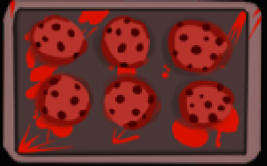
I thought of an idea of creating a Bakery Simulator, taking the mechanics of cookie clicker and adding a horror spin to it. The main functions I focused on within this prototype are the Counter, the Clicker and basic Upgrade Mechanics which were created as UI elements such as the text and the buttons.

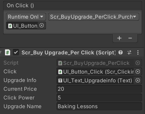
To start off with however, I worked on the clicker aspect itself. To do this, I created a button, replacing the default image with a more visually appealing look. This a similar thing I did when I created the upgrades.

Other UI elements I added was the counter and the Upgrade info which were both Text UI. These show the player how much currency is being produced through clicks and auto-upgrades.

UI Elements: Counter and Click Button

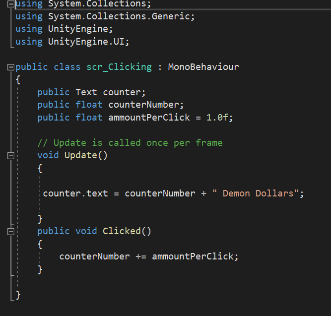
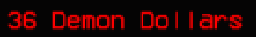
Script for the counter: This allows the counter to display the amount of clicks from the button. At the beginning of the game, the text for the counter will change into Demon Dollars.

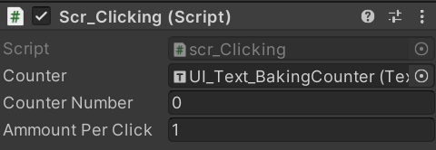
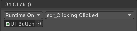
This script was linked to the click button (the baking tray of cookies) and when clicked it adds one ‘Demon Dollar’ to the counter (without the Upgrades). When the Game starts, the counter number will always start at 0.

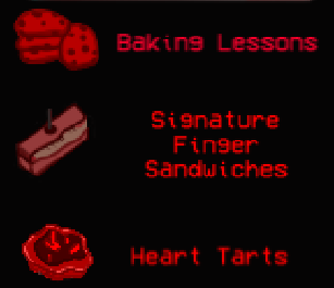
UI Scripting: Upgrades

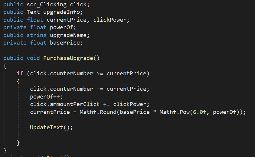
Essentially with this piece of the UpgradePerClick Code, it gives the upgrade a set Price which will increase to the power of 6 each time the upgrade has been purchased.

The public floats presented in the script are shown here: They link up to the click button and the UI Text: Upgrade Info. The click power adds 5 Demon Dollars to every click.

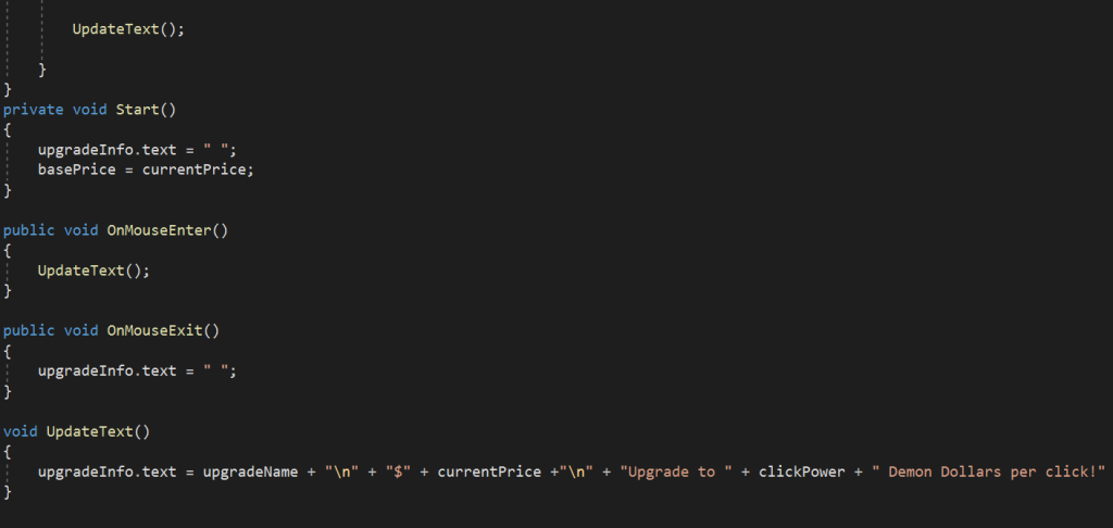
This is the code for the Upgrade Info, all the Upgrades have this piece of code which basically updates every time the player buys an upgrade. The currentPrice which increased every time the player purchased an upgrade, also updates the text on the Upgrade Info. The text in the speech marks will show when the mouse is hovered over the button. The OnMouseEnter and OnMouseExit allows the UI Upgrade Buttons and Upgrade Text to be linked together as well as turning them into Hover Buttons.

The main issue I came across when programming the upgrades was the balance between the steady increase in the upgrade price and the actual click power / multiplier. I didn’t want to make the game too easy nor too hard since the game is supposed to be an incremental game. From my perspective, however, the auto upgrades make the game a lot easier therefore they cost more in comparison the the upgrades per click so I decided that the auto upgrades must have a higher cost in comparison to the upgrades per click.

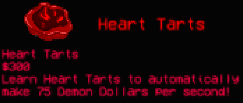
UI Scripting: Auto Upgrades

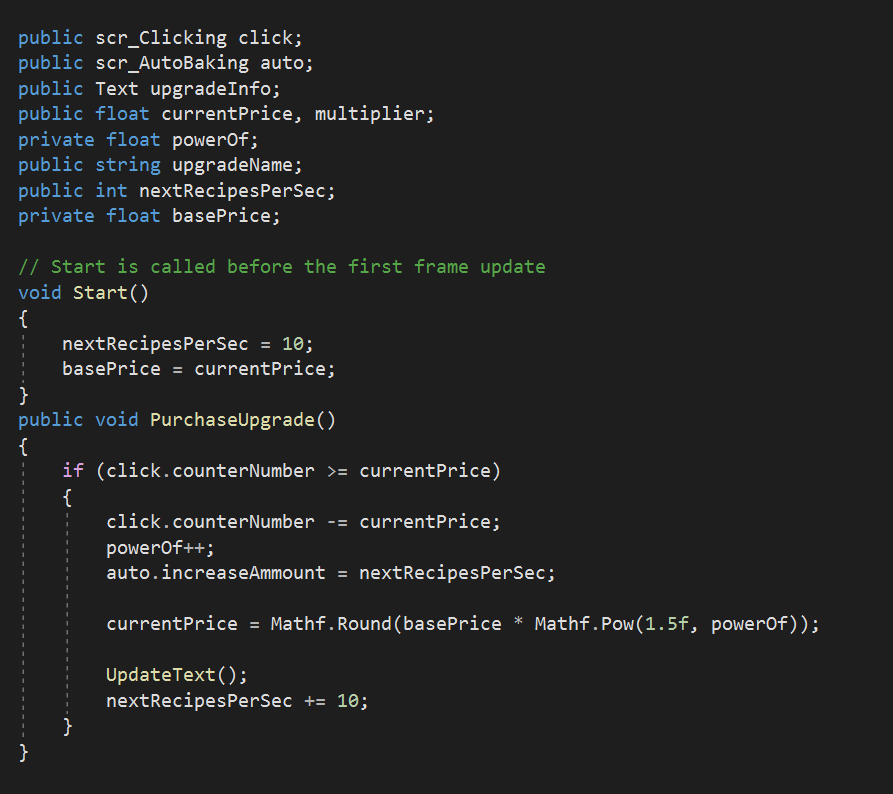
As mentioned previously, I have used similar coding to the UpgradesPerClick script, however, since its an upgrade that produces currency automatically we needed to add script that will automatically increase the amount of the counter. The current price also increases a much more and within each purchase, the currency being produced increase by ten.

Summary

The Cookie Clicker Game, as basic as it is, starts out as a clear introduction to the fundamentals of coding. The game is based on numerical values and UI elements but it serves as a way to focus on the functionality of the game rather than the visual aesthetics.

This also meant seeing common mistakes in coding which I faced a lot during the programming stages such as missing strings or spelling errors. However, this helped me get used to the requirements in coding as well as making it easier to spot mistakes.

Link: https://moodyjazzblues.itch.io/bloody-bakery-cookie-clicker

Software Used: Paint Tool SAI, Unity 2D and Microsoft Visual Studio

Categories
Art and Animation

Week 4: One Point Perspective and Composition

This is just a concept I came up with for a character’s backstory, they’re basically trapped in a room with their arm missing and they have to make sure they don’t go into shock. My main intention for this piece was to create a visual story with an element of mystery. I figured that having less items in the room meant that they didn’t remember much from the event but I tried to make the room look as isolated as possible.

Especially considering my lack of experience in perspective drawing, I drew the layout of the room before creating a digital piece.

I used guidelines from the vanishing point at the centre of the canvas to give me an idea on how the room would be laid out. The window with the blood marks was initially the room’s wall; however I wanted to bring the room closer as I was trying to make the room as claustrophobic as possible. Afterwards, I started working on the digital version, although looking back on the rough sketch, there were some issues with some of the angles of the objects.

I wanted to create an unsettling scene, like it’s been plucked out of a memory so I wanted to make the room as dark as possible. However, this caused some of the close objects (such as the sofa) to blend in with the flooring, making it harder to see.

The lighting in the room was created through the multiply and shading filters but also through painting with the shadows highlighting the lines in the room. However, in retrospective, I should’ve add more lighting coming from the windows so you could see more of the items in the room since the sofa is very hard to distinguish from the dark panelling.

The background of the image conveys the setting of the piece: A city, showing that despite being in a populated area, you can still feel isolated within the room, especially in dangerous situations.

To create the distorted effect for the room, I used the paint tool to blend the shadows and the lineart together so the room was essentially surrounded by darkness. The blood, however, was intentionally made brighter with a luminous effect in order to draw attention to the window and the pool of blood on the ground.

Categories
Art and Animation

Week 3: Colour and Shape Theory

For the Space Invader’s clone project, I wanted to step away from the typical Sci-Fi tropes and create an anime magic girl game much like a 2D bullet hell game called Touhou, although the main character could only go in 2 directions. Using inspiration from other Magic Girl animes, I decided to go for a more cute appeal to the main character but also diverting typical expectations of magic girls by creating a cocky and overconfident look to her through her expression and her pose.

The colours for her clothing were chosen to make her stand out amongst her enemies as well as give a fantastical and flamboyant feel to her character, the cape also shows that she takes the hero role within the game. Her shape also represents that shes physically strong which goes towards her confident and loud personality.

Her wand mimics the typical magic girl weapon, simple by design but being held by an overconfident character means that she doesn’t care too much about flashy appearances but rather than the overpowered functionality of her weapon.

The enemies on the other hand, are quite simple by design but they follow the style I’m going for within the game. The slime enemy’s shapes (Green blob) are soft which shows they’re generally weak and cowardly despite showing up as a ‘threat’. This also shows that the main protagonist sees them as an obstacle rather than an actual enemy.

Categories
Art and Animation

Week 2: Photo Manipulation

This is a photo composition that I created through Photoshop. I wanted to create a horror piece using different stock photos along with original assets (such as the character, the text and the eyes).

I wanted to create a dark and sinister approach to this piece so I decided my color scheme should reflect that as well as the use of typical horror conventions. Black and Red often convey danger and mystery and by creating a red contrast it creates harsh lighting which fits the overall unsettling mood to the composition.

I added eyes to the piece because, in the context of the image, the eyes are meant to be ‘haunting’ the central character, making it more apparent that she’s never safe. This is made more apparent by the text, which I distorted with the wave effect. I intentionally made the central character small so it symbolized that she had little to no control of what was happening around her, visually conveying to the viewer that she’s vulnerable and isolated.

The central focus to this piece is the moon, I wanted to present the image at night because viewers often associate fears with the dark and the unknown. The static inside the moon was to add an another distortion effect, giving off an unnatural and disturbing vibe to the entire composition almost like its a hallucination created from the character’s mind.

Categories
Art and Animation

Initial character designs: Honey

I created Honey as a part of a mystery / psychological horror game concept. Her real name is actually Rei but she only knows that near the end of the game, Honey’s existence is based off of Rei’s stuffed rabbit. These are the initial designs for Honey’s character which I transferred from different perspective sketches onto Photoshop.

I tried to go for a simplistic but cute aesthetic to replicate the feel of a stuffed toy and to also create a visually deceptive art style which will be transferred onto the other characters and the game’s environment.

Whilst I have used Photoshop for photo editing and occasional digital artwork, I haven’t fully explored it’s tools and so I fully utilized the quick selection tool / magic wand tool to fill in the flat colours. The shading was also created with the fill (paint bucket tool) to fit the simple design.