Categories
Art and Animation Year 1

Week 8: Principles of Animation Part 1 – Walk Cycle

I’ve had basic animation experience before: mainly with mouth animations and basic keyframe tweening. However, I’ve dealt with movements in animation let alone walk cycles so this was a challenge for me to complete especially since I was using new software to animate with: Blender.

Since I’ve had no experience with movement animation I had to use a reference, this is where I learnt how frames work when it came to movement.

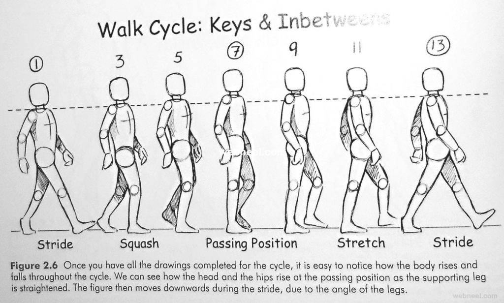
The reference taught me how to have a more dynamic walk cycle with the character’s position moving within every frame without a singular frame being remotely the same as the last. This is because, as humans, every part of our bodies move when we’re emitting simple actions such as walking or breathing. This reference helped demonstrate this by showing a squash and change in height when the character’s moving.

The minimum frames I did for this exercise was 8 frames since this animation was used as a practice to teach me not to focus too much on the anatomy but more of the flow and the movement of the animation. Since I set the frame rate to be 24 frames per second, I was able to experiment with the pacing between each frame and so I decided to have the keyframes have different pacing.

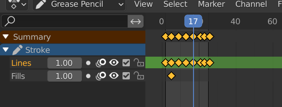
The main issue I came across when working with Blender was when creating each key frame. Blender has the option called onion skinning which allows me to draw over previous key frames to keep consistency, however since Blender wasn’t primarily used for 2D animation, the overall process for the walk cycle took longer to animate.

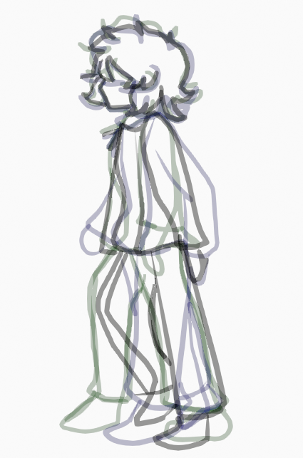
Blender also doesn’t have typical brush settings and instead uses strokes. This meant that rendering each stroke for the key frames took significantly longer and even slowed down the frame rate at certain points. So this meant I had to use less strokes when it came to drawing out my key frames, that also mean I couldn’t add details to the animation and had to focus on the overall movement on the legs.

In summary, Blender was quite difficult to use in terms of animation, I wanted to add basic colours and potentially draw a simple scene but the software was incredibly frustrating to use. In the future, I also want to sketch out the frames before animating it digitally.

References:

https://www.pinterest.co.uk/pin/292593307041458702/

Categories
Art and Animation Year 1

Week 11: Facial Expressions

My main inspiration for these facial expressions come from the anime art style. I wanted to explore and practice drawing basic emotions. I wanted to use the different elements I’ve learnt throughout the module and apply them to this exercise. I wanted to apply my art style when it came to designing facial expressions, so I started off with drawing up what the expressions could look like.

The most difficult challenge in this exercise was the porportions of the face since I would be drawing different the face in different angles. However, with the help of my previous sketches I’ve done, I managed to outline where the faces would be.

Afterwards, I started to draw them out digitally, I wanted a more rendered look to the shapes and the faces so I tried to go for a neat approach when it came to filling in the lineart. I didn’t want to spend too much time on highlights but I added the shadows by blending darker tones into the skin along with a blush which was especially needed to show it’s varying usage within different emotions (for example happiness and sadness).

The next element I wanted to add was the lighting, knowing my work with shadows and lighting I wanted each face to have lighting which would represent their mood. So by using multiple filters such as shade, multiple and luminosity, I was able to make the facial expressions stand out more conveying the overall tone of the emotion.

Categories
Art and Animation Year 1

Week 10- Anatomy for Character Design

With character anatomy study, I wanted to focus on muscles as well as overall gesture anatomy. For this, I didn’t want to go for a neat look as the lines (especially for the muscles) give the character more rough edges and to experiment with direction. To achieve this, I started off with creating rough lineart to give me an idea on where the overall structure of the body would be using a reference to help guide this process:

With the help of the structure lines from the reference model, I was able to get an overall feel to how the body structure was going to work, especially in regards to the character’s stomach muscle and gesture.

I wanted my character to have an intimidating look to her so I decided to give her a ragged yet feminine look, this is where I started experimenting with creating loose lines to add more flow to the clothes.

Afterwards, I worked on the colour and the shadows. From what I’ve learnt from I learnt from colour theory and shadows, I used bright red and a dark colour palette to not only emphasise the contrast between the character and the background but to also visually emphasise that this character’s ruthless and incredibly strong. Her gesture, being a fighting stance, suggests that she’s experienced and possibly dangerous which I wanted to emphasise through the colour choices.

Once I finished the basic colors, I wanted to experiment more with the filters so I added a red multiply filter and duplicated the character and created a shadow effect behind her. Afterwards, I added a darker background to make her stand out more as well as make the background more appealing. The filters helped bring out the colors more on the character and the shadows help make her feel part of the background.

In terms of improvements for this piece, just cleaning up the lineart and the colours would make the piece much more neater, whilst still maintaining the loose artstyle. Adding more shadows the katana could potentially work as it seems to stick out more than the character does.

References:

https://www.pinterest.com/pin/783063453939493372/

Categories
Art and Animation Year 1

Week 9: Principles of Art and Animation Part 2 – Storyboard

I’m much more used to storyboarding for animation, storyboards often tell a story whether it be a flashback or a cutscene and so I wanted to create a storyboard of an emotional scene.

Before I started, I wanted to get an overall layout to how each scene is presented and how it transitions to the next scene, so I started off with an establishment shot to show where the character was. Since storyboards are meant to show the basis of the scene (rather than any details) I created rough sketches for each scene, not worrying too much about porportions.

I created two pages for this rough sketch with different shots, I wanted each shot to express a certain emotion to them therefore without any dialogue, the viewer can still determine the tone of the scene through facial expressions and body language.

For this cutscene, whilst expressing the tone through visuals was ideal, I also wanted to cover some context behind the scene, therefore I added a flashback for viewers to understand what happened prior to the present.

Once I finished the rough planning, I started working on the digital version, again still keeping the details of anatomy to a minimum. I used a monochrome colour palette since lots of storyboards in the animation industry primarily use it to get an idea on the scenes structure and how it’ll play out therefore using a simplified colour scheme saves time when creating longer storyboards.

I laid out the storyboard as if it was a comic, although to make the structure more coherent I could’ve added numbers or switched to a horizontal layout like my original sketches.

For further improvements, for the flashbacks, I could’ve added a static effect to visually indicate to the viewer that it is a flashback. Another improvement I could’ve also added was the inclusion of transitions between the flashback and present scenes: this could’ve also helped indicate the flashbacks further.

I’ve also learnt that storyboards also had more notes that would not only indicate dialogue but also what type of shot it was and further background on what the scene was about for animators that may not understand the context behind a scene. This addition will be useful for future game projects where story cutscenes are involved.

However, overall, the storyboard was clear and cohesive to outside / new viewers and I made sure that the storyboard ended off on a cliffhanger, much like an animated TV episode would.

Categories
Art and Animation Year 1

Week 6: Pixel Art

I’ve had little experience with Pixel Art despite wanting to make games that focused heavily on that aesthetic. This was a good exercise to work on as it’s showed me the fundamentals of working on pixel art and sprites.

To start off with, I started to compile reference images, my main inspiration however comes from a game called Katana ZERO which predominantly uses pixels for their art style.

So to start off with – I drew out what my sprite would look like:

Then I picked out a color palette making sure not to use predominantly black in my sprite but also adding highlights to it, I used the pencil in photoshop along with a minimalist canvas to create the pixel look. I tried to make my scope small when it came to pixel art but I wanted to add details to the sprite:

and so I added shadows to the sprites, much similar to Katana ZERO’s artstyle.

However, the main lesson I’ve learnt from this piece is to keep the amount of pixels and the overall scope of the piece small. There are a lot of jagged lines in this pixel art which makes the sprite look harsh, this could work to a certain extent depending on what mood, art style and atmosphere I’m going for with the overall game.

However, it’s better to have less details rather than focusing heavily on creating anatomically correct and detailed art. The less is more when it comes to pixel art and this exercise helped me understand that.

References:

Katana ZERO . April 18th 2019 . PC [ Game ] . Askiisoft ( Published by Devolver Digital ) Austin, Texas .

https://katana-zero.fandom.com/wiki/Fifteen

Categories
Art and Animation Year 1

Week 5: Shading Basics

For the shading exercise, I wanted to experiment with different lighting as shading and lighting can massively impact how a scene’s tone is interpreted. So to start off with, I wanted to practice harsh lighting, like someone’s being pointed at with a spotlight. So I decided to choose a suitable scenario for this exercise: a beginning of a concert.

I started off with drawing out the based character, I wanted her colour palette to be warm and inviting which would compliment the lighting. So I decided to go with variations of pink and purple. This is similarly how I laid out the background, however, I found it difficult to find a balance when it came to colour contrast.

The lighting has definitely helped with emphasizing the main focus, I used multiple luminosity filters (with various opacity levels) to only highlight the character whilst I used the multiply filter to darken her surroundings.

The final touches I wanted to add were the shadows, after adding the lighting, it’s helped me figured out the locations of where the light bounced off, so I added shadows to the character and the background using the paint brush tool so the shadows blended in more with the background.

A lesson I’ve learnt from this was to have brighter contrasting colours if I wanted to focus on harsh lighting. Whilst in this instance, pastel colours worked in this instance, it’s made the background seem less exciting and dull in comparison.

Shading Exercise 2

In my next exercise, I wanted to mainly focus on the tone of a scene rather than the lighting. I decided to try and go for a melancholic and sentimental mood for this piece. I sketched out the character and her facial expression.

I decided to set the scene at night so there would be less lighting to work with and I can focus more on the shadows. For this, I experimented with cel shading and lowered the opacity within the shading layers.

This came out surprisingly well and it saved time from having to use my normal approach, which was painted shading. However, the disadvantage with cel shading is that it’s a basic approach as it doesn’t blend into the skin.

There are also different shades when it comes ot shadows and that’s what was primarily missing in this piece.

However, I decided to go for the painted shading look with her clothes, whilst it still looked somewhat blocky, blended in better with the lighting.

For the shadows, I used the multiply filter however it looks like it doesn’t affect the character’s face all too much, which throws off the shading to a certain extent.

The tears are also quite hard to see, so I’ve also learnt to use to luminosity affect to help make them stand out, tears are meant to be clear but if I wanted them to be the main focus then this could be a good alternative.

Categories
Art and Animation

Week 4: One Point Perspective and Composition

This is just a concept I came up with for a character’s backstory, they’re basically trapped in a room with their arm missing and they have to make sure they don’t go into shock. My main intention for this piece was to create a visual story with an element of mystery. I figured that having less items in the room meant that they didn’t remember much from the event but I tried to make the room look as isolated as possible.

Especially considering my lack of experience in perspective drawing, I drew the layout of the room before creating a digital piece.

I used guidelines from the vanishing point at the centre of the canvas to give me an idea on how the room would be laid out. The window with the blood marks was initially the room’s wall; however I wanted to bring the room closer as I was trying to make the room as claustrophobic as possible. Afterwards, I started working on the digital version, although looking back on the rough sketch, there were some issues with some of the angles of the objects.

I wanted to create an unsettling scene, like it’s been plucked out of a memory so I wanted to make the room as dark as possible. However, this caused some of the close objects (such as the sofa) to blend in with the flooring, making it harder to see.

The lighting in the room was created through the multiply and shading filters but also through painting with the shadows highlighting the lines in the room. However, in retrospective, I should’ve add more lighting coming from the windows so you could see more of the items in the room since the sofa is very hard to distinguish from the dark panelling.

The background of the image conveys the setting of the piece: A city, showing that despite being in a populated area, you can still feel isolated within the room, especially in dangerous situations.

To create the distorted effect for the room, I used the paint tool to blend the shadows and the lineart together so the room was essentially surrounded by darkness. The blood, however, was intentionally made brighter with a luminous effect in order to draw attention to the window and the pool of blood on the ground.

Categories
Art and Animation

Week 3: Colour and Shape Theory

For the Space Invader’s clone project, I wanted to step away from the typical Sci-Fi tropes and create an anime magic girl game much like a 2D bullet hell game called Touhou, although the main character could only go in 2 directions. Using inspiration from other Magic Girl animes, I decided to go for a more cute appeal to the main character but also diverting typical expectations of magic girls by creating a cocky and overconfident look to her through her expression and her pose.

The colours for her clothing were chosen to make her stand out amongst her enemies as well as give a fantastical and flamboyant feel to her character, the cape also shows that she takes the hero role within the game. Her shape also represents that shes physically strong which goes towards her confident and loud personality.

Her wand mimics the typical magic girl weapon, simple by design but being held by an overconfident character means that she doesn’t care too much about flashy appearances but rather than the overpowered functionality of her weapon.

The enemies on the other hand, are quite simple by design but they follow the style I’m going for within the game. The slime enemy’s shapes (Green blob) are soft which shows they’re generally weak and cowardly despite showing up as a ‘threat’. This also shows that the main protagonist sees them as an obstacle rather than an actual enemy.

Categories
Art and Animation

Week 2: Photo Manipulation

This is a photo composition that I created through Photoshop. I wanted to create a horror piece using different stock photos along with original assets (such as the character, the text and the eyes).

I wanted to create a dark and sinister approach to this piece so I decided my color scheme should reflect that as well as the use of typical horror conventions. Black and Red often convey danger and mystery and by creating a red contrast it creates harsh lighting which fits the overall unsettling mood to the composition.

I added eyes to the piece because, in the context of the image, the eyes are meant to be ‘haunting’ the central character, making it more apparent that she’s never safe. This is made more apparent by the text, which I distorted with the wave effect. I intentionally made the central character small so it symbolized that she had little to no control of what was happening around her, visually conveying to the viewer that she’s vulnerable and isolated.

The central focus to this piece is the moon, I wanted to present the image at night because viewers often associate fears with the dark and the unknown. The static inside the moon was to add an another distortion effect, giving off an unnatural and disturbing vibe to the entire composition almost like its a hallucination created from the character’s mind.

Categories
Art and Animation

Initial character designs: Honey

I created Honey as a part of a mystery / psychological horror game concept. Her real name is actually Rei but she only knows that near the end of the game, Honey’s existence is based off of Rei’s stuffed rabbit. These are the initial designs for Honey’s character which I transferred from different perspective sketches onto Photoshop.

I tried to go for a simplistic but cute aesthetic to replicate the feel of a stuffed toy and to also create a visually deceptive art style which will be transferred onto the other characters and the game’s environment.

Whilst I have used Photoshop for photo editing and occasional digital artwork, I haven’t fully explored it’s tools and so I fully utilized the quick selection tool / magic wand tool to fill in the flat colours. The shading was also created with the fill (paint bucket tool) to fit the simple design.