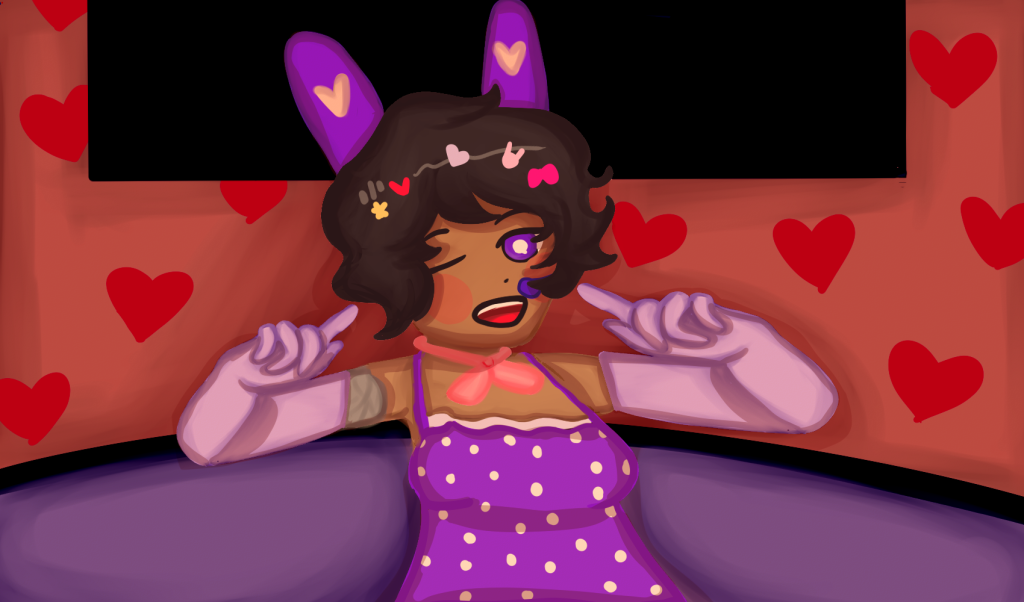
For the shading exercise, I wanted to experiment with different lighting as shading and lighting can massively impact how a scene’s tone is interpreted. So to start off with, I wanted to practice harsh lighting, like someone’s being pointed at with a spotlight. So I decided to choose a suitable scenario for this exercise: a beginning of a concert.
I started off with drawing out the based character, I wanted her colour palette to be warm and inviting which would compliment the lighting. So I decided to go with variations of pink and purple. This is similarly how I laid out the background, however, I found it difficult to find a balance when it came to colour contrast.
The lighting has definitely helped with emphasizing the main focus, I used multiple luminosity filters (with various opacity levels) to only highlight the character whilst I used the multiply filter to darken her surroundings.
The final touches I wanted to add were the shadows, after adding the lighting, it’s helped me figured out the locations of where the light bounced off, so I added shadows to the character and the background using the paint brush tool so the shadows blended in more with the background.
A lesson I’ve learnt from this was to have brighter contrasting colours if I wanted to focus on harsh lighting. Whilst in this instance, pastel colours worked in this instance, it’s made the background seem less exciting and dull in comparison.
Shading Exercise 2
In my next exercise, I wanted to mainly focus on the tone of a scene rather than the lighting. I decided to try and go for a melancholic and sentimental mood for this piece. I sketched out the character and her facial expression.

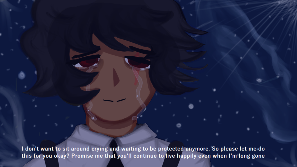
I decided to set the scene at night so there would be less lighting to work with and I can focus more on the shadows. For this, I experimented with cel shading and lowered the opacity within the shading layers.
This came out surprisingly well and it saved time from having to use my normal approach, which was painted shading. However, the disadvantage with cel shading is that it’s a basic approach as it doesn’t blend into the skin.
There are also different shades when it comes ot shadows and that’s what was primarily missing in this piece.
However, I decided to go for the painted shading look with her clothes, whilst it still looked somewhat blocky, blended in better with the lighting.
For the shadows, I used the multiply filter however it looks like it doesn’t affect the character’s face all too much, which throws off the shading to a certain extent.
The tears are also quite hard to see, so I’ve also learnt to use to luminosity affect to help make them stand out, tears are meant to be clear but if I wanted them to be the main focus then this could be a good alternative.