With character anatomy study, I wanted to focus on muscles as well as overall gesture anatomy. For this, I didn’t want to go for a neat look as the lines (especially for the muscles) give the character more rough edges and to experiment with direction. To achieve this, I started off with creating rough lineart to give me an idea on where the overall structure of the body would be using a reference to help guide this process:
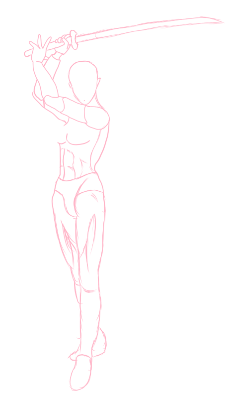
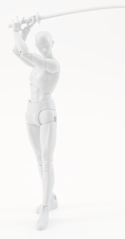
With the help of the structure lines from the reference model, I was able to get an overall feel to how the body structure was going to work, especially in regards to the character’s stomach muscle and gesture.
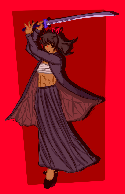
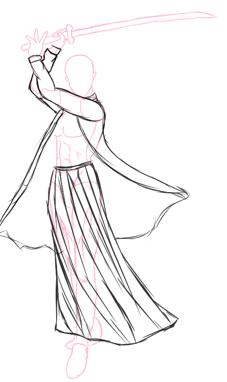
I wanted my character to have an intimidating look to her so I decided to give her a ragged yet feminine look, this is where I started experimenting with creating loose lines to add more flow to the clothes.
Afterwards, I worked on the colour and the shadows. From what I’ve learnt from I learnt from colour theory and shadows, I used bright red and a dark colour palette to not only emphasise the contrast between the character and the background but to also visually emphasise that this character’s ruthless and incredibly strong. Her gesture, being a fighting stance, suggests that she’s experienced and possibly dangerous which I wanted to emphasise through the colour choices.
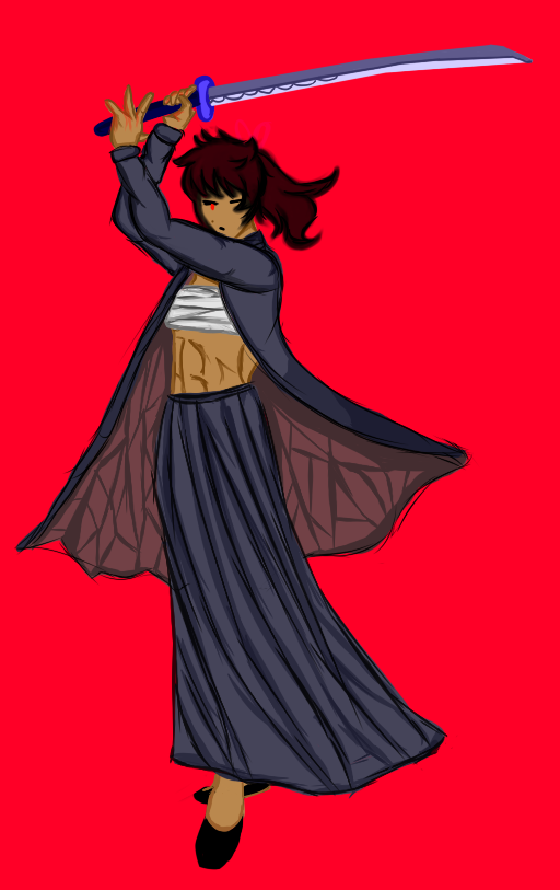
Once I finished the basic colors, I wanted to experiment more with the filters so I added a red multiply filter and duplicated the character and created a shadow effect behind her. Afterwards, I added a darker background to make her stand out more as well as make the background more appealing. The filters helped bring out the colors more on the character and the shadows help make her feel part of the background.
In terms of improvements for this piece, just cleaning up the lineart and the colours would make the piece much more neater, whilst still maintaining the loose artstyle. Adding more shadows the katana could potentially work as it seems to stick out more than the character does.