Date 20th – 26th March
This week, the main tasks were to start designing and creating the character sprites – this will also help establish the project’s visuals.
Last week, we had decided to go for a 16 bit art style reminiscent of RPG games that hold a similar 90’s aesthetic. But before beginning to make making the character sprites, I needed to create and design reference sheet for the protagonist. Before developing the game, I made some sketches of his character.
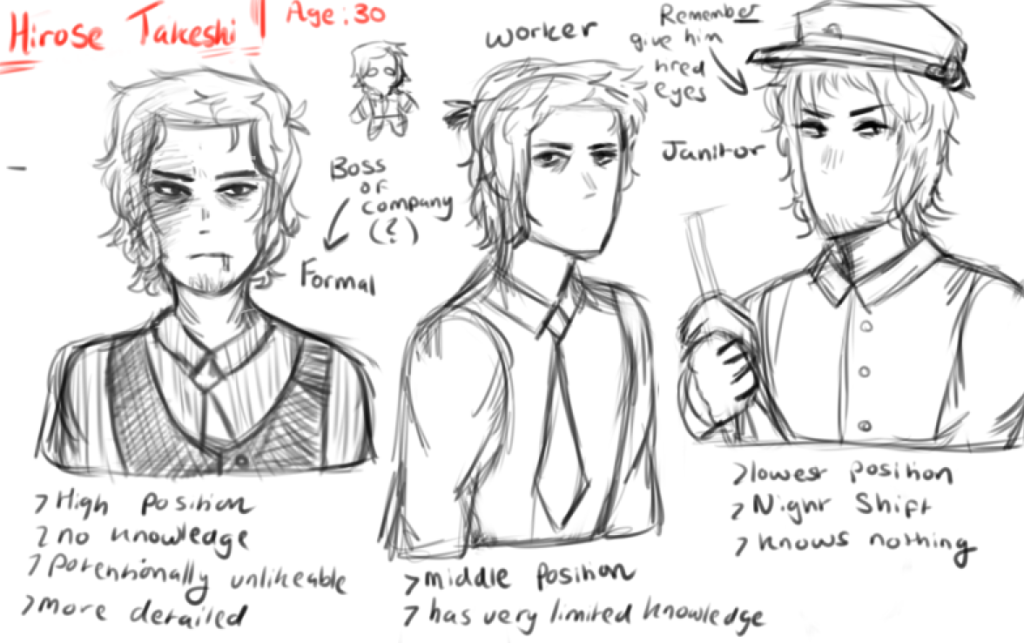
For his character design, I tried to go for a more ordinary look that compliments the unconventional horror game setting. Since the game is also set in an office environment, I wanted the character to be able to connect to the audience by establishing that he’s in the same position as the player. I wanted to protray that through his design that he’s an ordinary office worker and therefore is just as clueless of the situation as the player is.
Despite the genre, the protagonist was also designed with visual appeal in mind as he was created to be conventionally attractive. Upon research, audience (moreso from internet fanbases per example) are able to resonate and become more invested with characters that hold attractive qualities. Whilst appeal is an subjective area for all players, by making his design recognizable the game would be able to attract a larger audience.
Designing Sprites
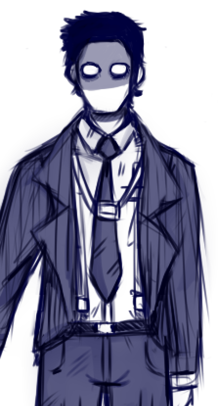
When talking about Visual design, I went for a more monotone color scheme showing that he’s unassuming but physically unwell and pale. He appears to take his job seriously through appearance but at the cost of his health which is shown through his mute colours. His character also suffers with intense insomnia, this will be mentioned here and there through subtle dialogue but I wanted to express that through his appearance.
His character, therefore blends into the office environment without standing out too much. His design draws attention to the player with the subtle contrast between the beige environment and the character’s appearance.
Researching the 16px art style, I was heavily inspired by a psychological horror game with a similar anime style, OMORI. So I looked at Sprite sheets from the game and tried to develop my own style of sheets based off of it. In the end, I was able to create my own style whilst learning about the fundementals of 2D animation and movement.
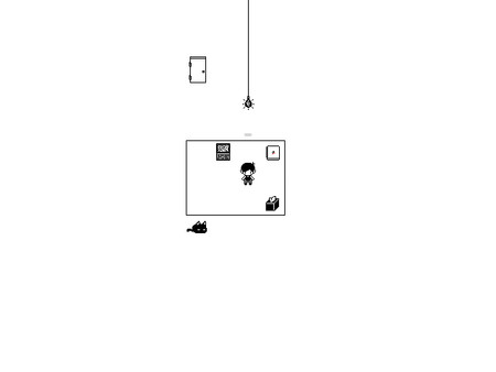


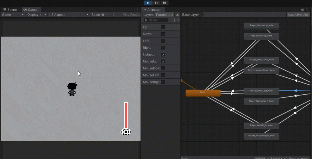
After working on the main character’s sheets, I started working on some placeholder assets for the enemy sprites. Here are a couple of examples as shown here.

By making the placeholders, it allowed our group to see how the enemies could interact. I created two seperate sprites: Those being stationary and moving types.
The stationary sprites were created so our programmer could test the blink and insanity mechanics. To have an insanity component within this mechanic would not only fit the main character’s insomnia but it would also increase the difficulty by forcing players to pay attention to their eyesight and damage they take during the game. The moving types, however, help experiment how we’d want to tackle to art style as well as the movement speed for enemies.
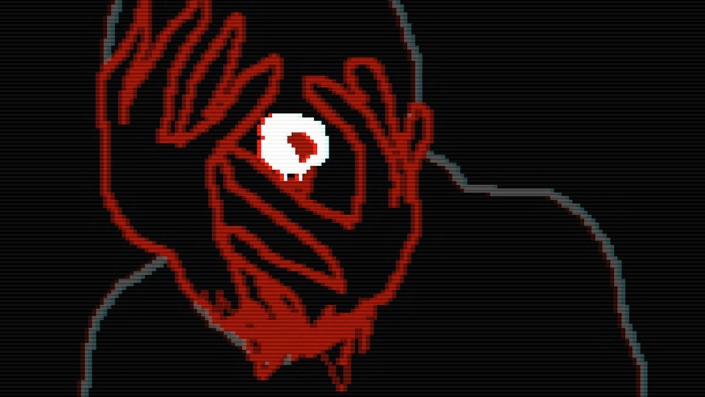
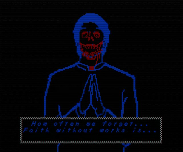
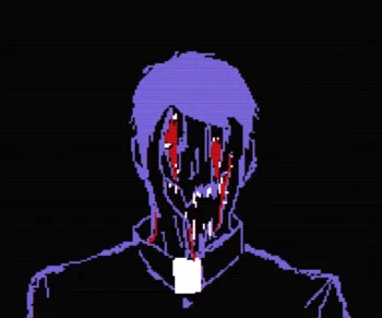
These mechanics are directly inspired by FAITH’s narrative structure. In that game, there are subtle details that debate whether or not the events of the game were real or hallucinations plaguing the player’s mind. Whilst this wasn’t an active mechanic in FAITH, it presented an perfect opportunity to draw inspiration from.
This also meant, in development, I would need to create a new system when designing the enemies.
This will be next week’s task as after making the character and placeholder sprites, I was able to learn how to learn the fundemantals of spritework as well as the basics of simple 2D animation within pixel art and video games.