Date: 27th March – 2nd April
To start off this week, as mentioned in my prior log, I began to work on some enemy designs that could fit the 16 px aesthetic. The main focus of creating these sprites were to create a new system for 2 stages in the blink mechanic.
Enemy Designs
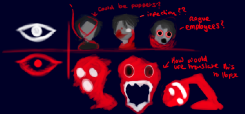
As shown here, there are two established stages so far depend on the player’s sanity throughout the level. The first type, the normal enemies are established at the start of game. As a group, we established their patterns early on in development as it was our main selling point for the game: normal enemies only move when the monster is out of the players view.
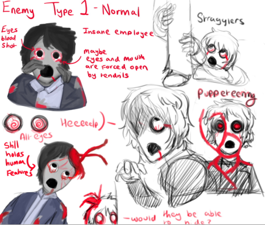
For this enemy type, I started to design creatures that were humanoid, almost as if an infection was eating away at them. So they still held very human characteristics in terms of appearance. I plan for them to also move similarly to the main character to emphasize that appearance.
This establishes the insanity mechanic by establishing the contrast of this ‘infected human’ to the still pristine but dark office environment. As a writer for the game, This also helps the audience question the character’s reality through this contrast as well as add a level of intrigue to the overarching narrative. After all: Is what the character’s experiencing real or not?
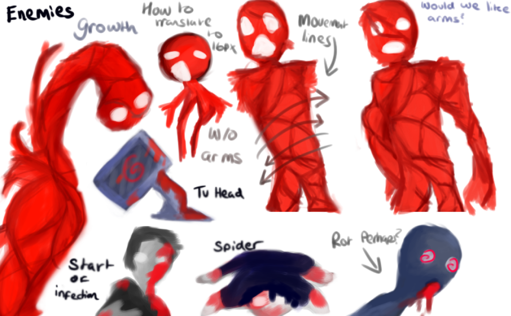
The second type of enemies are only activated if the character loses enough sanity through damage or staring at enemies for too long. These enemies are planned to be much more aggressive than their predecessors as the main character has fully succumbed to the madness around him.
Keeping these decisions in mind, I created these monsters to be less humanoid and visually terrifying by essentially skinning them of any parts that made them seem human in the first place. Their designs are completely contorted, once again inspired by silent hill monsters and I plan for them to move in an incredibly unnatural and distorted way in their sprite work.
Creating Character Portraits
The idea of character portraits came whilst I was trying to produce ideas on how to emphasize visual appeal into our game. Whilst it is purely cosmetic, the addition of character portraits allow players to further visualize and therefore humanise our main character since we were also planning to add dialogue into the game.
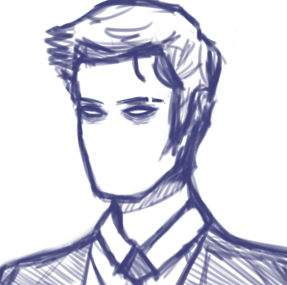
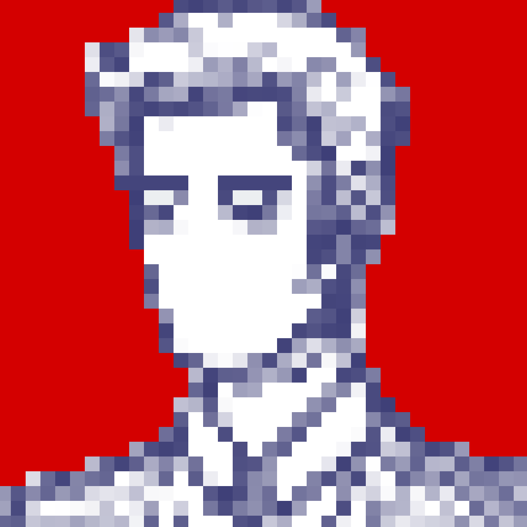
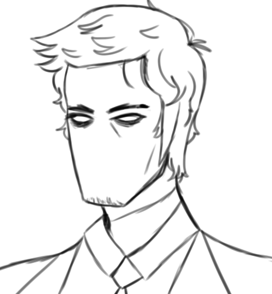
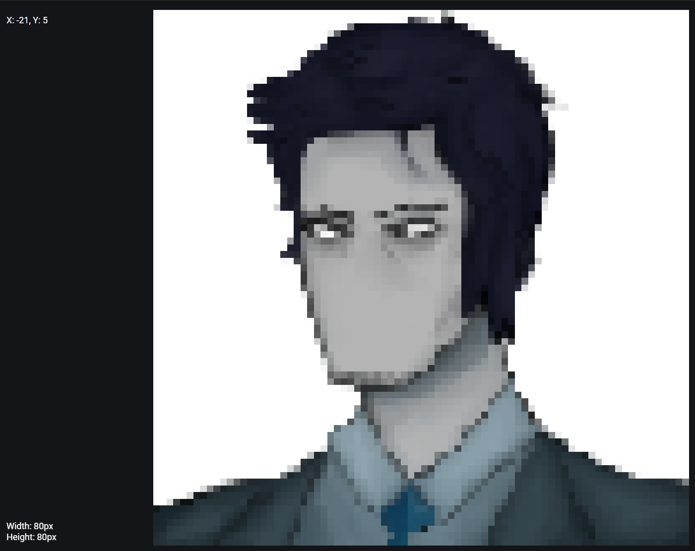
This week, I will continue to work on some character portraits and hopefully have them produced by next week. For our character, I also wanted to show off different expressions which would compliment his dialogue as my main goal with his writing and development is to produce a personality for players to connect with. In, another version of the portraits, I made a couple of changes to his appearance to make him look older.
Whilst I tried to keep the pixel style consistent with 16 bit, if we wanted to showcase the characters details, I would need to produce a more high resolution version of the portraits whilst trying to maintain the pixel aesthetic.