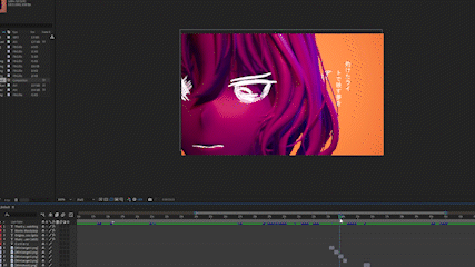
To start off this week, as mentioned in my prior log, I began to work on some enemy designs that could fit the 16 px aesthetic. The main focus of creating these sprites were to create a new system for 2 stages in the blink mechanic.
Enemy Designs
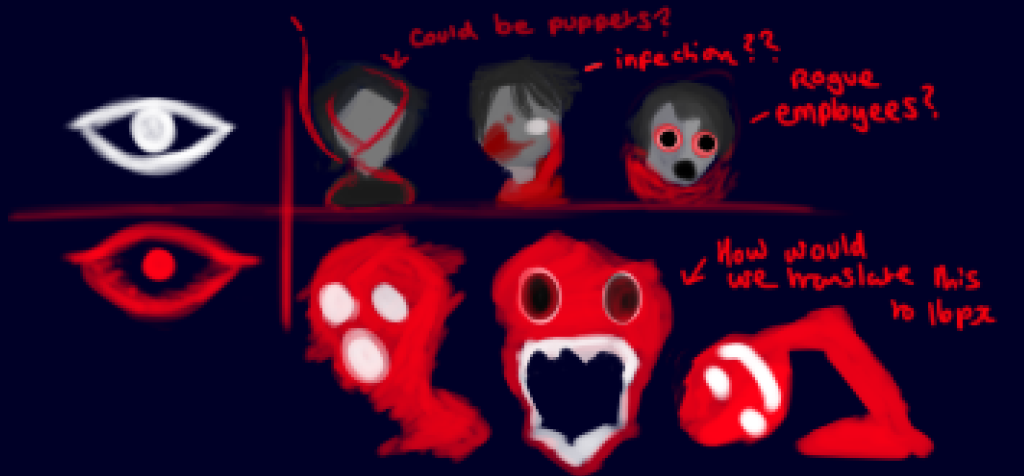
A sketchy table showing the two stages – normal and ‘insane’ monsters.
As shown here, there are two established stages so far depend on the player’s sanity throughout the level. The first type, the normal enemies are established at the start of game. As a group, we established their patterns early on in development as it was our main selling point for the game: normal enemies only move when the monster is out of the players view.
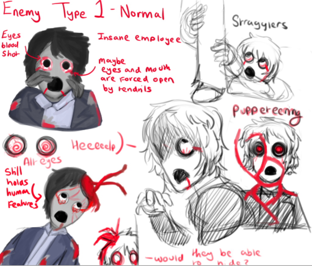
Rough sketches and ideas of Enemy Type 1
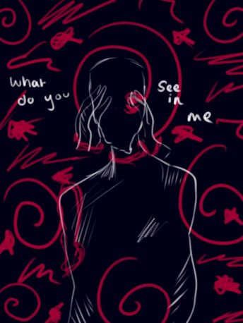
For this enemy type, I started to design creatures that were humanoid, almost as if an infection was eating away at them. So they still held very human characteristics in terms of appearance. I plan for them to also move similarly to the main character to emphasize that appearance.
This establishes the insanity mechanic by establishing the contrast of this ‘infected human’ to the still pristine but dark office environment. As a writer for the game, This also helps the audience question the character’s reality through this contrast as well as add a level of intrigue to the overarching narrative. After all: Is what the character’s experiencing real or not?
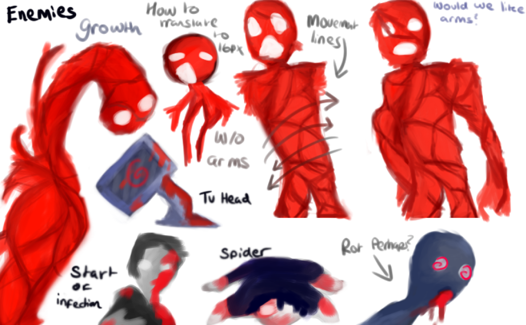
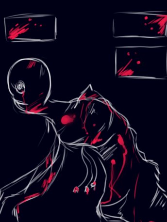
Rough concept ideas of the ‘insane’ enemies – Decided to keep a bright, red contrast to the first enemies.
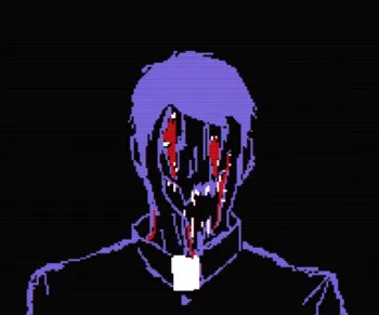
The second type of enemies are only activated if the character loses enough sanity through damage or staring at enemies for too long. These enemies are planned to be much more aggressive than their predecessors as the main character has fully succumbed to the madness around him.
Keeping these decisions in mind, I created these monsters to be less humanoid and visually terrifying by essentially skinning them of any parts that made them seem human in the first place. Their designs are completely contorted, once again inspired by silent hill monsters and I plan for them to move in an incredibly unnatural and distorted way in their sprite work.
Creating Character Portraits
The idea of character portraits came whilst I was trying to produce ideas on how to emphasize visual appeal into our game. Whilst it is purely cosmetic, the addition of character portraits allow players to further visualize and therefore humanise our main character since we were also planning to add dialogue into the game.
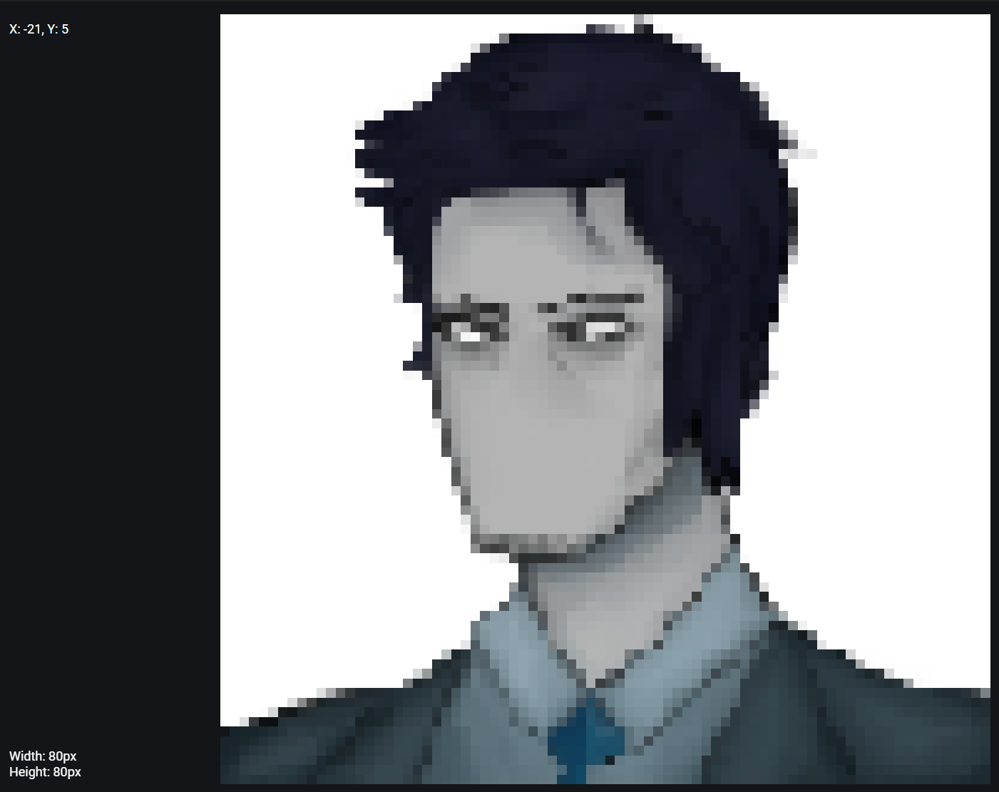
Beta portrait designs – Left is High Res and Right is 16 pxFinal Portrait DesignExperimenting with Higher resolution for the portraits 80px
This week, I will continue to work on some character portraits and hopefully have them produced by next week. For our character, I also wanted to show off different expressions which would compliment his dialogue as my main goal with his writing and development is to produce a personality for players to connect with. In, another version of the portraits, I made a couple of changes to his appearance to make him look older.
Whilst I tried to keep the pixel style consistent with 16 bit, if we wanted to showcase the characters details, I would need to produce a more high resolution version of the portraits whilst trying to maintain the pixel aesthetic.
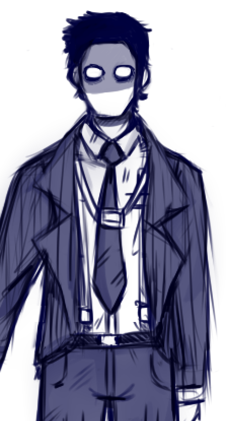
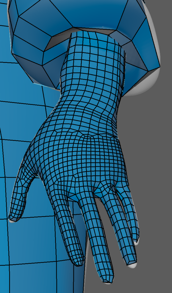
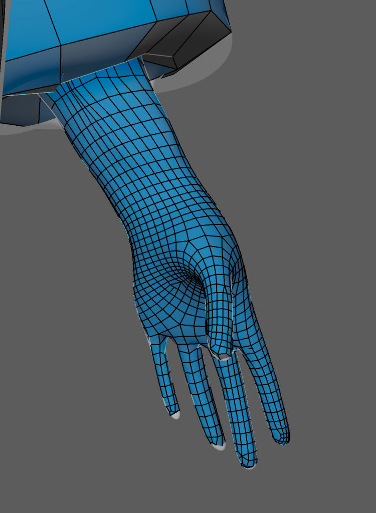
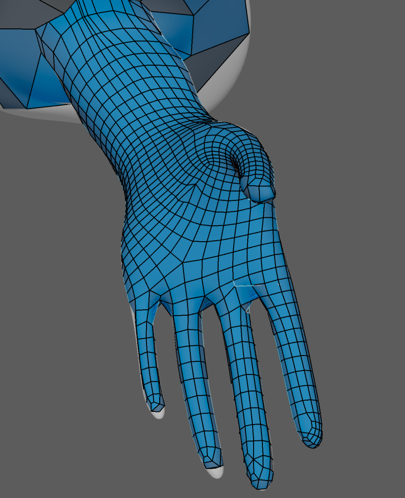
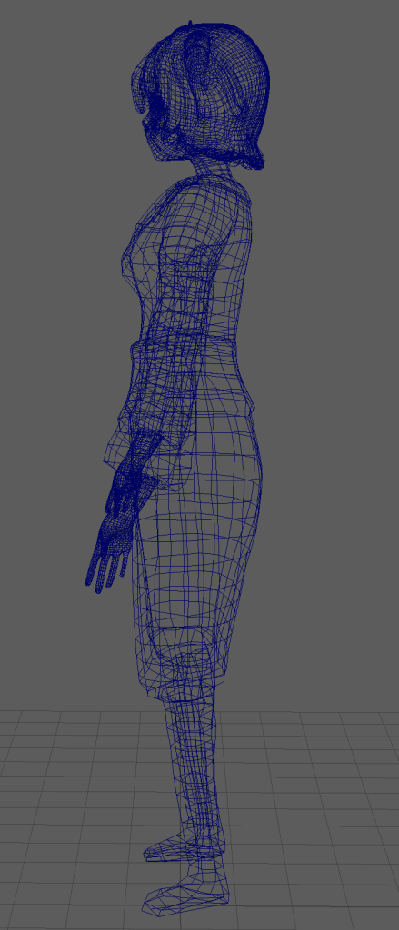
This week, the main tasks were to start designing and creating the character sprites – this will also help establish the project’s visuals.
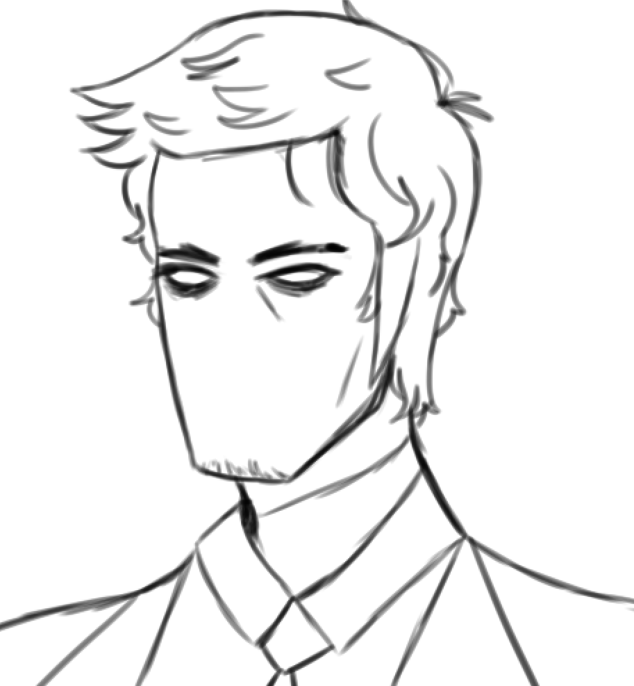
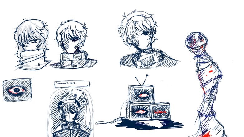
Last week, we had decided to go for a 16 bit art style reminiscent of RPG games that hold a similar 90’s aesthetic. But before beginning to make making the character sprites, I needed to create and design reference sheet for the protagonist. Before developing the game, I made some sketches of his character.
Character Concept Art
For his character design, I tried to go for a more ordinary look that compliments the unconventional horror game setting. Since the game is also set in an office environment, I wanted the character to be able to connect to the audience by establishing that he’s in the same position as the player. I wanted to protray that through his design that he’s an ordinary office worker and therefore is just as clueless of the situation as the player is.
Despite the genre, the protagonist was also designed with visual appeal in mind as he was created to be conventionally attractive. Upon research, audience (moreso from internet fanbases per example) are able to resonate and become more invested with characters that hold attractive qualities. Whilst appeal is an subjective area for all players, by making his design recognizable the game would be able to attract a larger audience.
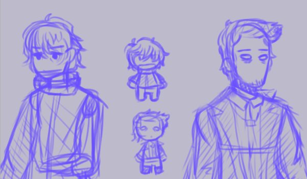
Designing Sprites
When talking about Visual design, I went for a more monotone color scheme showing that he’s unassuming but physically unwell and pale. He appears to take his job seriously through appearance but at the cost of his health which is shown through his mute colours. His character also suffers with intense insomnia, this will be mentioned here and there through subtle dialogue but I wanted to express that through his appearance.
His character, therefore blends into the office environment without standing out too much. His design draws attention to the player with the subtle contrast between the beige environment and the character’s appearance.
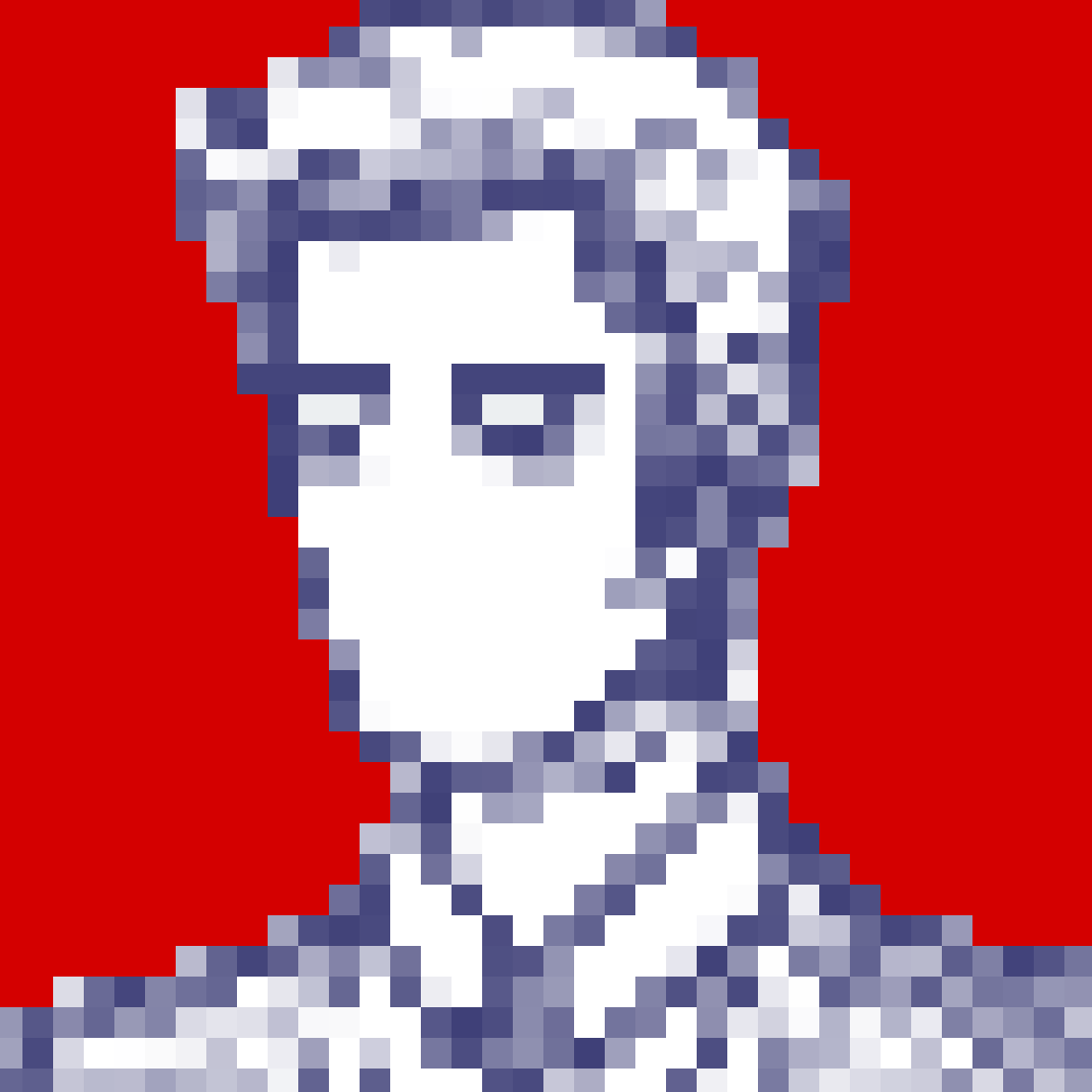
Researching the 16px art style, I was heavily inspired by a psychological horror game with a similar anime style, OMORI. So I looked at Sprite sheets from the game and tried to develop my own style of sheets based off of it. In the end, I was able to create my own style whilst learning about the fundementals of 2D animation and movement.
OMOCAT, LLC (2020). Omori Screenshot (White Space) [Image] Available at: https://store.steampowered.com/app/1150690/OMORI/ [Accessed 15/03/2023].Examples of OMORI art styleFinal Main Character Sprite sheets – I also learnt that 2D animation principles such as squash and stretch and arcs are fundemental in creating fluid movements.
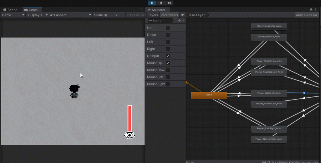
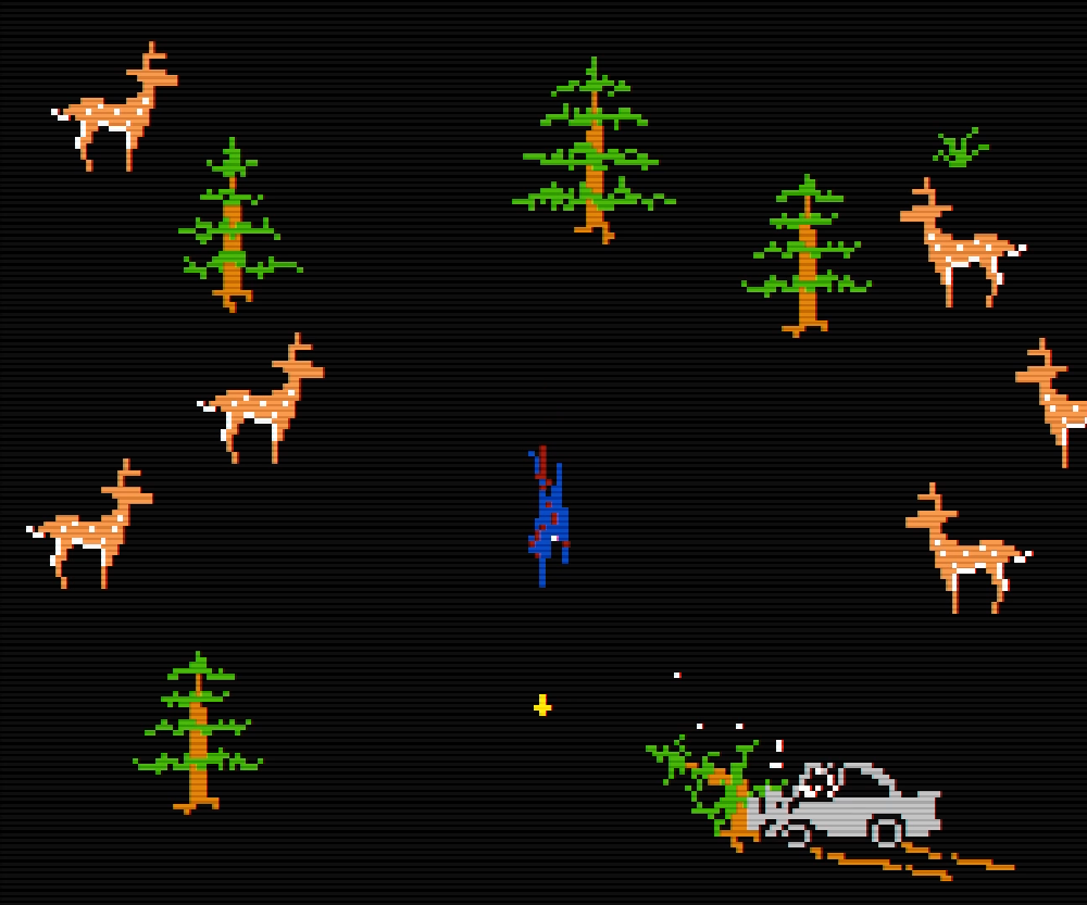
After working on the main character’s sheets, I started working on some placeholder assets for the enemy sprites. Here are a couple of examples as shown here.
Stationary SpritesMoving SpritesExperimentation for enemy movements
By making the placeholders, it allowed our group to see how the enemies could interact. I created two seperate sprites: Those being stationary and moving types.
The stationary sprites were created so our programmer could test the blink and insanity mechanics. To have an insanity component within this mechanic would not only fit the main character’s insomnia but it would also increase the difficulty by forcing players to pay attention to their eyesight and damage they take during the game. The moving types, however, help experiment how we’d want to tackle to art style as well as the movement speed for enemies.
These mechanics are directly inspired by FAITH’s narrative structure. In that game, there are subtle details that debate whether or not the events of the game were real or hallucinations plaguing the player’s mind. Whilst this wasn’t an active mechanic in FAITH, it presented an perfect opportunity to draw inspiration from.
This also meant, in development, I would need to create a new system when designing the enemies.
This will be next week’s task as after making the character and placeholder sprites, I was able to learn how to learn the fundemantals of spritework as well as the basics of simple 2D animation within pixel art and video games.
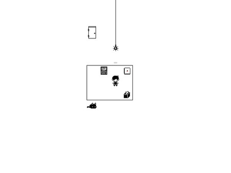
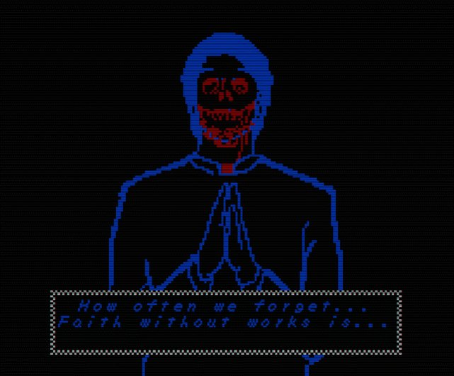
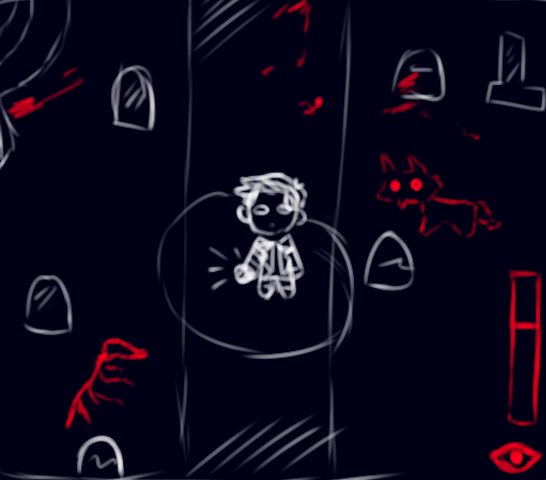
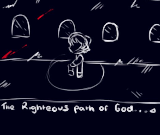
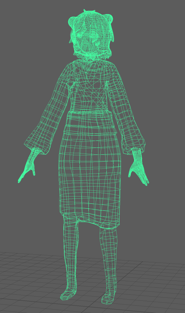
For our final project, we decided to create the game “BLINK”, a simple horror survival game about trying to escape the workplace and the monsters that reside in it. The monsters, in this case, were once human, created by the screens in the office place. As the title suggests, the only way to avoid these creatures is to resist blinking, however, by not blinking, your sanity dwindles so the player must balance this mechanic in order to survive. This game was intended to be 2D as our biggest strength, especially as my art could only be translated in that particular medium. This meant that we weren’t restricted by limited knowledge as we were most confident with 2D styled games.
During this introductory week, we were mainly setting up plans for the project and through this process we would be able to further solidify our roles in developing the game. This was also the perfect time to further discuss and expand the world we had created for our game through compiling all the concept pieces made before the projects development.
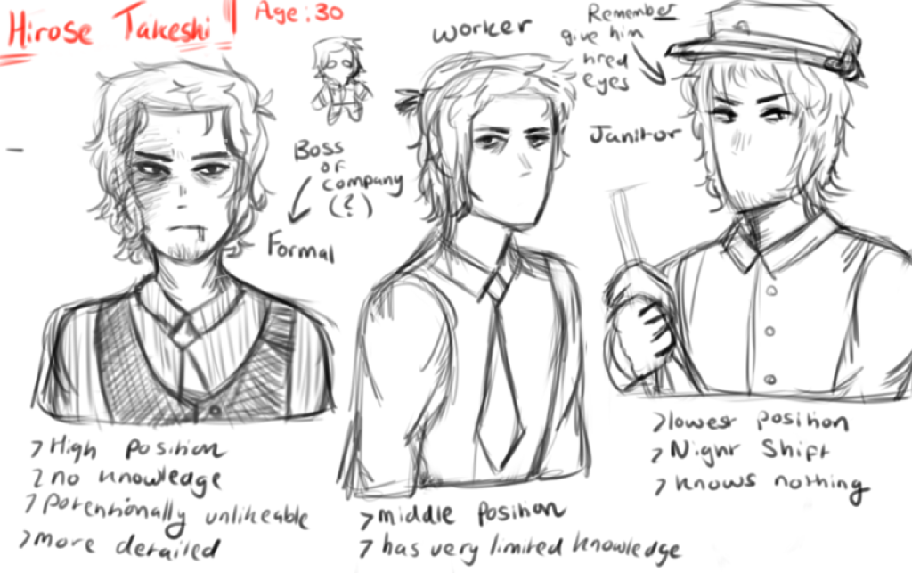
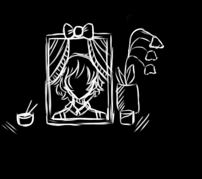
Character Concept as well as Monster concept artCharacter Concept art
Our team, upon feedback, also combined two concept ideas (those being the BLINK and TV concepts) as those prototypes not only fit the fundamental premise of the project but also allowed me to explore different design options, especially when it came to the monsters and the game’s setting.
These core ideas were the main focus of this week’s tasks for my role as well as combining two ideas together, compiling relevant concept pieces and deciding on an art style that would not only fit the world but would allow both me and Damien, our level designer to both work unanimously without switching art styles.
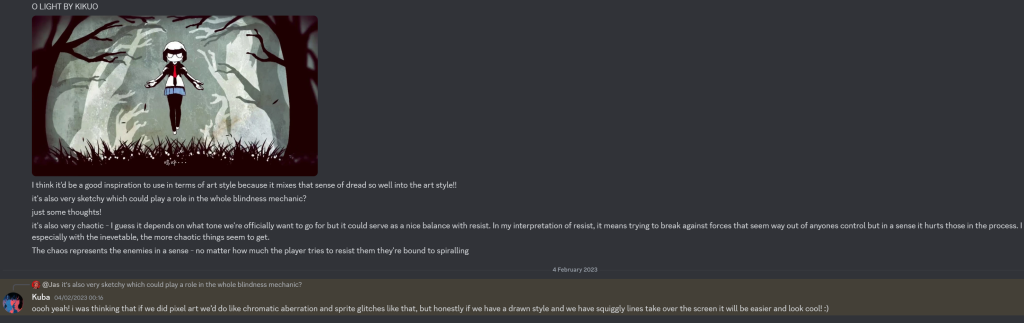
This particular issue, would be resolved by researching pixel horror, a niche genre that perfectly works for a small team. To start off with, I looked into two of my biggest art inspirations in the RPG genre, Omori and Mad Father.
OMOCAT, LLC (2020). Omori Screenshot (Dream World) [Image] Available at: https://store.steampowered.com/app/1150690/OMORI/ [Accessed 15/03/2023].sen (2016). Mad Father (Screenshot of Father) [Image] Available at: https://store.steampowered.com/app/483980/Mad_Father/ [Accessed 15/03/2023]Discussing a potential art style we could go for in our game. In a meeting we debated whether this would be difficult to replicate especially for two artists. Kikuo (2016). Thumbnail for Kikuo’s song, O Light [Image] Available at: https://www.youtube.com/watch?v=AxhZgT_Hx2I [Accessed on: 11/03/2023]
Whilst these games have two different art styles and tone, their pixel styles hold a simplistic yet personalized look similar to gameboy games. In the end, both me and Damien had decided to go for a style akin to Omori. This is because, whilst Mad father’s sprites look more detailed, we wanted to stay consistent with the game’s planned simplicity. This would also make the planned character sprites fit better with the level design. So now, with the character and detailed art, the style will be 16px based.
Planning our Development
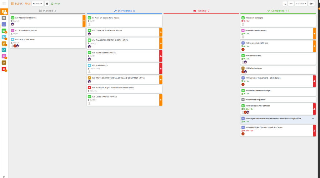
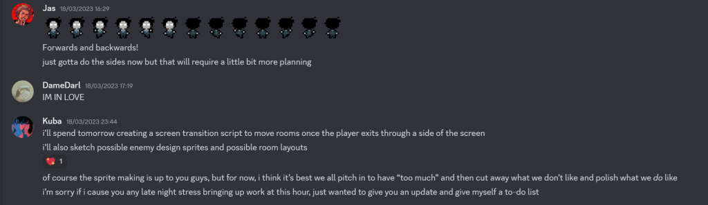
As mentioned prior, every week, as a team, we would write up our tasks in the Hack N plan and work through the specific tasks until the next week. Because we’re a small group, whilst the roles were set in stone, other team members could help with the development of other assets in case of delay. Our team would also regularly communicate in discord for advice or feedback:
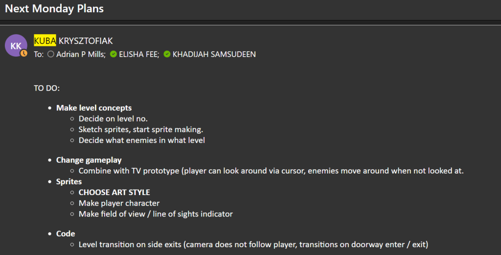
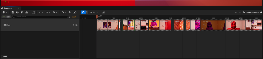
These are a couple of examples of screenshots for our tasks for this week:
Compiling Monster Art
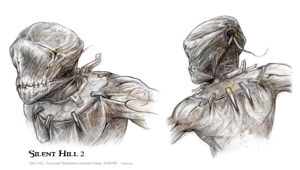
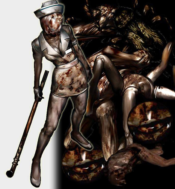
As the concept artist, I wanted to explore different ideas and scenarios that would suit the horror genre best. So in the beginning of the project, I created concept art inspired heavily by games such as Silent Hill and Resident Evil – these games also focused on the more survival and physiological aspects of their designs and settings. These inspirations also heavily contributed to my work as an concept artist as a lot of the monsters from said games have an uncanny, humanoid look which I tried to illustrate here.
Two Clown Noses (2022) Bee and Puppycat: Lazy In Space, Season 1, Episode 12. Directed by Hisaya Takabayashi. Written by Jack Pendarvis [TV Programme]. Netflix. September 06, 2022.
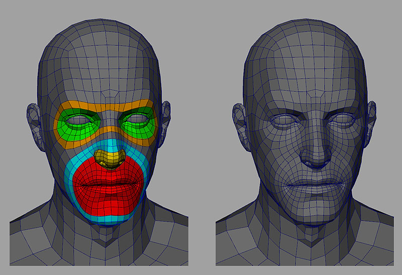
Academic Phoenix Plus (2019). Rigging for Beginners: Face Expressions/Blend Shapes in Maya. [Video] Available at: https://www.youtube.com/watch?v=2Ce-spSV0r8 [Accessed 17/02/2023].
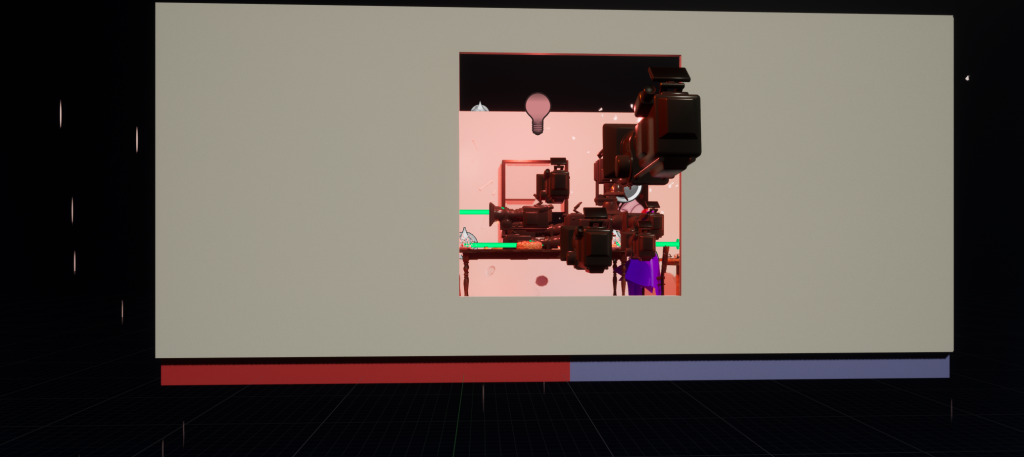
Along with the VFX, creating the sequence took the most amount of time to do in Unreal Engine 5. Despite this however, using the master sequencer and setting up the cameras for the different shots were fairly easy to do.
The most engaging part of this area was creating dynamic shots since I learnt very quickly that dynamic shots aren’t confined to movement.
Using Keyframes to move the camerasUsing the focal length and movement keyframes in order for the object to be in focus by the end of the shot.
They could also mean changing the focal length in order for a particular item to become more visible. It’s a more subtle change but it helps compliment the song’s melancholic pace. This was also a great opportunity to utilise the space using wide camera shots were the best to use in terms of making the characters feel as if they’re in their own space despite being in the same room.
Lots of cameras were used during the sequencing process
Saying this, however, timing these shots in line with the music was the hardest part of the project as it’d take multiple tries in order for a single shot to move with the song seamlessly. Looking back, whilst it would’ve been easier to focus on timing in adobe premiere, there would’ve also been a risk of not having enough footage for the music video. So whilst it took a large portion of time, it was still safer to line up the shots in time with the music in Unreal rather than primarily using editing software.
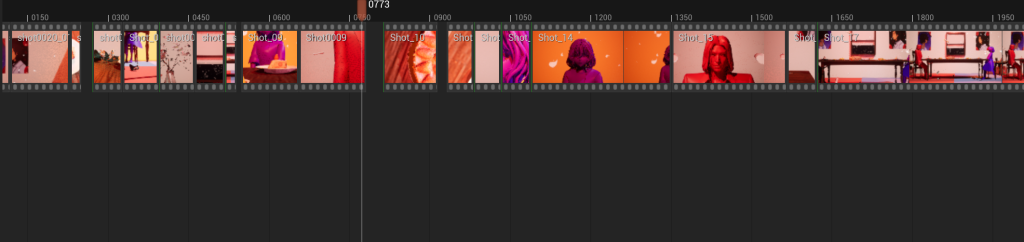
These are all the shots edited down before exporting to Adobe using the master sequencer in Unreal
Post Processing
Once I finished the basic sequence in Unreal, I was able to tweak and cut down the unedited footage using Adobe After Effects. There are 3 separate types of the same sequence that were exported due to each version having different VFX and character poses. This also allowed me to point out any potential errors within each version that weren’t initially visible when working on the sequence.
Lyric Layers in After Effects – similar to timing the sequence in unreal – I had to sync up the lyrics to the music.Emphasising contrast with black lyrics in the first half and white lyrics in the second half to introduce a shift in tone.
Whilst editing the footage, I added in the lyrics to make the video authentic to the genres it’s based off of as a lot of the example MV’s from the Vocaloid community often contain lyrics for the audience to follow along with the song, deciphering their own interpretations on what the song was trying to convey.
This is the point, where I decided to mix 2D and 3D visuals into the video together. Not only did it fix the problem of the lack of animation and facial expressions for the main character but it helped add subtle, visual details for the audience when interpretating the narrative.
2D animation frames used in After Effects
2D frames that were used in the music video during cuts.
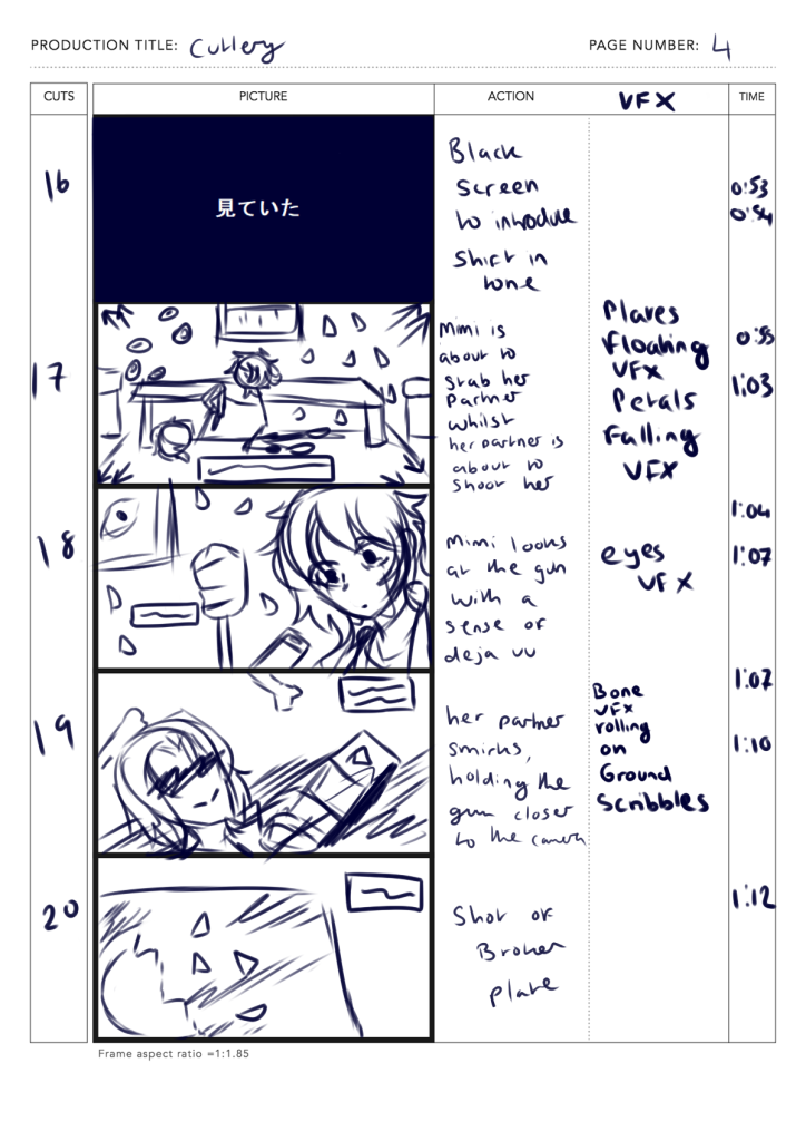
These 2D visuals really helped flesh out the story and make the main character look more human, whilst her partner looks lifeless which creates a great contrast between the two personalities. To make the 2D visuals, I drew them out using Paint Tool SAI and exported them into Premiere during the editing process.
Tracking the animation for this pan wide shot felt a bit choppy and in the future, I’d like to learn more about how to properly track animations without having to rely on editing each keyframe.
Conclusion
In summary, the project was an overall enrichening opportunity to explore different techniques and artistic approaches when it came to designing and making the music video. The most interesting learning experience came from the film making side of the project as it allowed me to explore different techniques and compositions when filming all the scenes. Combining the 3D and 2D mediums was also an enlightening experiment that surprisingly worked well as they didn’t clash too much – instead in an artistic context, they were able to complement each other in story telling whilst making the video more lively and engaging. The VFX, whilst I struggled on for a bit, also helped me to understand how to make artistic effects as well as helping me compromise in design decisions that couldn’t be implemented in a stylised environment.
To improve the video in the future, I want to create the full sequence rather than only focusing on that particular part of the song. This way, the video would be able to provide more context whilst also allowing the song to flow a lot better. Whilst it may not suit the tone of this particular project, in future MV, I’d like to explore more complex VFX as I’ve gained confidence by learning and implementing simpler effects.
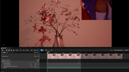
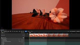
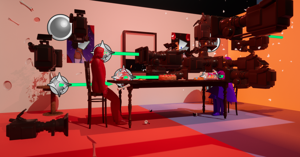
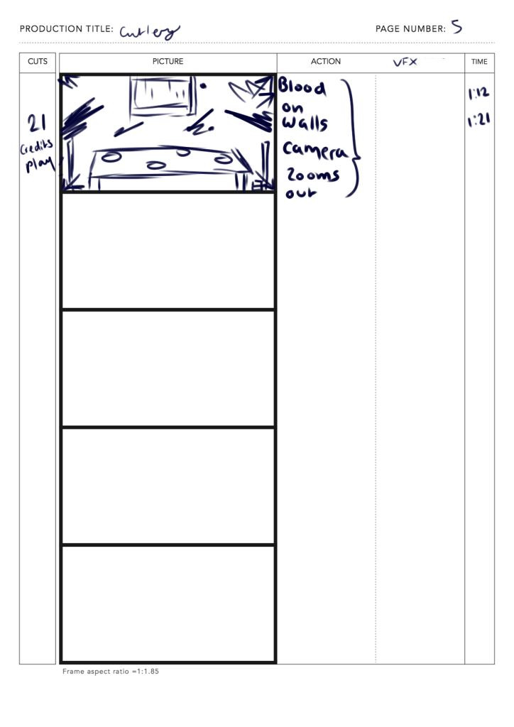
Small details such as tweaking the duration of certain focus scenes (e.g flowers in vase shot) so they’re in full focus, adjusting certain asset errors such as the floating dining table or the flying cutlery or editing the chairs so that they fit with the room’s symmetry are also minor changes that I’d like to implement in the near future.
For now, in conclusion, the music video was an overall enjoyable and interesting experience to make and It has given me the inspiration and confidence to make similar projects henceforward.
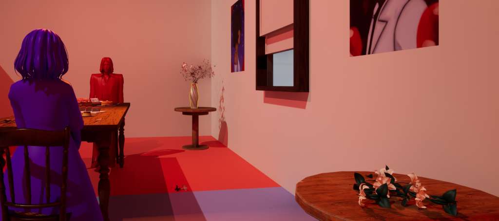
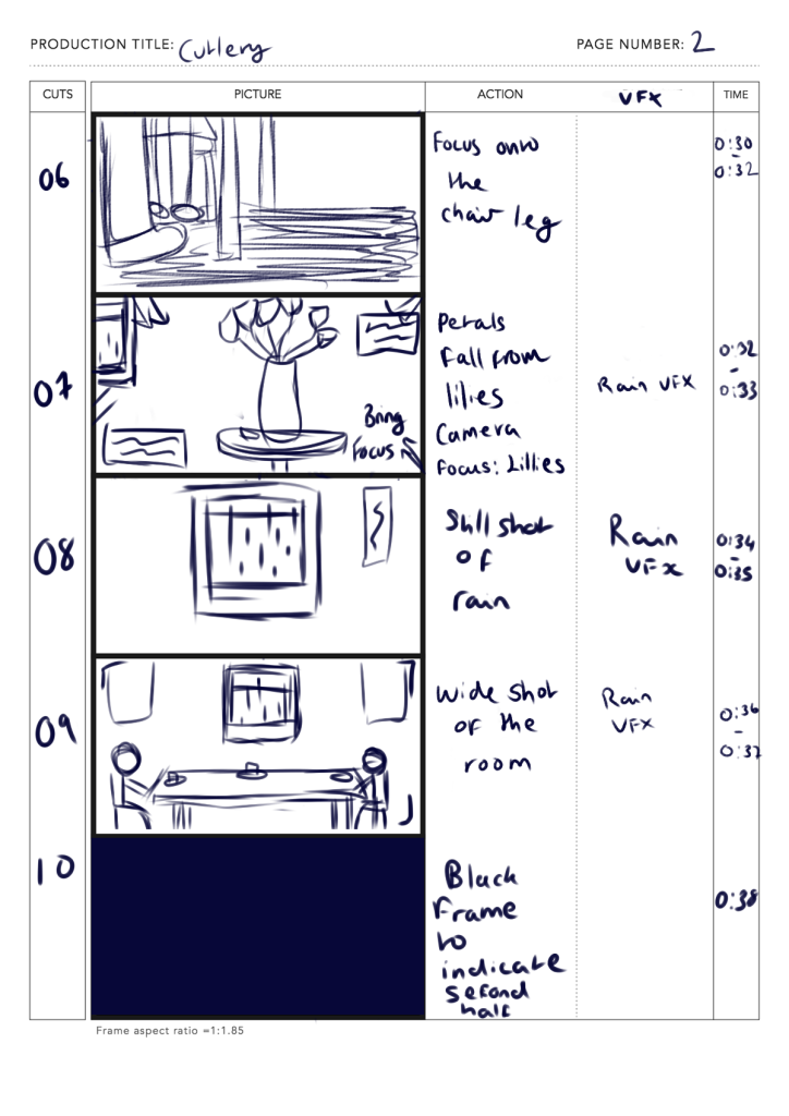
Since the MV was going to take an artistic approach, I decided to try and see if I could keep the sequence limited to one set piece, keeping the idea simple whilst being able to try out different props and compositions for the scene. By setting up the scene in unreal engine, it becomes a great opportunity to see which shots need to be tweaked or overall scrapped, much like the first storyboard.
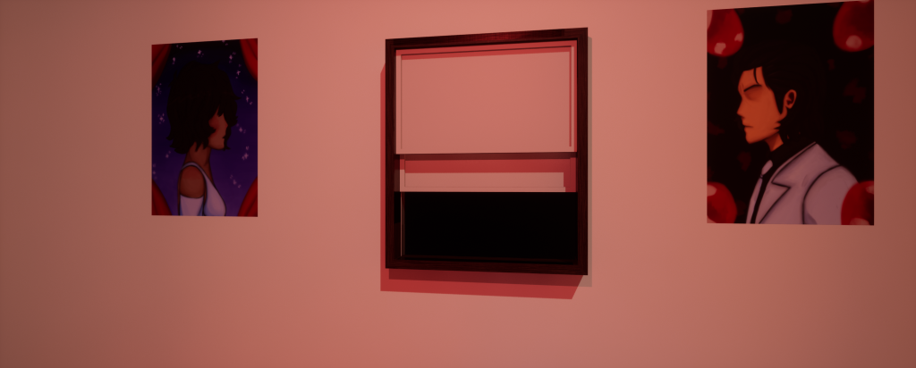
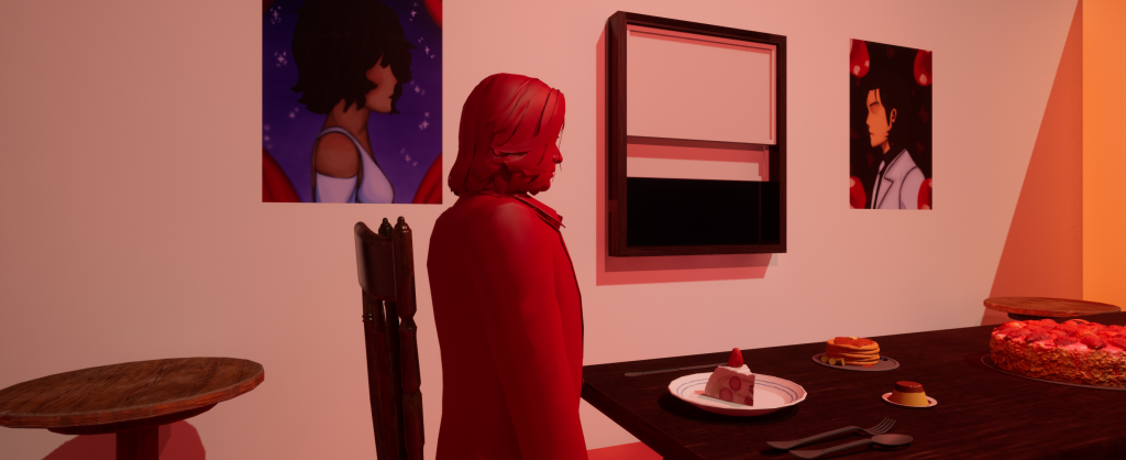
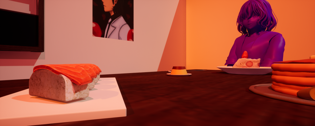
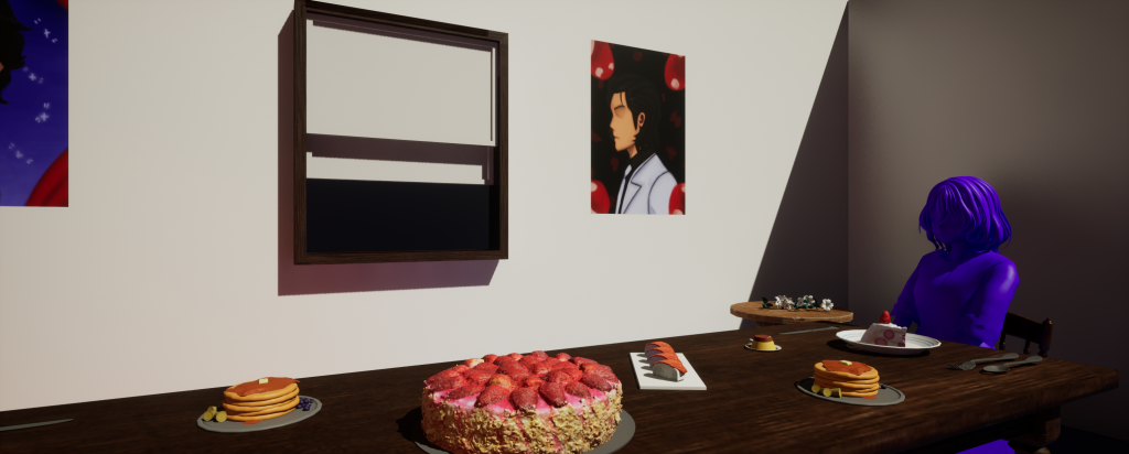
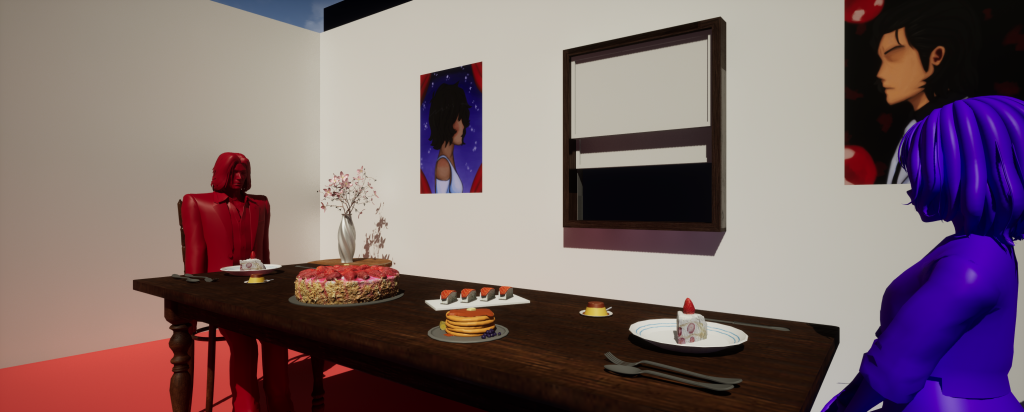
Beginning stages of designing the composition – later on the table was adjusted to line up with the window. Realised, however, that there’d be trouble with the character heights when the models were sitting down so I adjusted the chair heights.Added decals to the scene – these are portraits to visually represent the characters seperation. Looking back however, these would’ve been better visually shown with picture frames.Added some more food onto the table to add variety to the table. Used the animation blueprint to pose them sitting down.
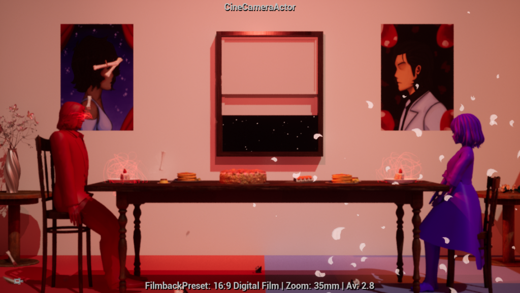
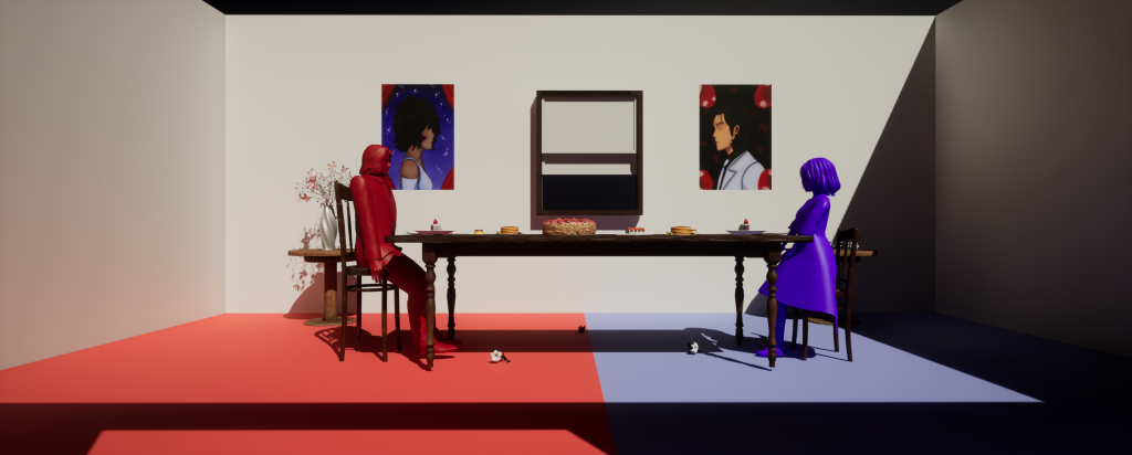
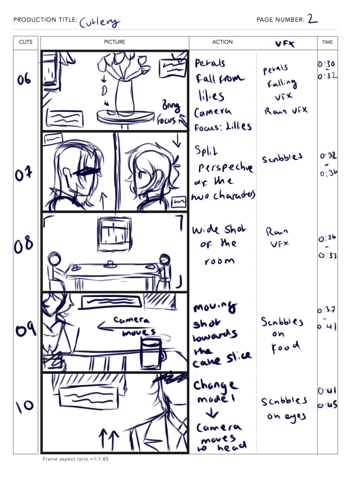
In the second storyboard, the MV would take place between two separate spaces. However, using the room’s size, the camera shots were able to create the illusion that the characters were in separate spaces during certain scenes, giving them their own unique space once the second half began. This was achieved by dividing the room into two seperate spaces and adding their own unique pieces to their areas,
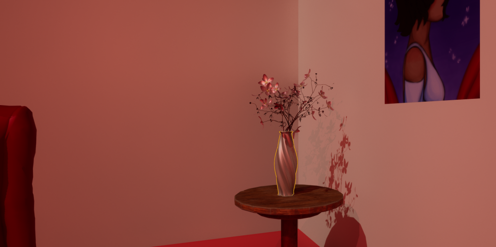
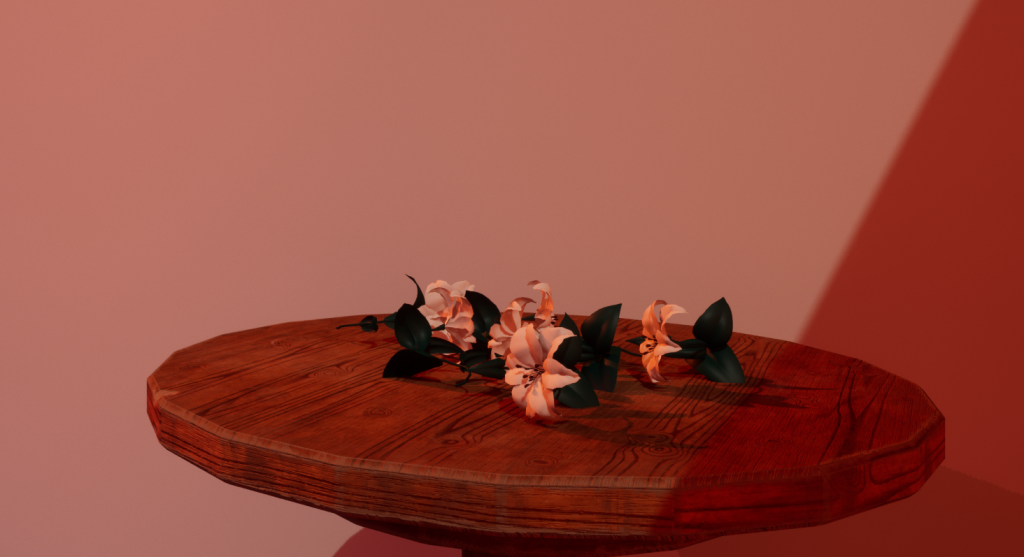
Added more funiture in order to begin making the areas feel unique.Added flower vase to the red side – neatly kept but presented in a darker light visually.Lilies were chosen as they are often used in bouquets for funerals – I also added them onto the ground to create further visual interest to the flowers. It’s composition implies that someone’s placed them there without care. This further creats visual contrast between the two spaces and by extension, the characters.
Initially, there were some concerns with the complexity of the set piece, but when seeing this complex MV take place in only 2 stages (with the majority of visuals being 2D). I wanted to challenge myself by creating an MV with only one set and only using camerawork to create these illusions mentioned prior.
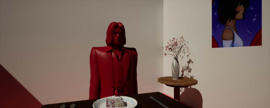
In addition, the visuals of this MV inspired the block colour aesthetic. Originally, the characters were going to be textured normally. However, they did stand out from the set piece too much, especially with the lighting. So instead, I gave them block colour textures in order for them to be the direct focus of the scene whilst also blending in with the aesthetic.
Another example of an MV using blockout colours and simple imagery whilst still bringing the story across
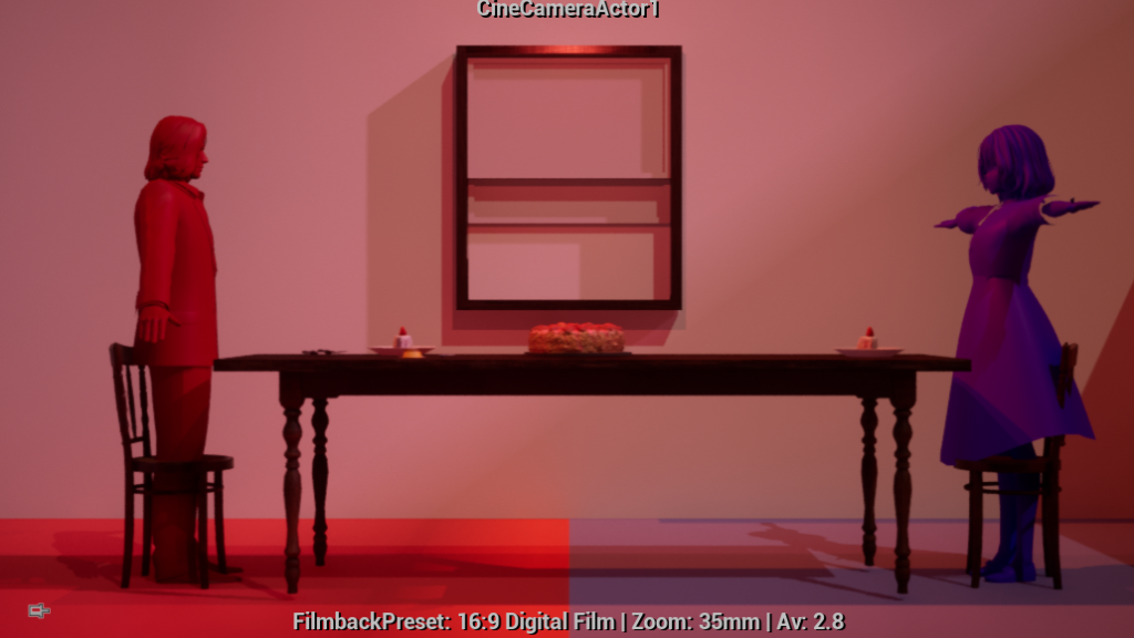
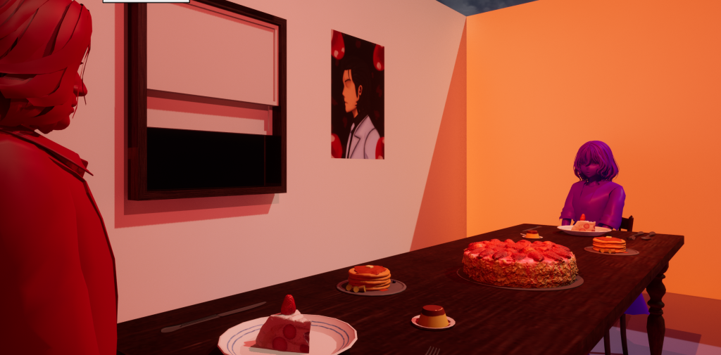
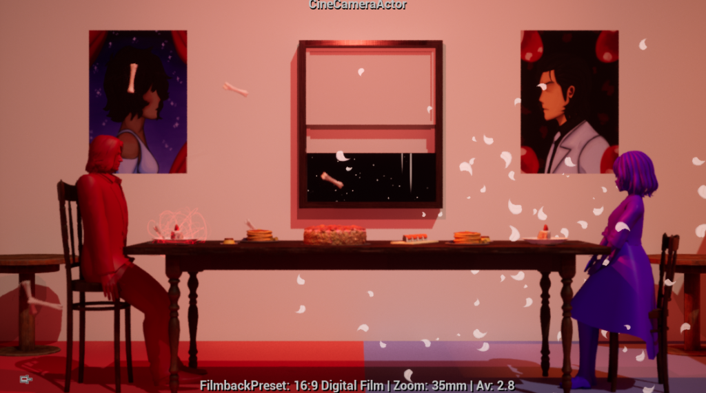
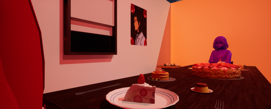
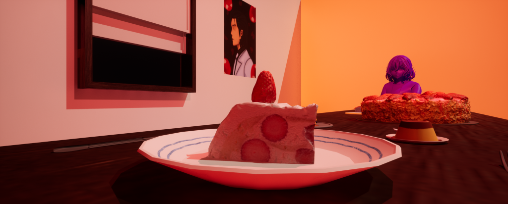
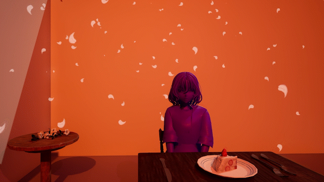
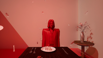
Given the inspiration, when building the composition for the set, the main objective was to make the room both artificial whilst still visually resembling a dining room. To do this I used symmetry composition by using one of the cameras to simulate a wide shot and the flooring as references. This helped me centre the dining table, cake set and window directly in the middle, creating an almost artificial but picturesque feeling to the room. This tone is further emphasised by the perfectly placed food on the table which also becomes part of the main focus. This also tells the audience that something isn’t right visually without directly telling them the reasoning behind it.
I chose these characters because the song fit their relationship that I created in personal pieces before the project began.added additional set pieces to the composition as well as new VFXOutside perspective of how the room was built
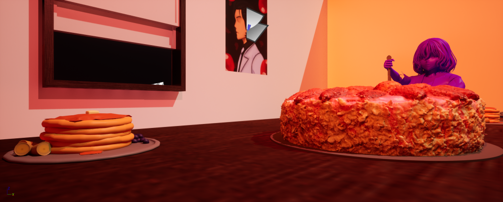
The orange, directional and spotlight lighting creates a warm ambience whilst also making the colours pop. This also helps sell the dining room image despite the set looking unnatural which, in a different interpretation, could make the room feel more ominous.
Example screenshots of the lighting – it helps make the cooler colours stand out whilst emphasising the food’s warmer colours and it’s vibrance.
Without the lighting, the colours and food seem bland and sterile – the composition isn’t as interesting or visually appealing.
With not lights emphasising the colour scheme – it takes away from the artistic angle. For the characters, their colours stand out too much in contrast to the pure white background.
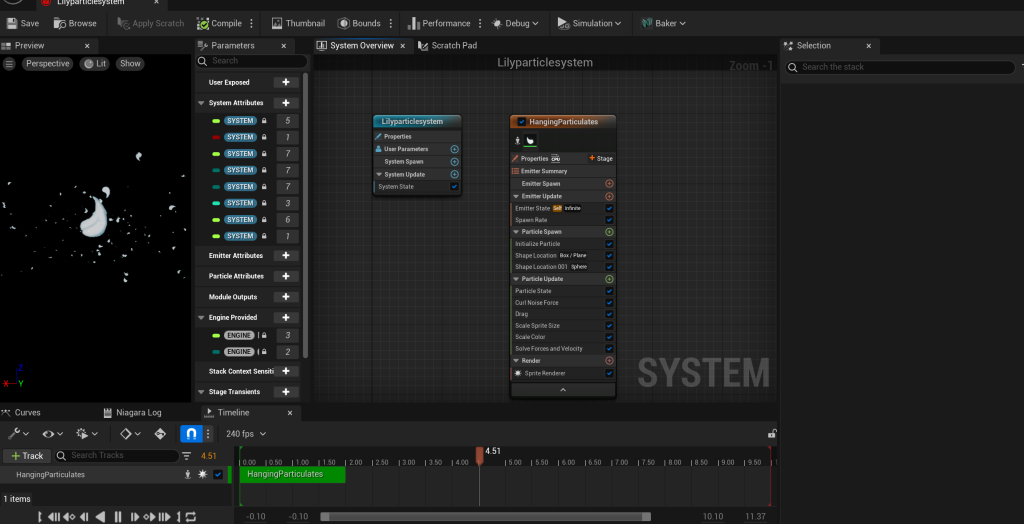
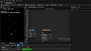
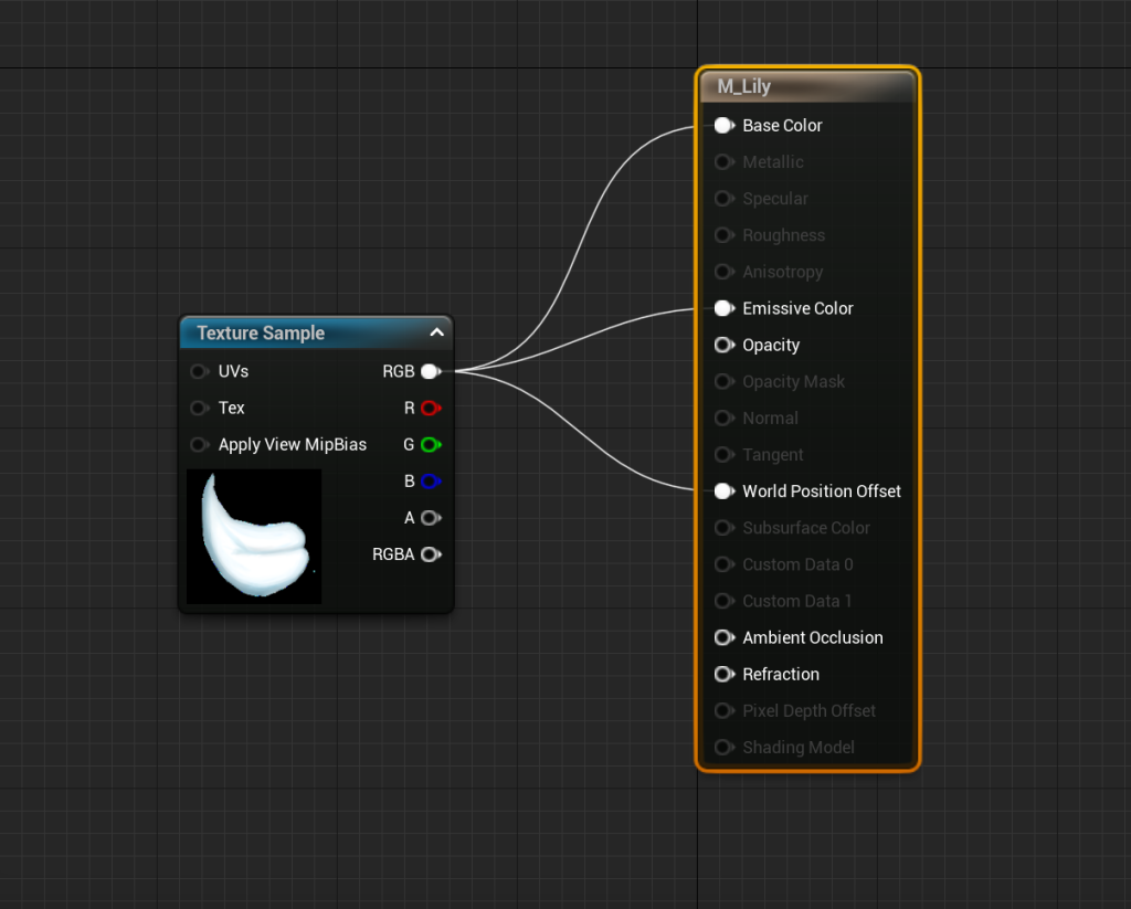
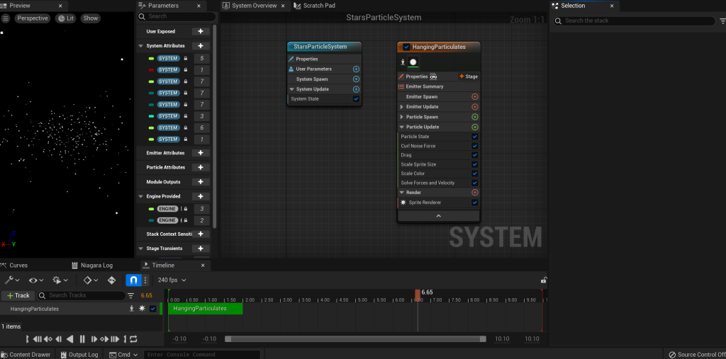
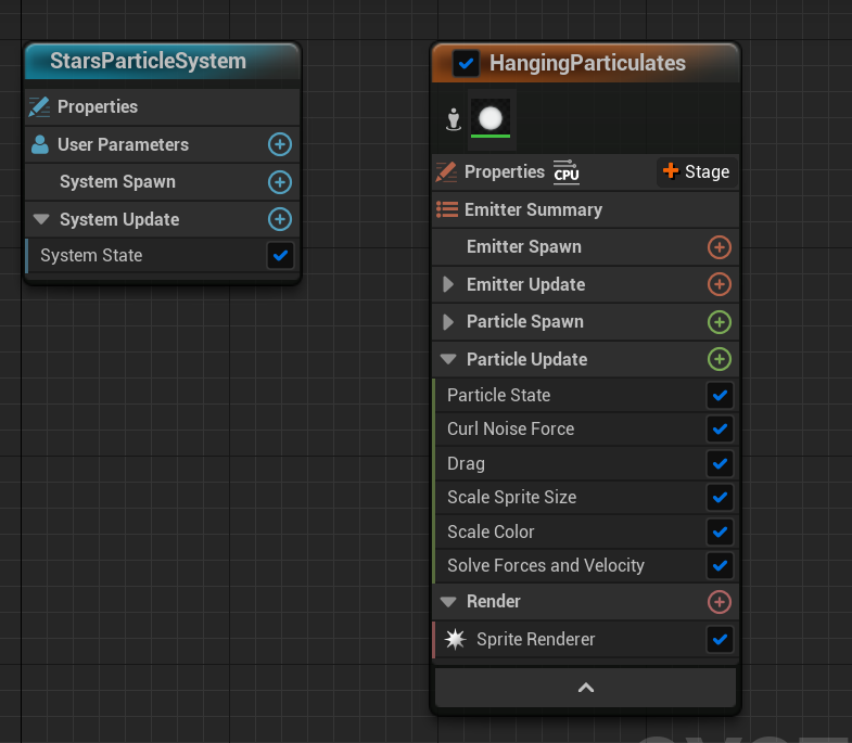
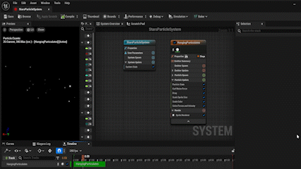
Experimenting with Niagra system – the first effect I created was the lily particle system. For this, I created the particles by using the hanging particles emitter and then changing the sprite texture to hand-drawn lilies petals and adjusting the opacity so the texture became an additive.
Afterwards, I added lighting to the particle system and adjusted the spawn rate so that the lilies didn’t obstruct with any of the obstacles or the character. Whilst it’s still a simple effect, this system helped me to understand the interface of Niagra and the ability to explore the different variables that could be easily adjusted.
Created Hanging particles and changed the sprites into lilies – Created the lilies as a PNG texture
Outdoor VFX
Due to location of the window in the set piece, adding a HDRI map wouldn’t have been suitable for the outside area as it’d be difficult to see. But on the creative side, HDRI maps would’ve directly contrasted with the stylised room so I decided to opt out – instead making a scenery by only using VFX.
This way it’s still stylised but not overtly eyecatching enough to steal away from the main focus of the shot: the characters and the props. Before adding the effects, I added a black backdrop in order for the parrticles to stand out.
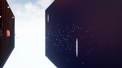
Experimenting Hanging particles with stars
So for the stars, I used the same hanging particle emitter and changed the sprite for a more rounded look as well as raising the spawn and distribution rate in order for the stars to appear more spaced out.
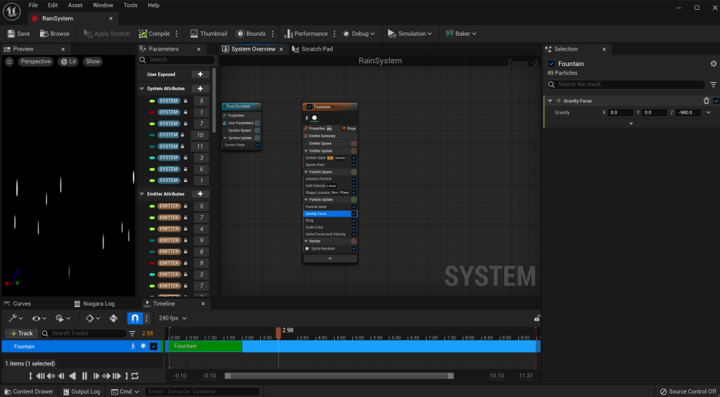
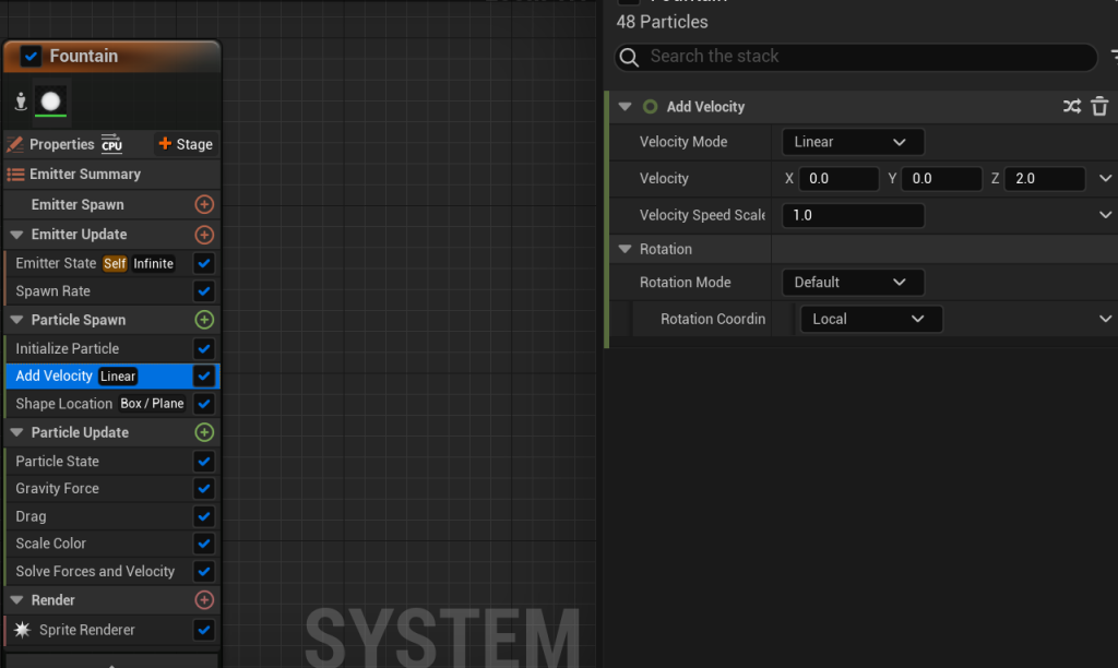
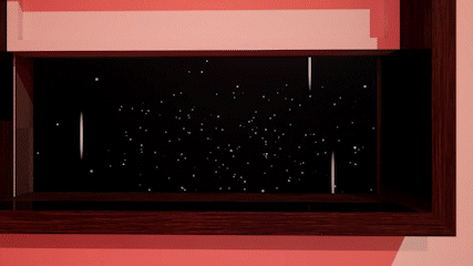
Whilst the rain drops were made using the fountain emitter and to keep particles set in a closed area, I added a box location and stretched out the dimensions of the box in order to keep the particles spread out.
Afterwards, I added a velocity variable which was kept at -1000 in order for the rainfall to be noticed in the shot and finally, I stretched out the sprite size to simulate rain drops.
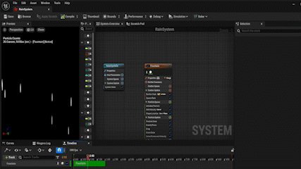
Rain particles are created through fountain emitter – In order for the rain to ‘fall’, the sphere location and cone velocity settings had to be deleted.
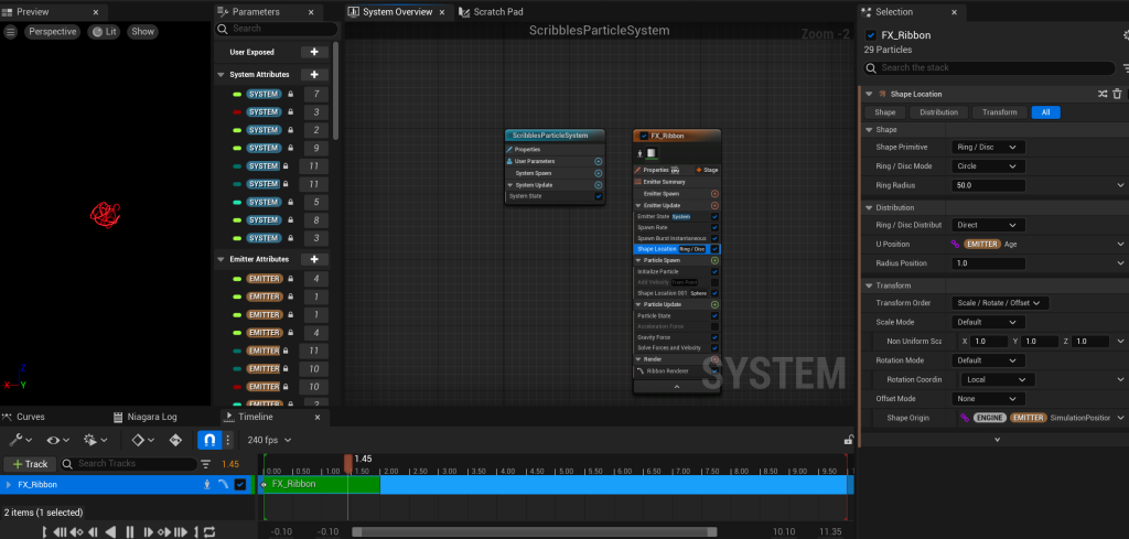
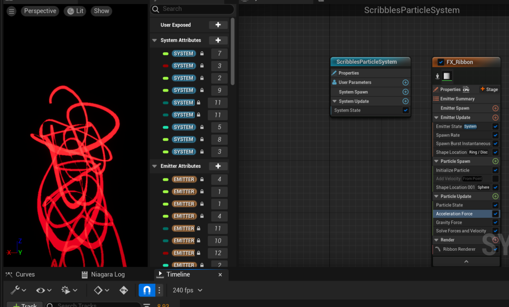
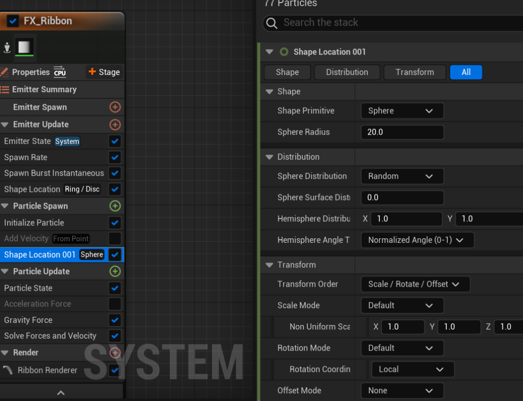
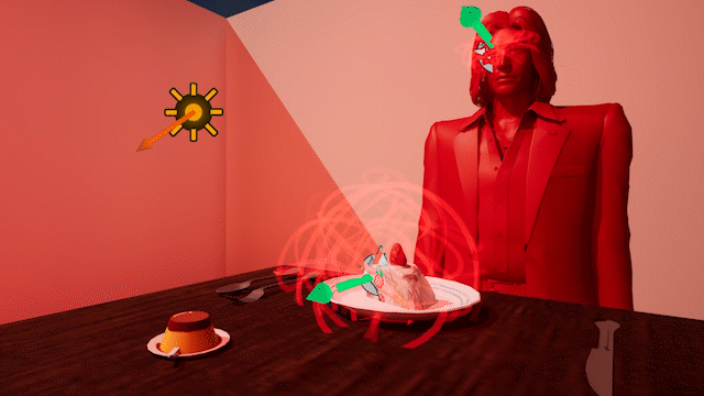
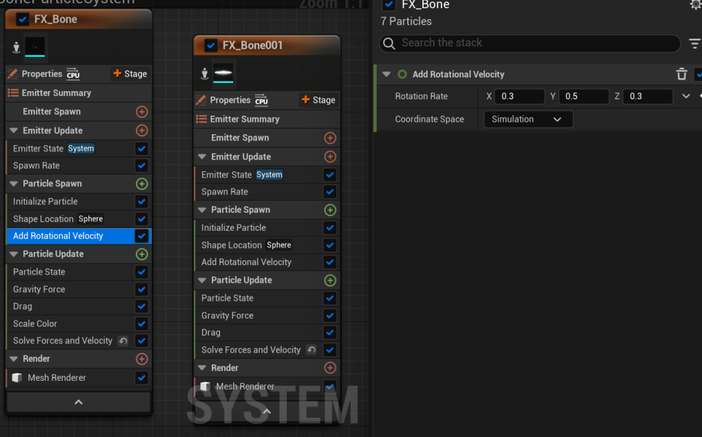
Creating the Ribbon VFX
Whilst this effect was another experimental piece, it still fit the stylised and unnatural tone of the set. It doesn’t have a particular meaning but it helps convey to the audience that the video is based off of the main characters perspective, seeing the food as nothing but scribbles on a plate and later seeing those scribbles on her partner’s face showing her distaste, fitting in with the songs themes of feeling unsatisfied in a relationship.
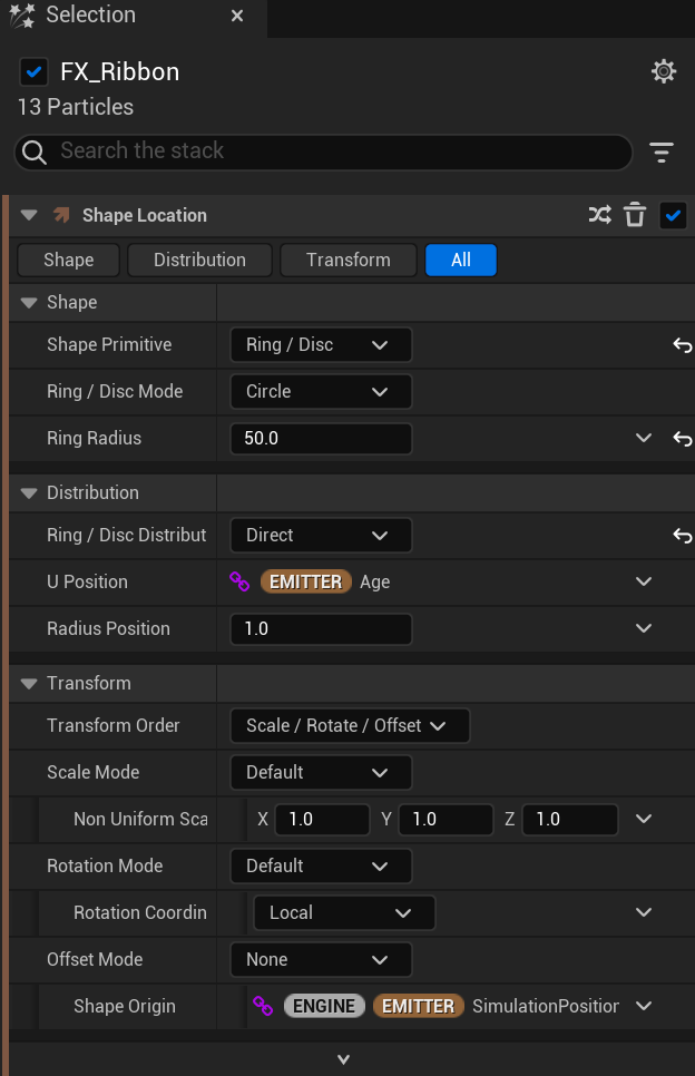
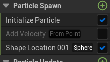
Acceleration Force usage example – in the end I took out this feature in order to keep the scribbles contained Added shape Location Sphere to make the scribbles contained and disabled velocity so the scribbles were randomEdited the scale so the spirals could fit on the plate and Nishiki’s eyes.
Originally, I wanted to use the ribbon system to create an effect with lyrics spiraling around the main character. However, after exploring the settings and being unable to format the lyrics into the spiral I decided to create the scribbles instead.
To create this, I started off with a simple sprite burst emitter, changing the sprite renderer into a ribbon one, switching the sprite renderer into a ribbon one. Then after changing the life cycle to “self”, increasing the spawn rate to 100 and changing the shape location to torus and it’s distribution to random, it became a tangled mess of light. I was then able to place it on the food and later on the second character’s face.
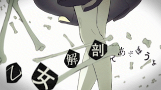
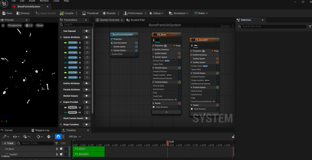
Bones and Plates VFX
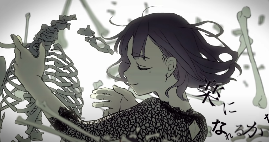
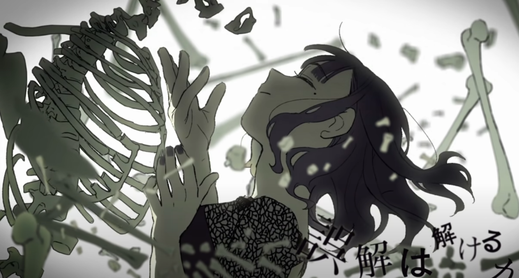
The final effect I added into the scene was a mesh particle effect featuring bones and plates, these effects mainly serve as a homage to the music videos that inspired this project’s creation as the imagery simply represents death, further implying that she sees her partner as the cause for their relationship failing (and also because in the story he accidentally kills her.).
Visual Inspiration for VFX – Otome Dissection MVVisual Inspiration for VFX – Otome Dissection MVSystem layout for Mesh VFX
In aid for the making of this system, I used the mesh particle tutorial from the Unreal Engine 5 Documentation. Similarly to how I created the rain, I started off by using the fountain template emitter. Then I changed the sprite renderer to the mesh renderer and added the bones asset to the particle mesh section.
Afterwards, to make the movement of the bones more dynamic, I edited the rotation velocity in order for the bones to move in random directions. Finally, since I wanted to add multiple meshes to the system, I copied the effects settings as a template for the plates and adjusted the spawn rates for the two particles.
For this project, I wanted to create a 3D music video using Unreal Engine 5 and Adobe Premiere. By creating a music video, there’s opportunities to experiment with different shots, composition methods and vfx. Another interesting aspect I wanted to explore was the editing and post production aspect as editing and creating a seamless story would become a large and vital portion of the video itself.
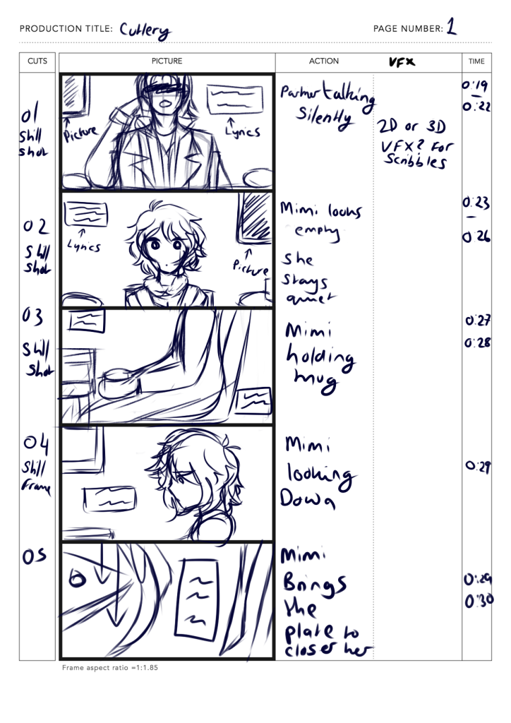
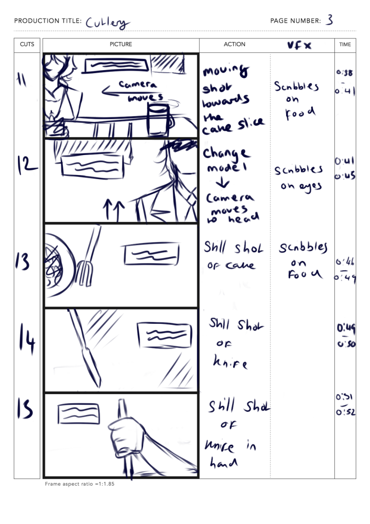
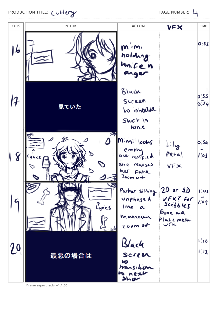
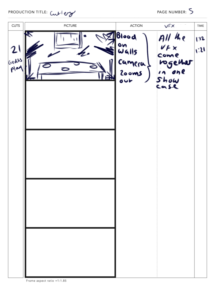
The song chosen for this piece is called Cutlery, A Japanese Vocaloid song created by ewe which talks about the anxieties and struggles of a one sided relationship. The music video made for the song is presented in 2D and is a generally slow paced which emulates the melancholic tone of the music’s tune. The song is also accompanied with strange but symbolic imagery which fits the character’s relationship falling apart throughout the video.
Whilst 60 seconds could only provide a snippet of the song’s full story, by snipping out the second half and just focusing on the initial buildup and main chorus, the song’s narrative remained uninterrupted. With this project, the main goal is to create a different story whilst still maintaining the song’s themes. So the plan started off with creating a rough storyboard to have a better understanding of the story and the song’s beat.
The story logline created for this music video is as follows:
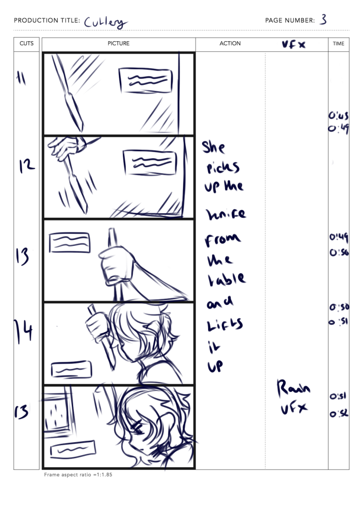
The main character is stuck in purgatory. She has recently been accidentally shot by her husband and now must spend the rest of her time with the same man she hates in a confined space that vaguely resembles their dining room.
Storyboard Planning
In order for the MV to follow the rhythm, The storyboard generally has a lot of cuts with static or moving shots. The combination of both creates a diverse sequence that keeps the audience engaged. On the other hand, this also allows to exploration in compositional shots.
The first storyboard relied on a lot of poses and facial animation – ontop of this, the story was more obvious, leaving out that sense of mystery.
When finding inspiration, I also used examples from existing 3DMV’s of the same genre.
An example of a music video using quick movement shots to simulate the song’s intense tone and beat. This is also one of the main inspirations for adding lyrics to the music video during the editing process later on.
Whereas, these two are much slow paced – using visual clues to show the song’s seperate story, fitting into the music’s themes. I want to replicate these elements when creating this project.
Cowardly Mont Blanc is also one of my biggest inspirations when making the video as the song follows a similar storyline and motif.This scene, in particular, inspired one of the shots in the storyboard.
The original idea was to have the MV solely be 3D with stop motion animation to accompany the slow and melancholic pace of the song. But when exploring Unreal’s animation editor – there was a realisation that rigging different poses for each frame would become time consuming very quickly. Looking back at the examples, The use of camera work in these videos create a fluid and dynamic feel, making the compositions and storytelling feel a lot more engaging with the audience, even with the songs aren’t as upbeat or fast paced.
To counteract the rigging issue, the storyboard was changed to instead focus on the camera shots to simulate that same dynamic movement shown in the examples whilst still maintaining that slow and choppy pace.
This is the second storyboard made. Some scenes were changed to better rely on camera shots and movement.
To make up for the lack of animation, especially in the characters facial expressions, I decided to mix the 2D and 3D genres together by adding hand drawn frames later on in the post production part of the workflow.
Finally, I made the storyboard frames into an animatic – this process further helps visualise what the music video would look like, especially during the editing process.
VFX planning
For the VFX, I created a list along with the storyboard. I saved the more elaborate ones for the second half of the video.
By having a list, I was also able to discover and learn a variety of different techniques for implementing these effects. This also helps to plan out which VFX to implement throughout the project based on how complex they were. Looking back in retrospective, A lot of time in the project was taken up from learning about Unreal’s Niagra system interface and experimenting different VFX emitters.
Nevertheless, using Niagra has been an enlightening experience as it opened up a lot of room for experimentation. With the storyboard, I was also able to sketch out what some of the effects could’ve possibly looked like. These effects were also inspired by other 2DMVs of the same genre. This is focused more in the VFX blogpost.
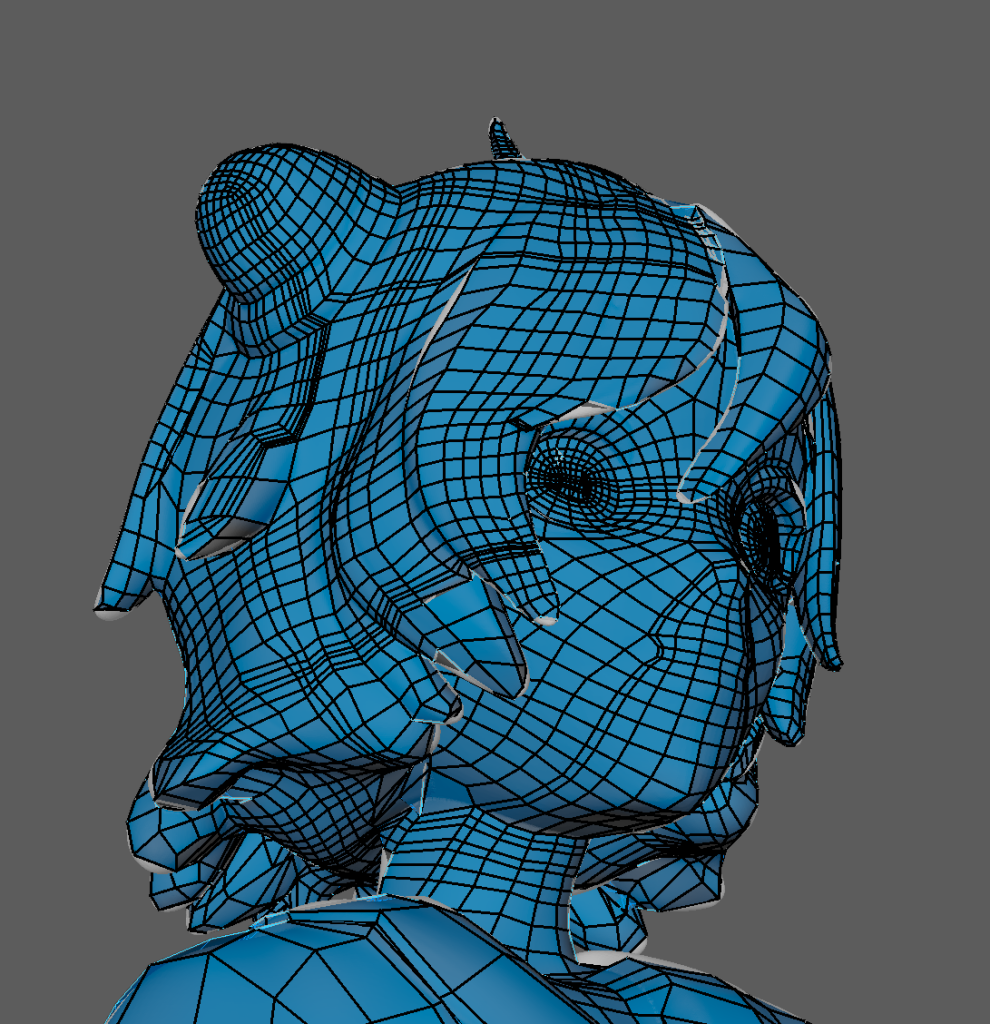
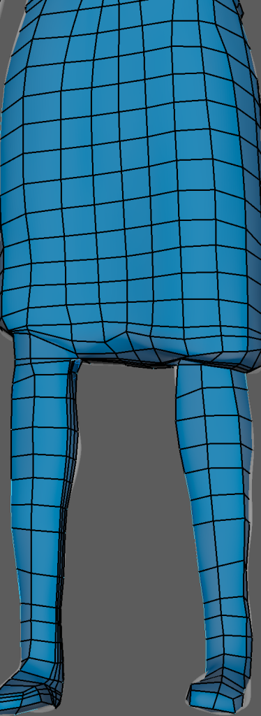
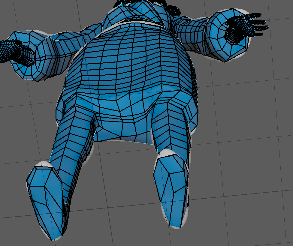
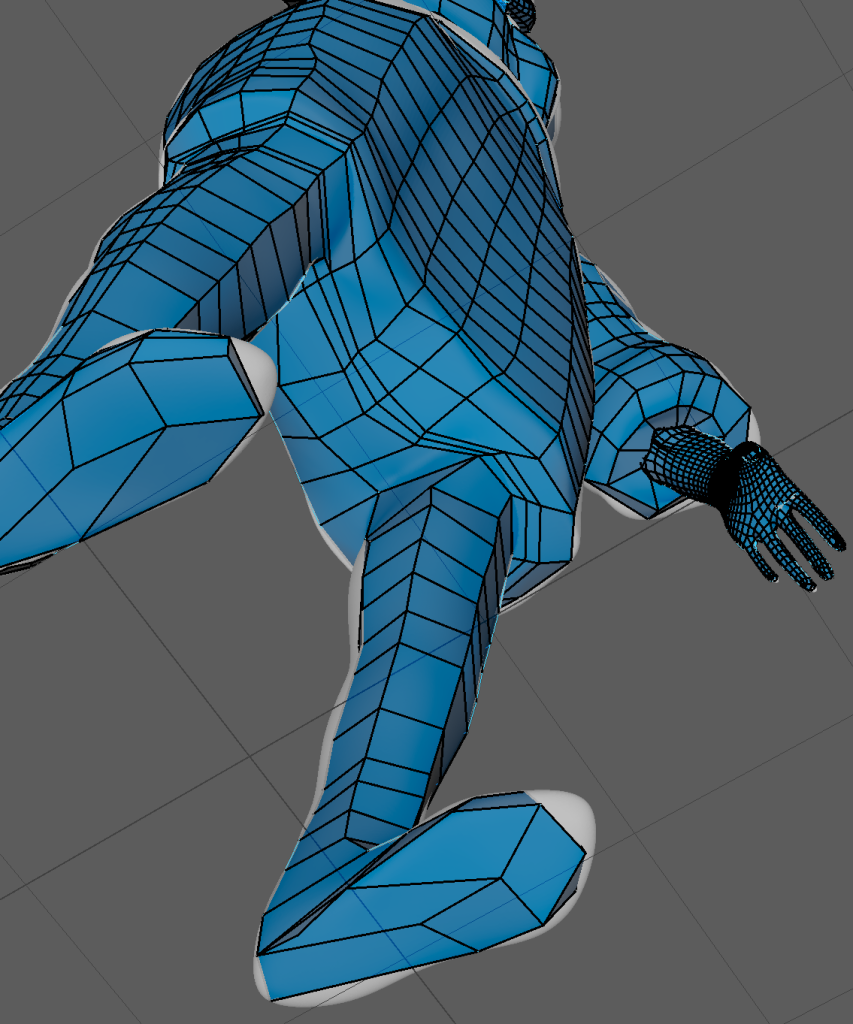
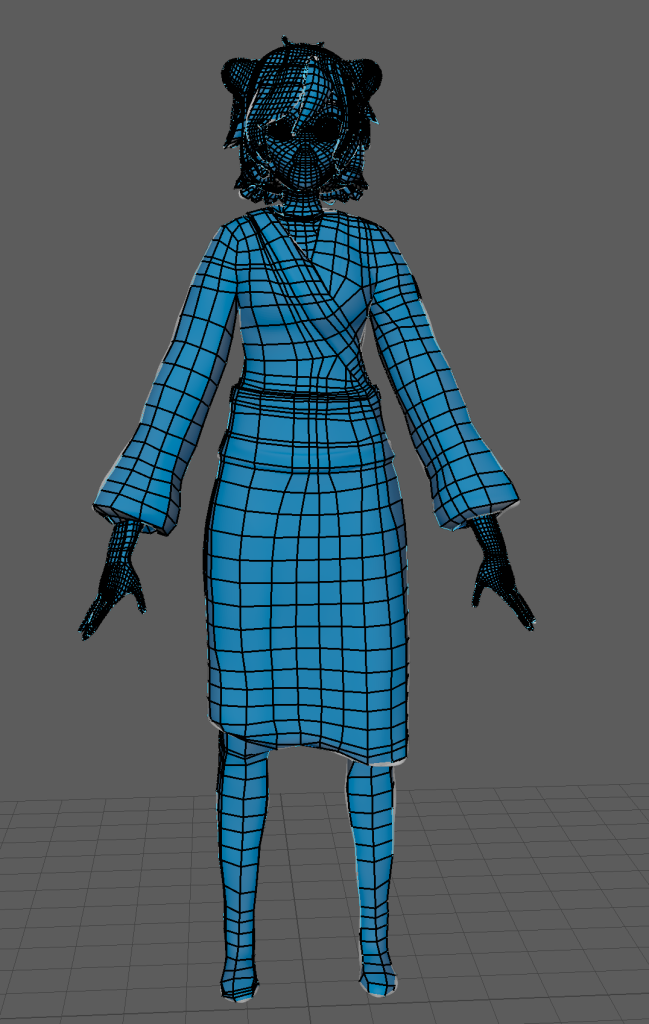
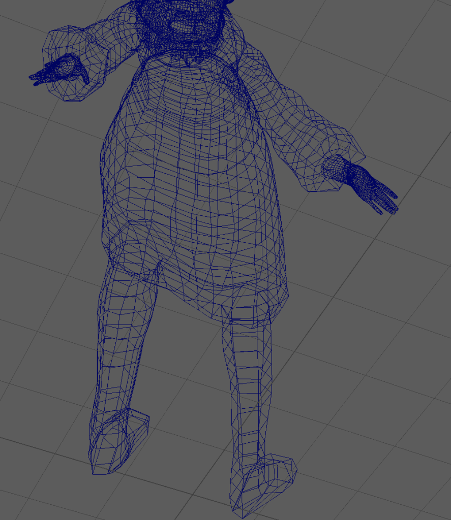
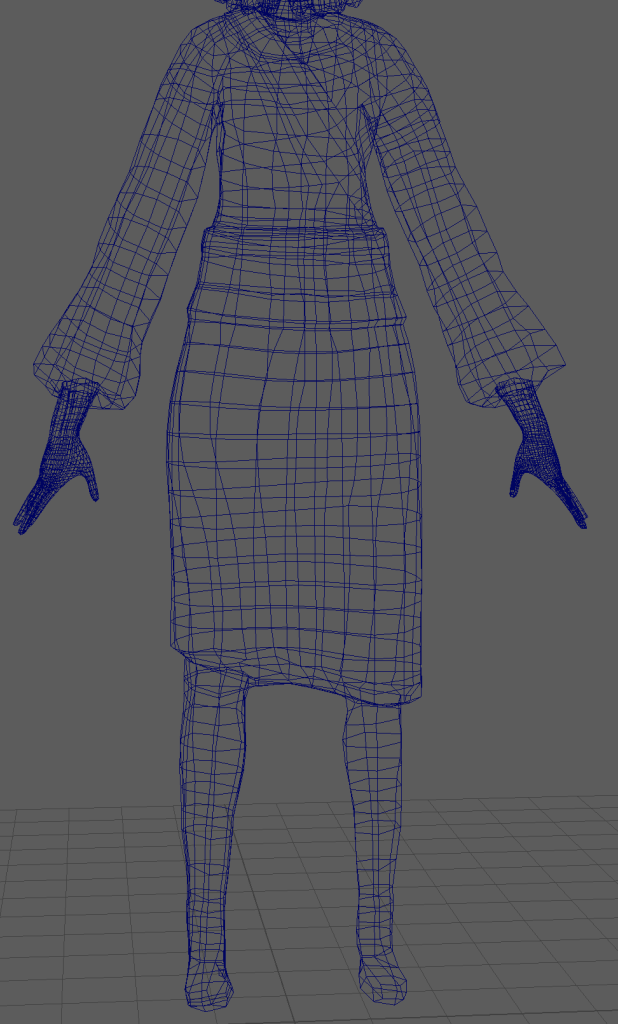
The longest part in this project was forming the retapology in Maya. This part of the workflow consisted of trial and error as the process would require experiencing several learning curves. By doing Retapology, as mentioned prior, not only does this create a “game ready” model but it also allows the model to be UV unwrapped and later on textured.
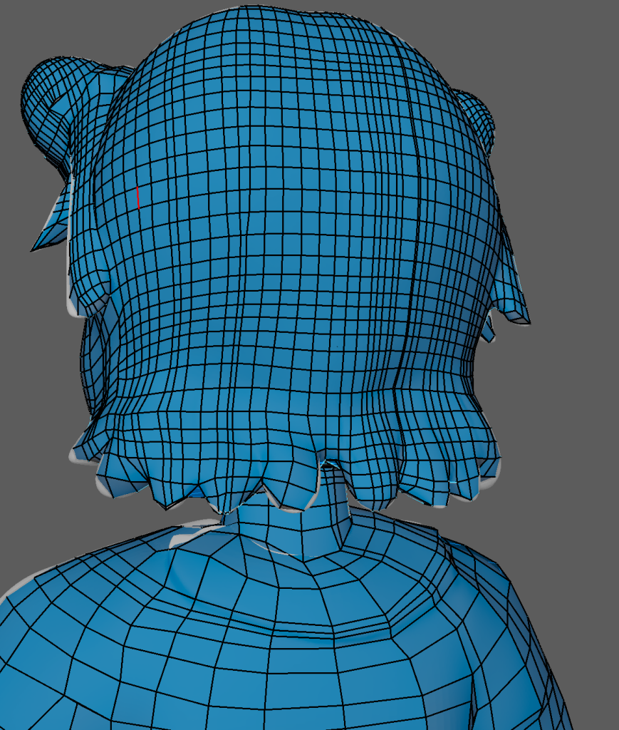
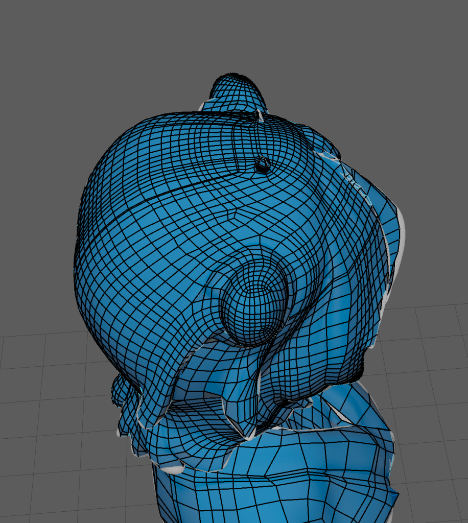
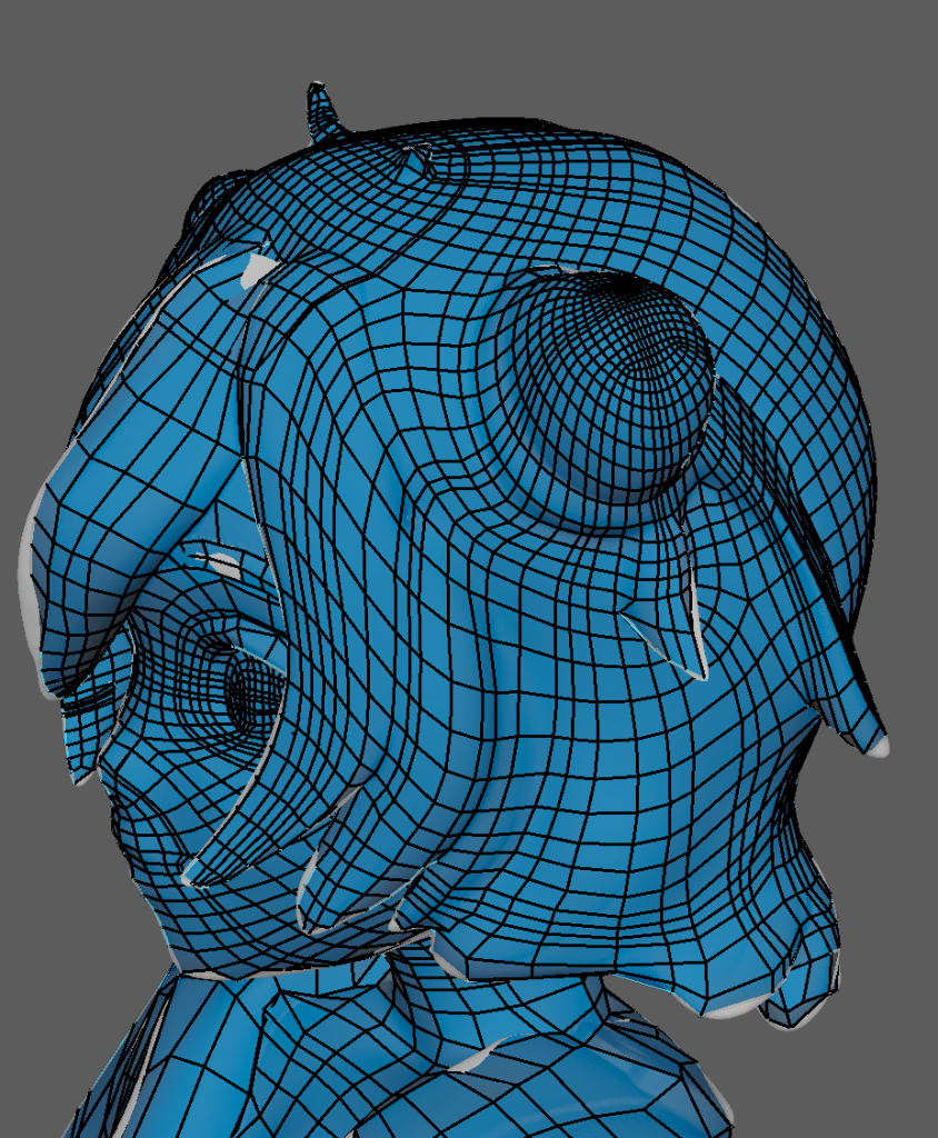
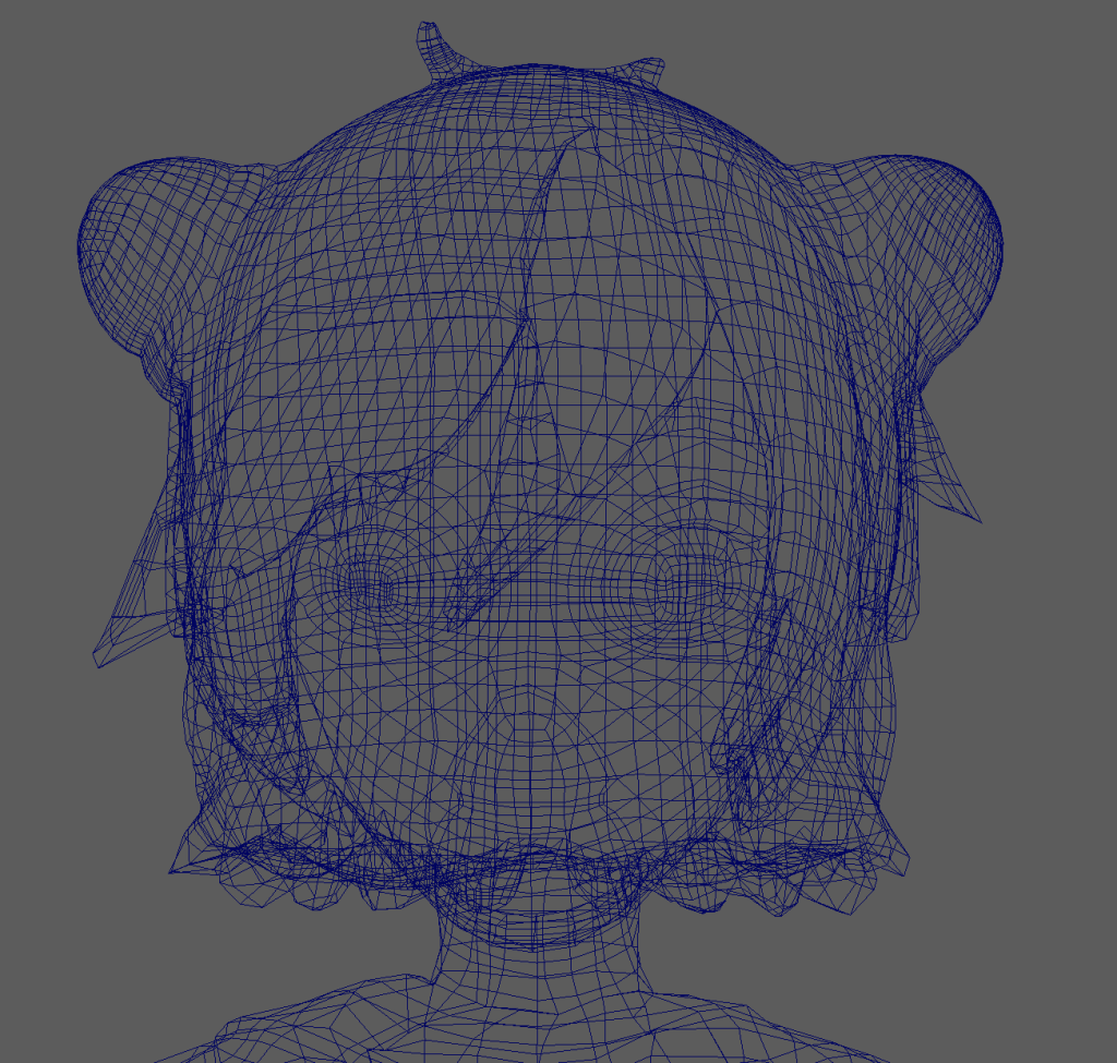
So for the start of the retapology, I began with working on the head and hair, working my way down the body. Working on the head, especially the areas that were covered by strands of hair or tight corners were incredibly difficult to retapologise as more often than not, it can lead to hidden faces which can create issues when UV unwrapping. These, however, were cleaned out during the final stage.
Here are a collection of screenshots detaling the retapology of the upper part of the model.
Face retapology was done using a reference
The high amount of edge loops around the eyes, nose and mouth areas are used in preparation for animation. (This is due to these features being deformed when animating. So it protects the model’s polys from breaking.)
Looking back on the head’s retapology (and a reflective criticsm that can be said for the whole model) There are a lot of unneeded edgeloops which causes the quads to become tightly bound together – when trying to solve this issue using the relax brushes, however, the quads would become either disjointed or uneven to the face. So in the future, I want to be able to dedicate the time to further redoing / cleaning up the retapology and it’s edgeloops.
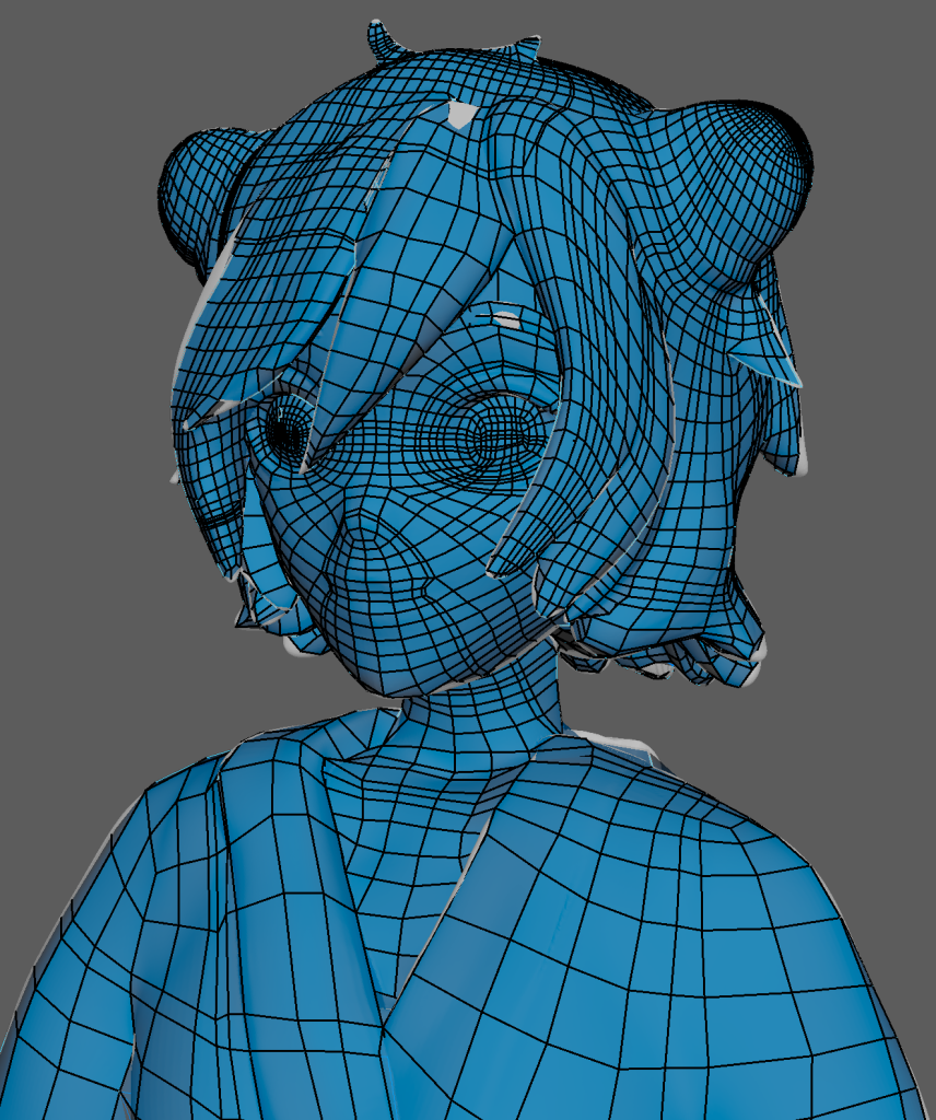
Added edge loops to the hair buns – each of the buns retapologies were done seperately so they may look different on each side. By adding edge loops, it allows more detail to be given to the low poly model. This also applies to the eyes and ribbons.a lot of edge loops in certain aprts of the hair strands. To improve – the model would either need to less edge loops or attempt to use the relax tool.Full image of the upper-body in development. Worked from the eyes all the way down to the upper part of the kimono. Also added in edge loops around the neck as this will also deform in animation.
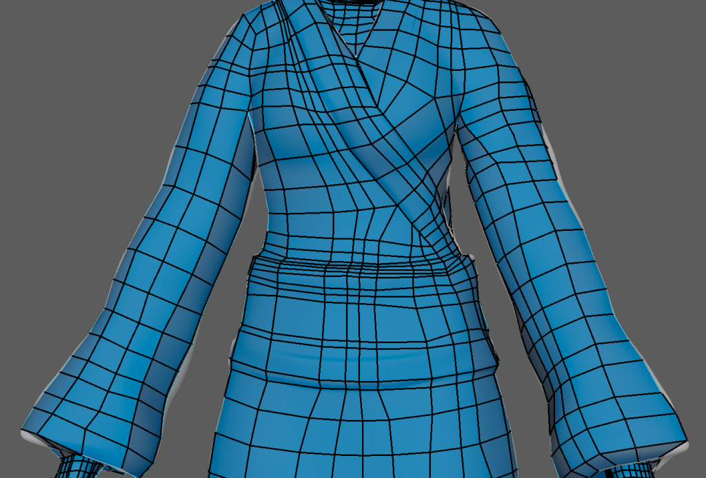
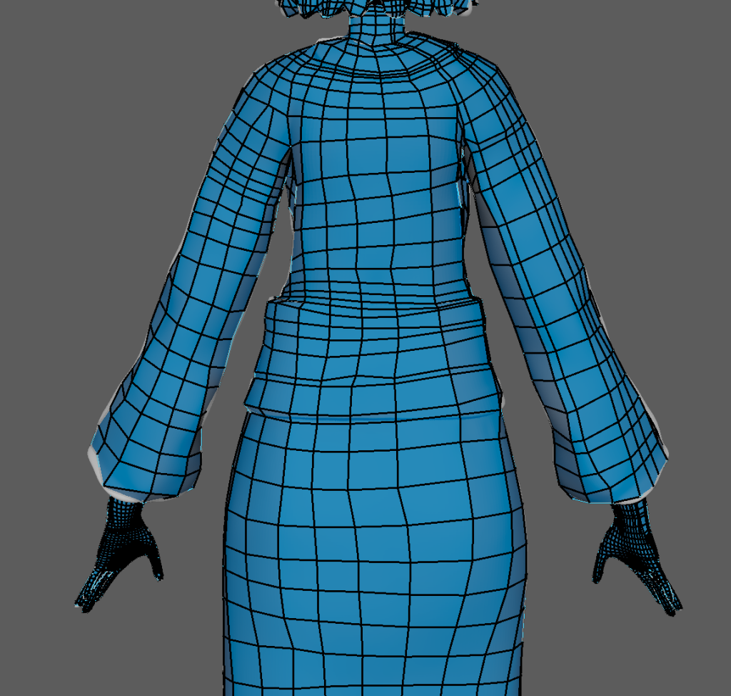
Body Retapology (Kimono)
When working on the Kimono, I focused on adding larger quads rather than continously adding edge loops. This is due to the body having less details. The main focus here was to add edge loops to the sash wrapping around her stomach (the Obi) as well as the folds and the collar. This also applies to the arms because certain parts of the clothes this helps seperate the torso and limbs from parts of the clothes when UV unwrapping.
Here are various close ups of the body retapology – a lot more broader as the kimono has less details that need to be translated in it’s low poly counterpart.
In certain areas – there were struggles in keeping the retapology clean and simplified (for instance the feet and bottom of the Kimono) but I managed to keep the retapology fairly simple by adding edge loops around the lower section to replicate the fabric’s tightness in the high poly version.
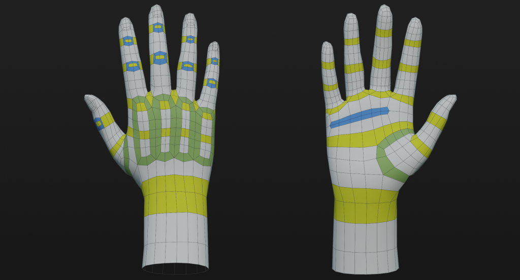
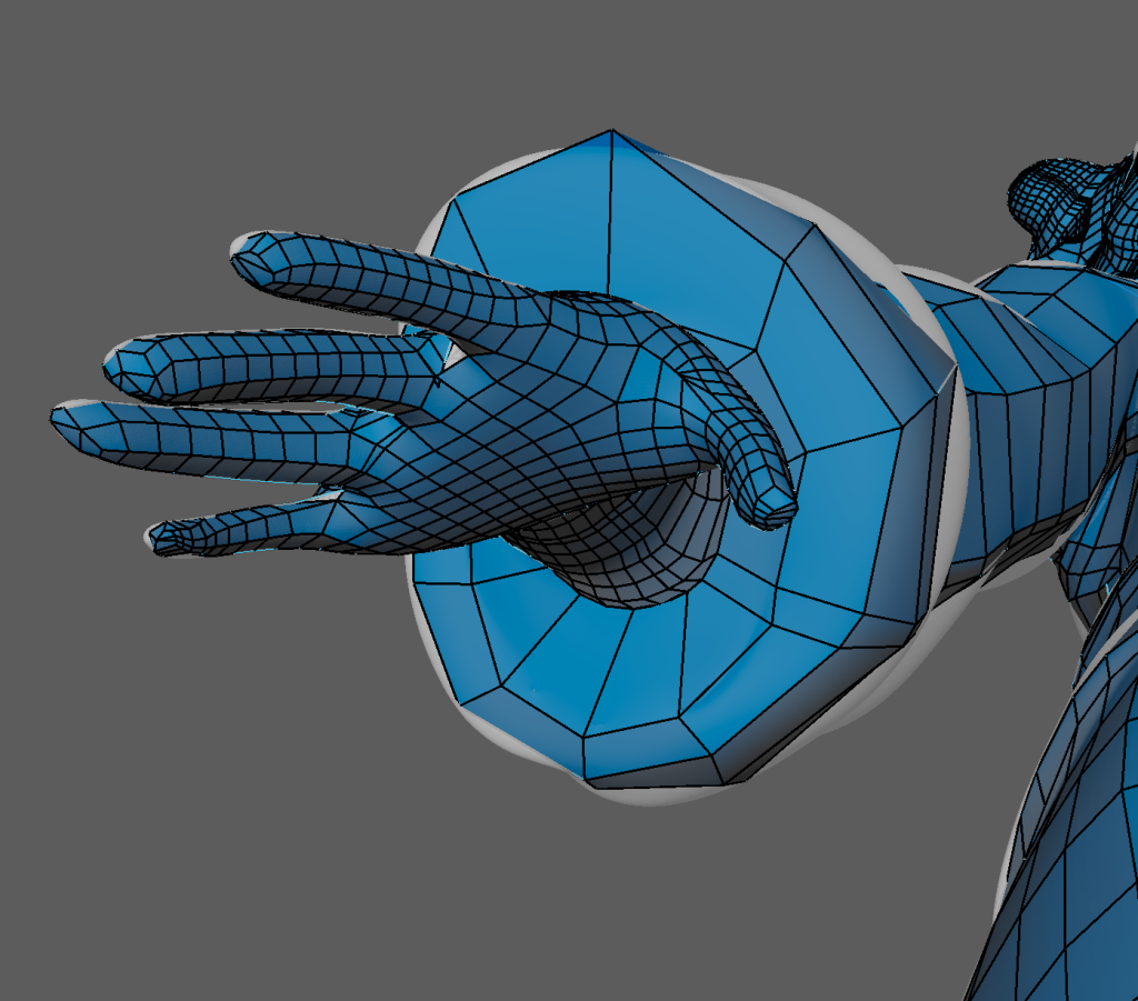
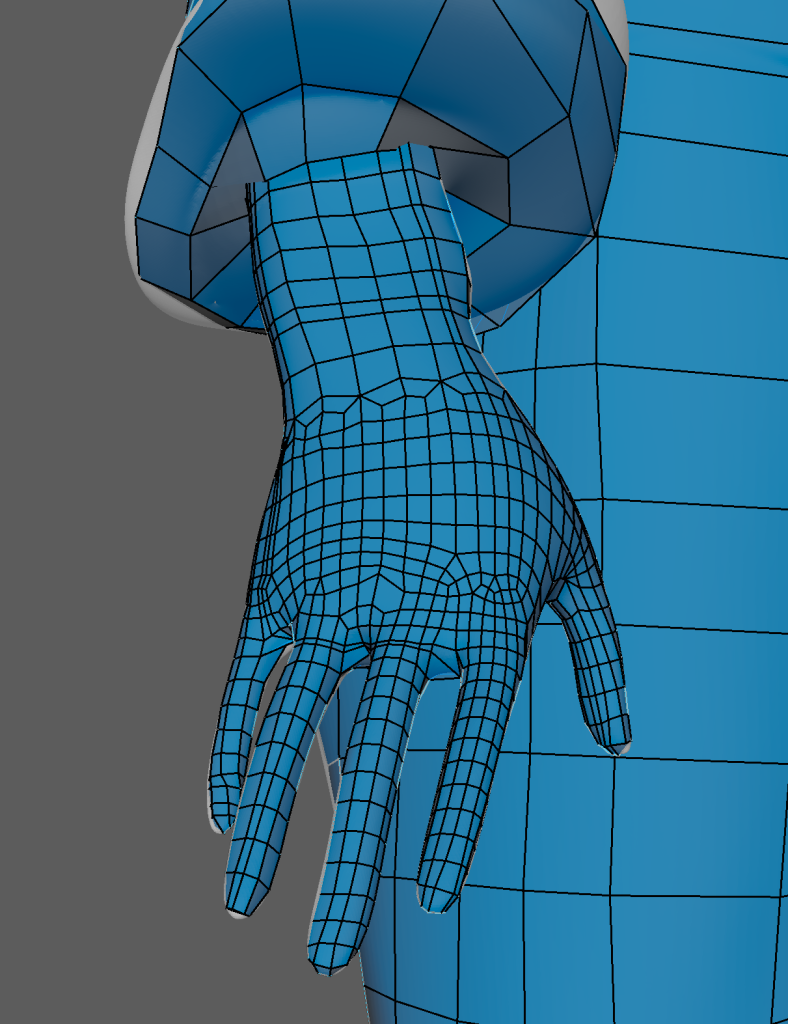
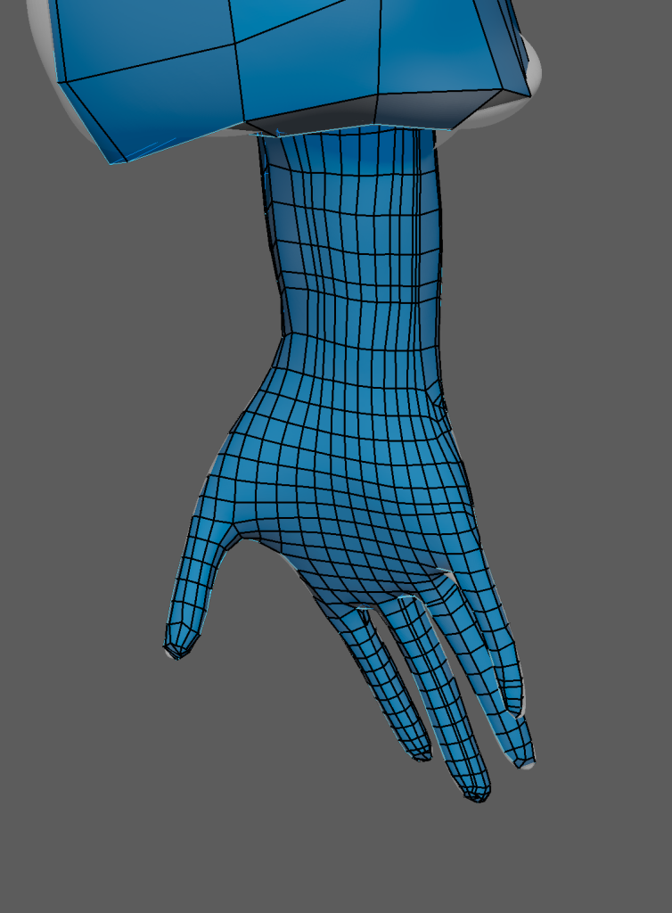
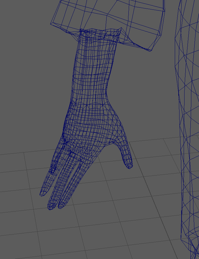
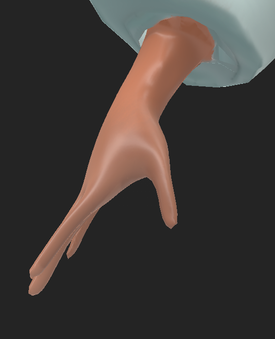
Hand Retapology
For the hands, since they will deform during animation and rigging – they had to be retapologised in a similar way to the face. I added quads in a certain pattern around the joints and fingers. This way – when they move, the texture and the mesh won’t deform. For the pattern, I had to work around the previous arm retapology I started making.
Reference used for the hand’s retapology.
Retapology Showcase
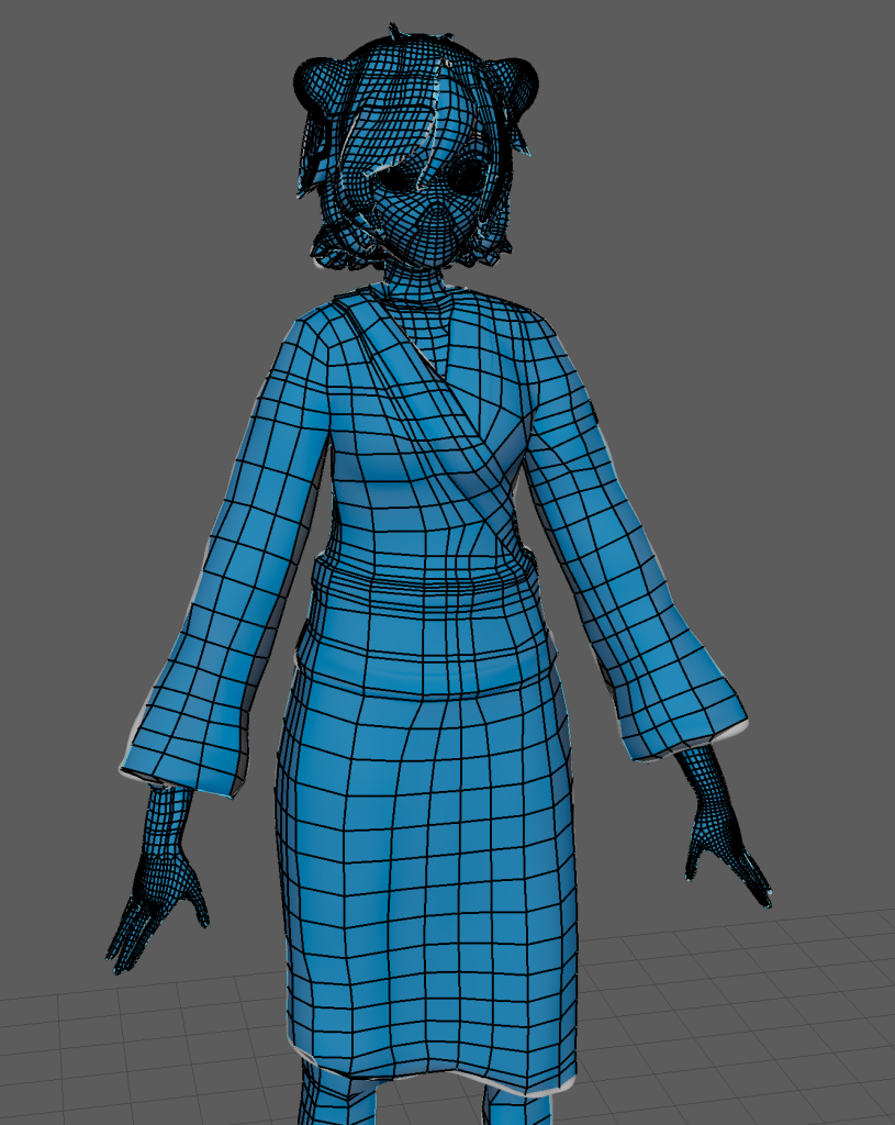
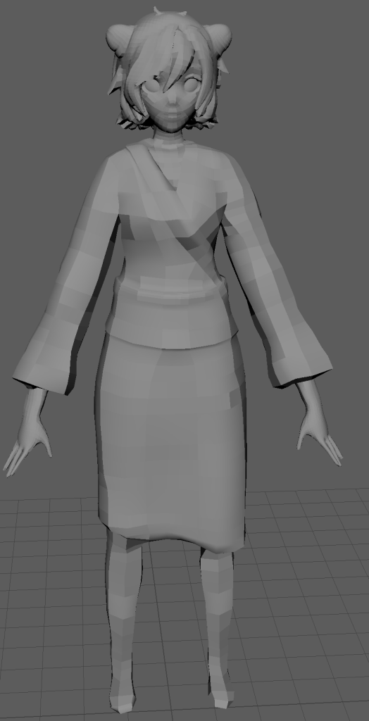
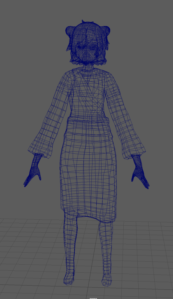
Finally, after the Retapology of the body was complete is a full showcase of the retapology. I cleaned up the model’s detatched quads and made sure that the retapology was relatively clean before UV unwrapping.
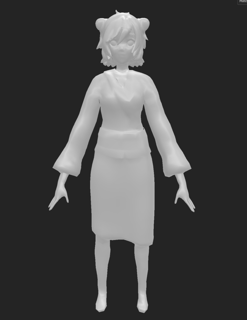
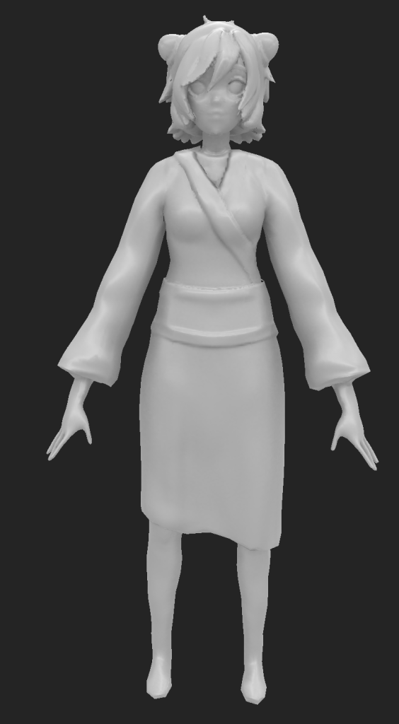
Retapologised version – Full Body
For comparison, here are the low poly and high poly versions of the model. This comparison, for the project, was especially helpful during baking.
Left: Low poly version of model – Right: High poly version of model
Orthagraphic view of Retapology
As shown, more faces were created in areas that have the most detail whereas the kimono still forms a basic shape.
Further improvements
Looking back in retrospective, overall, there could’ve been a lot of improvements that would’ve made the retapology a lot more cleaner. For instance, as mentioned prior, there were a lot of unnecessary edge loops created in the retapology. This was due to quads not being properly connected or the quads producing a spiral rather than an edgeloop. Retapology has been a steep learning curve and in the future, I would like to redo certain parts of the retapology (such as the Obi) and create a cleaner mesh to work with as this would’ve helped with UV unwrapping.
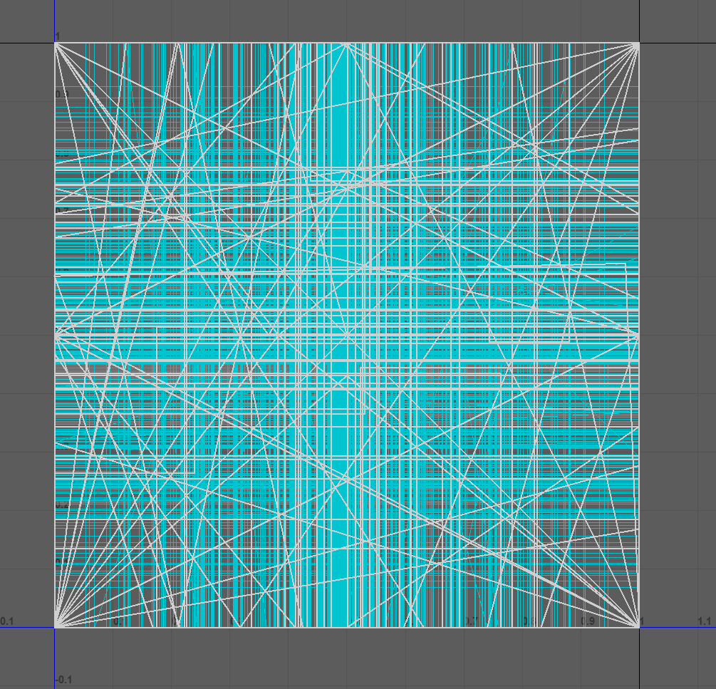
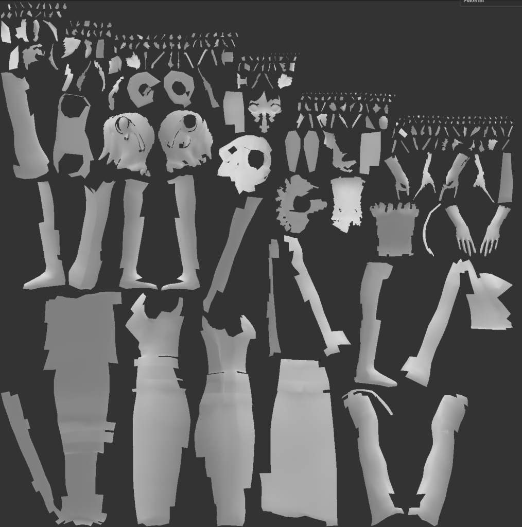
UV Unwrapping
This was my weakest aspect of the project as the UV unwrapping as after finishing the retpology, I created the low poly’s UV maps using the automatic unwrapping tool. This seperated the mesh into seperate pieces. However, some of those pieces were hard to identify without texturing them. These pieces included areas of the face or hair which demonstrates the flaws of the retapology I made.
UV before the automatic unwrapUV after automatic unwrap – imported from Substance Painter
However, whilst it is not ideal to automatically unwrap the model – it was still neat and simple – This also helped me come to the realisation that the retapology needed more work. Despite this, the UV for the low poly model still came out relatively uniformed and organised and it allowed me to texture the model in an easy manner.
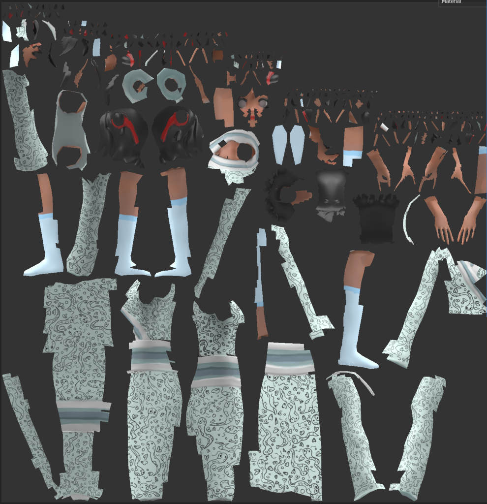
Textured version of the UV maps.
Baking
After importing the low poly version of Maki into substance painter, in order to bring back the details lost from the retapology – I baked the details onto the low poly using my high poly model. Whilst the bake came out relatively decent – there were were some issues when it came to the face (This was possibly due to the retapology). These were resolved by texturing the model.
Nevertheless, lots of the details came back into the model which helped began the texturing process.
Before baking (Low poly model) – After baking (High poly model baked onto low poly)
Texturing
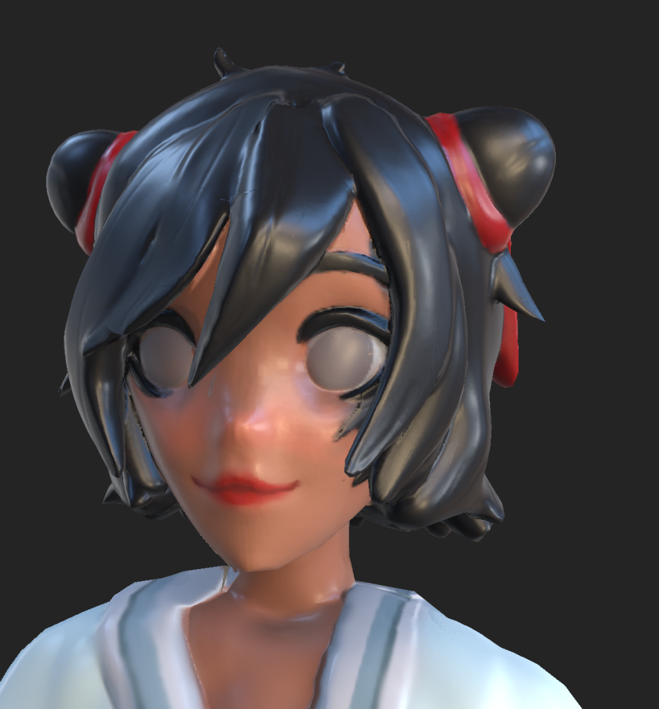
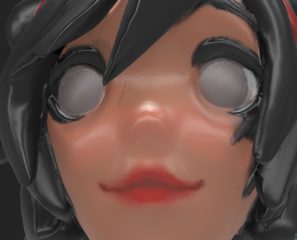
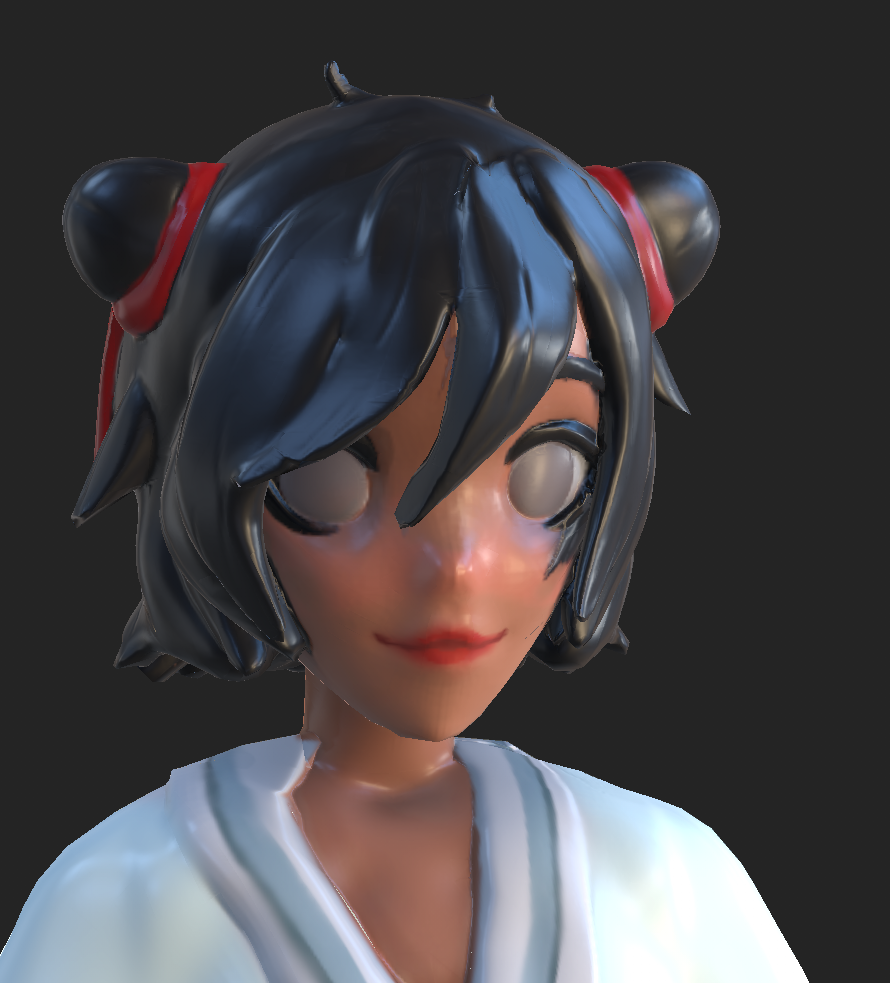
Looking back on the baking issues for the face – texturing the model helped alleviate the errors. When it came to working on Maki’s face – I experimented with different colours for her skin in order to add depth to her looks.
This was done by adding textured dark rings under eyes and adding a faint blush to her cheeks and nose. The contrast between the blush, the tired, faded look and the red lipstick, whilst textured on still exemplifies Maki’s sense of life, even if it’s not in a physical sense. The bright red motif is shown around the model – Red tends to signify danger but in Maki’s case – the red draws connotations to love and beauty.
With Maki’s eyes – as mentioned before, the idea was to go for a more glassy look in order for the player to visually understand that she’s blind.
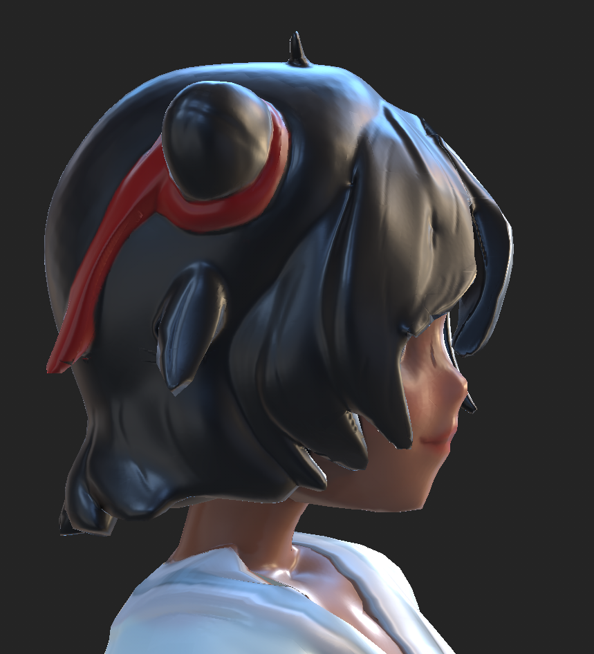
Her hair, whilst textured in a stylised fashion, the colours give shade and movement to the hair especially when shown in a soft lighting. The details of the high poly model emphasises that simple wave and direction to the hair strands. This was also the case for the ribbons as they flowed neatly to the back of Maki’s head.
Kimono and Body texturing
When making the kimono, originally I tried to experiment with block colours in hopes that shaders and different lighting would help make the cloth and the wrappings stand out. However, the lighting could only reflect certain parts of the shading, mainly in areas that have been modeled.
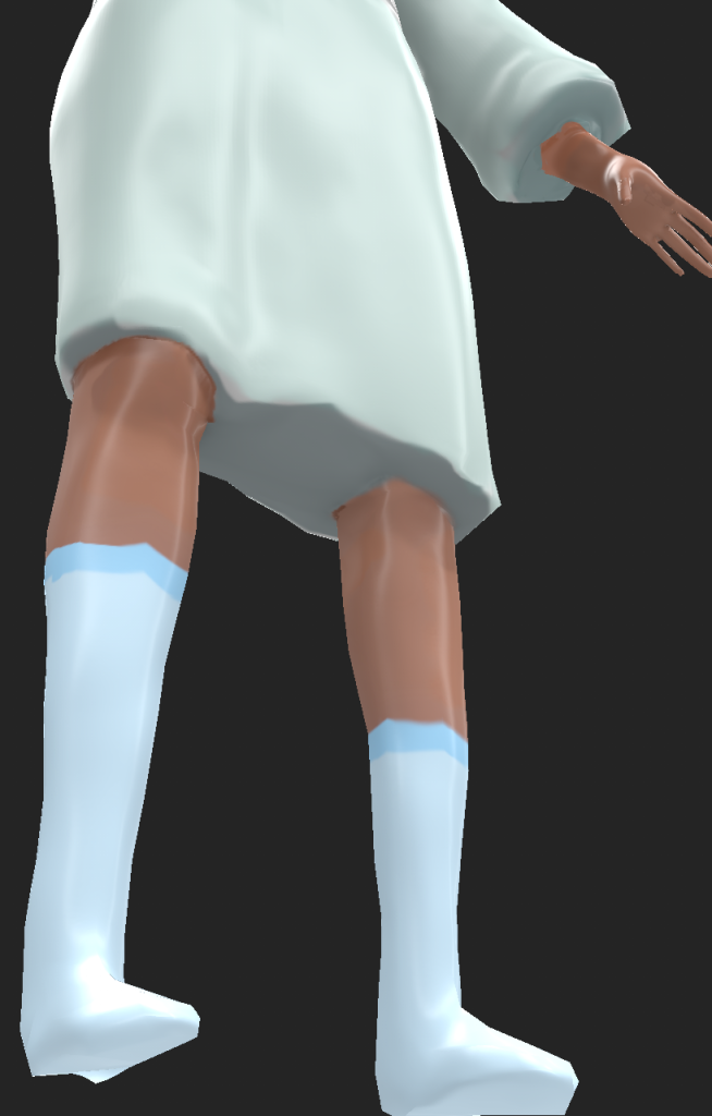
So to counteract this issue, I textured in some light shading to the model in order to make the wraps and fabrics stand out further. And for the insides of the arm sleeves and legs, it was to create the illusion that Maki’s hands are covered by the shadows. This also helped make the textures feel less flat and eye catching by creating two colour contrasts in the fabric. I also applied this technique to the hands and legs, giving them different shades of colours to help them pop out in the renders.
Finally, with the socks, these were simple textures that were added on – for these, I struggled to add shading to them instead prompting to add a more vibrant colours to the bands of the socks. The socks are also uneven which helps visually convey her messy nature.
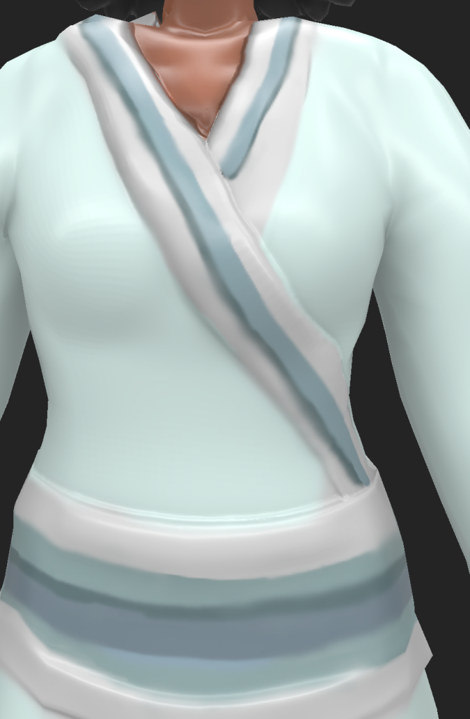
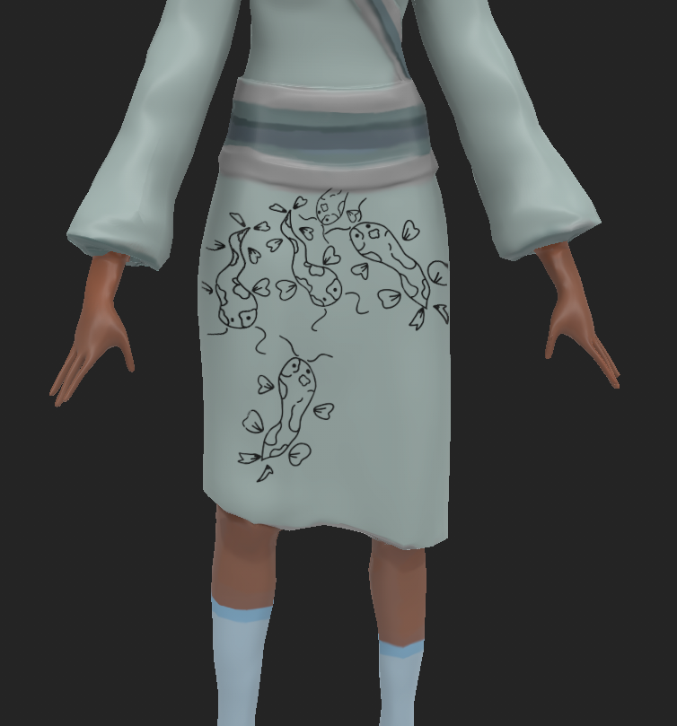
Texturing the Kimono Fabric
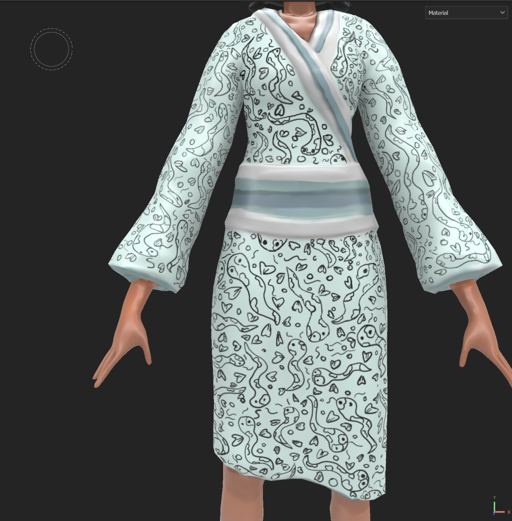
The final step to this project was to add the textures onto the Kimono. Originally, I tried to use a stencil by creating the design in photoshop and importing it into substance painter. The original design featured two Koi fish as shown here:
Initially this idea was to originally make sure that the kimono pattern stayed consistent. However, this method turned out to become incredibly tedious and time consuming as the stencils were suited for a more singular pattern or decal than a fabric pattern. The stencil method also make the Koi seem restrictive and it was difficult to create Koi in various sizes using this technique.
So instead, the pattern was painted on with the Koi moving around the fabric.
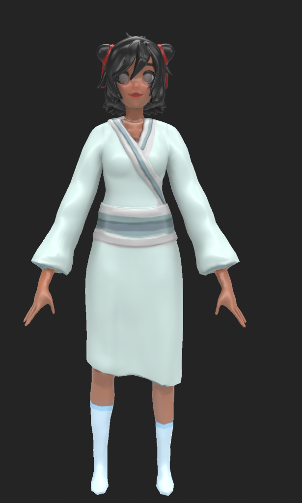
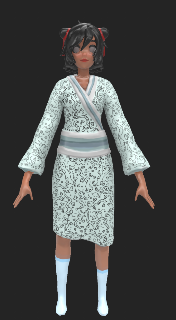
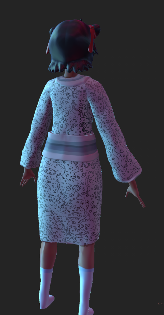
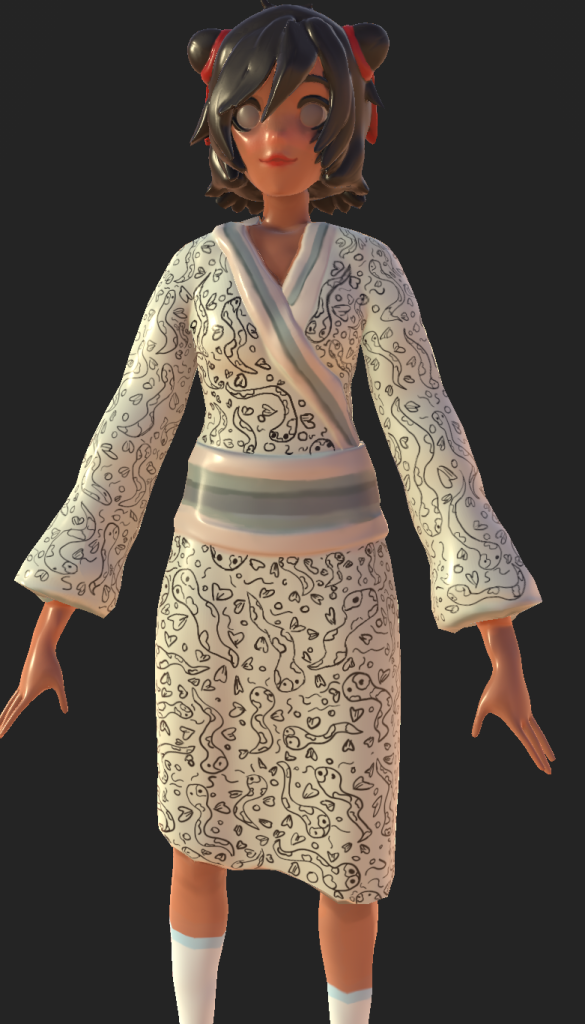
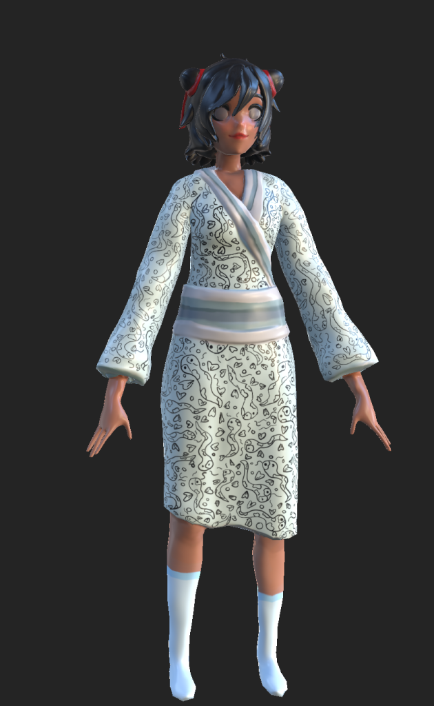
Finalised Maki model with normal lighting in Substance Painter.
This meant that the texture flowed better, adding vibrant movement to the texture and it makes the model stand out as an unique character. It also visually adds to her character by showing the care to try and keep the cloth maintained despite her siblings violent plans. It adds a level of innocence to the group despite her terrifying nature.
Final shots in Substance Painter
These are the final shots made in substance painter before exporting to Marmoset. This helped to see if there needed to be any final changes added to the shading or to help identify any texturing issues or colour mishaps.


?file=Offering_ending.png)